The COVID-19 pandemic has been absolutely fascinating to watch from a mathematical modeling standpoint. As the pandemic starts taking a stranglehold on the United States this week, let’s have a look at a few different COVID-19 models, including my SIR model. Can we gauge any semblance of what’s going to happen over the next few weeks?
Disclaimer: As I’ve mentioned many times before, I claim zero knowledge about anything in the medical field, including infectious disease. These analyses are based solely on my expertise in mathematical modeling.
An Important Note on Making Predictions From Mathematical Models
One of the most common uses of mathematical models to make predictions in day-to-day life is weather forecasting. Luckily, meteorology happens to be a field in which I do have extensive knowledge. When forecasting any type of weather, it’s important to look at multiple models. Do not make any predictions based solely on any one model. In an ideal world, the models are all in agreement. In reality, you need to use your knowledge and expertise to gauge how much weight to give each model when you make your prediction. The same principle applies to the current pandemic.
Additionally, from a purely mathematical standpoint, all outbreaks follow roughly the same bell-shaped curve when plotted over time. Different types of outbreaks can use vastly different equations in their models. While I do not have much experience with outbreaks of infectious disease, I have worked with and extensively studied outbreaks of tornadoes and severe weather during my time as a meteorology student at the University of Oklahoma. We can apply that knowledge when making predictions about the current COVID-19 outbreak.
Adding a Social Distancing Factor to the SIR Model
I have been running a lot of possible scenarios in Python using the Susceptible – Infected – Removed, or SIR model. I recenly covered the mathematics of the model, so I’m not going to state all of that again. You just need to know that the model is based on a system of three ordinary differential equations.
With the help of my uncle, who also has a lot of experience with mathematical models, we set out to add a parameter, which we’ll call f, to the SIR model. f represents the percentage of the population who are strictly complying with social distancing guidelines.
Accounting for Social Distancing in the Model
To incorporate f into the SIR model, we need to look at the terms that are modeling the contacts between the infected and susceptible people. The rate of contact would be reduced by (1 – f)2 because the fraction of both the susceptible and infected population interacting would be reduced by a factor of (1 – f). The removed (recovered/dead) population would not be affected by the social distancing parameter. Therefore, the differential equations for the susceptible and infected population would then become:


We are still working on fine-tuning these equations, but this is what we’re going with for now.
Estimating a Baseline Infection Rate
The final piece of the puzzle is to set the baseline for beta. That baseline is the infection rate assuming 0% social distancing compliance. In other words, beta is the number of infecting contacts per day between an infected and susceptible person. Beta is also part of the equation that calculates R Naught.
Since I only plan to model the effect of social distancing at the city level, I simply scaled beta based on the city’s population density to set the baseline infection rate. Cities with higher population densities would have a higher rate of infection than those with lower population densities. COVID-19 is spreading much faster in New York or Chicago than it is in Topeka, Kansas or Bismarck, North Dakota.
The scaled baseline for the infection rate at 0% social distancing compliance is simply:

where d is the population density in units of people per square kilometer. The “plus one” is because some small cities in Alaska have population densities of less than 10 people per square kilometer. Low population densities result in very small and unrealistic beta and R Naught values. It’s not an exact science, so the equation will be tweaked as we go along.
Limitations of the SIR Model
Not surprisingly, mathematical models are only as good as the assumptions that they make. The COVID-19 models make plenty of them. Some of the assumptions and limitations the SIR model (plus our revisions) make include, but are not limited to:
- Uniform population density across the entity being modeled. This means the SIR model predicts outbreaks in individual cities much more accurately than it does in states and countries.
- Population remains constant – i.e. people are not being born or dying of causes other than the disease. The SIR model has terms to account for birth and death rates, but its effect on the model is negligible. I don’t have birth and death rates in my database, so we will simply set those terms to zero.
- R Naught and the percentage of people social distancing are constant throughout the outbreak of the disease. This can cause both the peak of the outbreak and the date of that peak to be either over- or under-estimated.
Outputs From Our Revised SIR Model
We now have enough data from the United States, Canada, and Australia. Let’s fit the model output to each state’s existing curve. We can then use that output to model major cities in each state.
I’ve included model outputs from a few cities in the United States, and will include more in a separate post. When looking at the model outputs, you want to focus on general trends. Do not look at specific dates or case counts. Instead, focus on something happening in periods such as “mid-April” or “early May” instead of “April 15th” or “May 1st”.
Our Revised SIR Model’s Assumptions
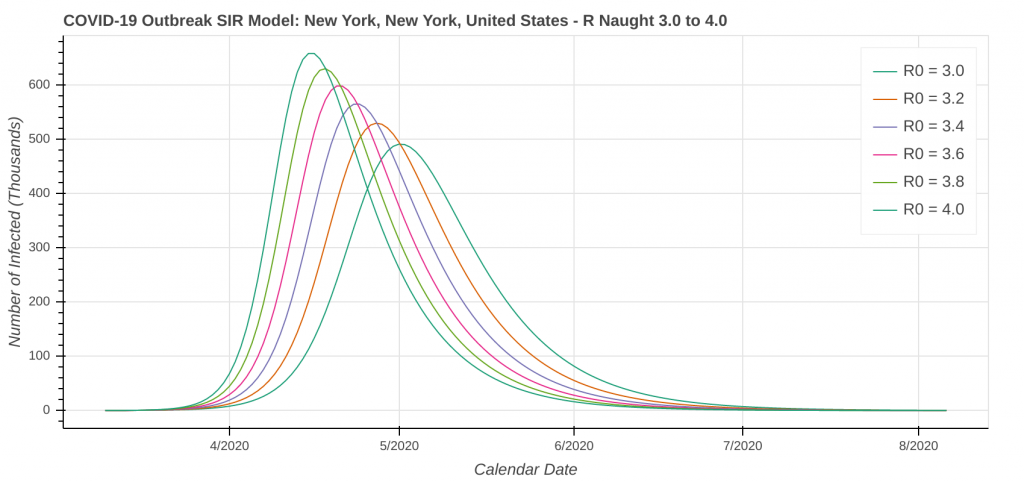
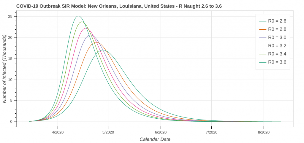
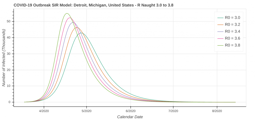
Don’t forget that our revised SIR model assumes a constant level of social distancing. We are just starting to see the effects of stricter social distancing show up in the data set. As a result, the model will likely underestimate the amount of social distancing being done. Therefore, it will overestimate the number of cases. I’ve included curves for several R Naught values both less than and greater than the R Naught values that I reverse engineered by fitting the model curve to the existing data.
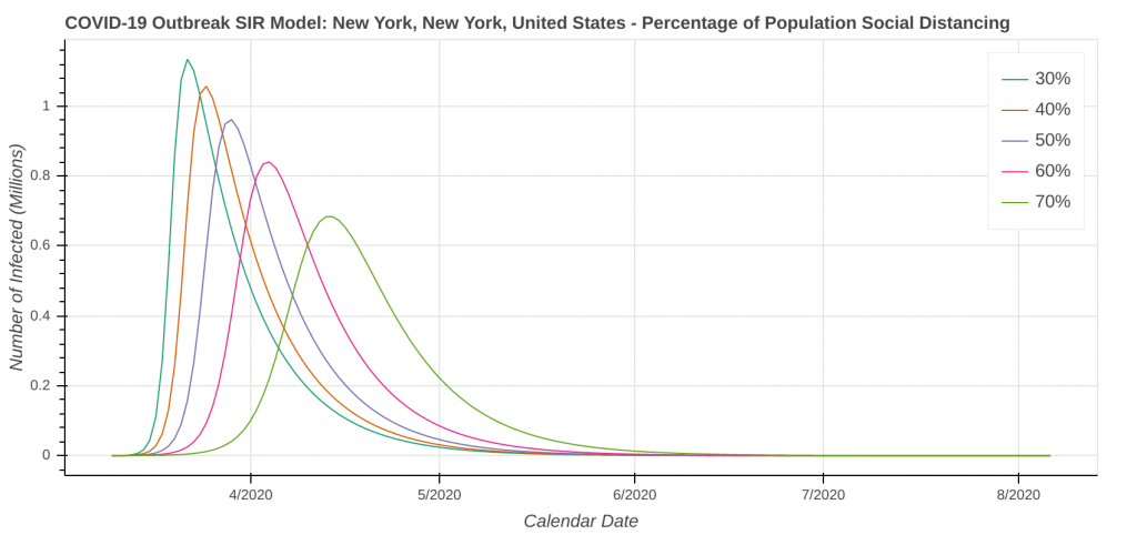
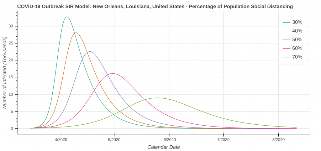
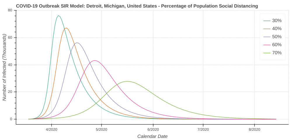
The revised SIR model seems to do a decent job predicting the apex of the outbreak. I have checked the apexes on the first plot you see below in each city against what health officials in Arizona, New York, Michigan, Massachusetts, and Louisiana have said. They’re at least “in the ballpark” with what health officials are saying. The social distancing plot is primarily to drive home the importance of social distancing and flattening the curve during the pandemic.
Speaking of social distancing, don’t forget about assumptions. The plots below assume the amount of social distancing remains constant throughout the entire time series. In reality, additional social distancing restrictions will dampen the curve and shift it to the right. Removing social distancing restrictions will cause the curve to accelerate and shift to the left.
Confidence Levels in the Model
My confidence level in these model outputs is as follows:
- Predicting the apex of the outbreak: medium-high to high. The curves should at least be “in the ballpark.”
- Predicting the total number of cases: low to very low. With how fast things are changing right now and how fast new data is coming in, we just don’t know at this point. My gut feeling is that the case count projections in these model runs may be high. From a public health perspective, I would much rather have the model overestimate case counts than underestimate them.
With regards to the projected case counts, look at the how the University of Washington model has been all over the place over the past week. That is how the model tells us it doesn’t know. We can’t make any meaningful forecasts from it at least until it starts to stabilize from day to day. This would be like trying to make a forecast and issue warnings for a hurricane using a model that keeps flip-flopping between the hurricane making landfall in Houston and making landfall in Miami.
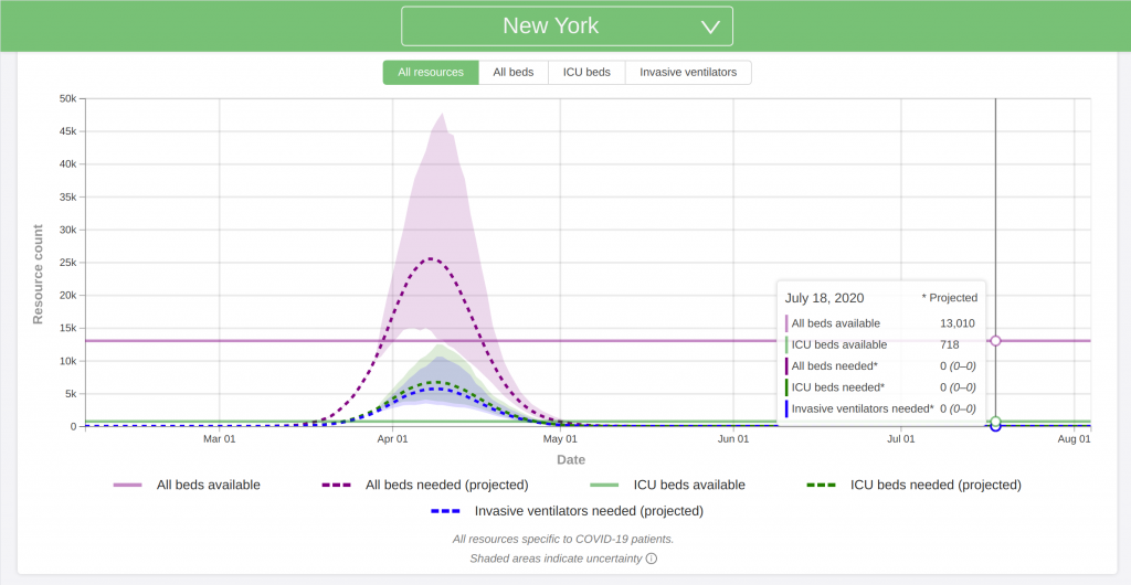
New York, NY
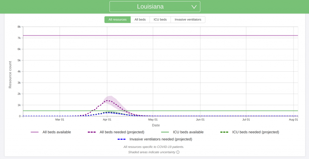
New Orleans, LA
Detroit, MI
Plots for additional cities will be posted in a separate post.
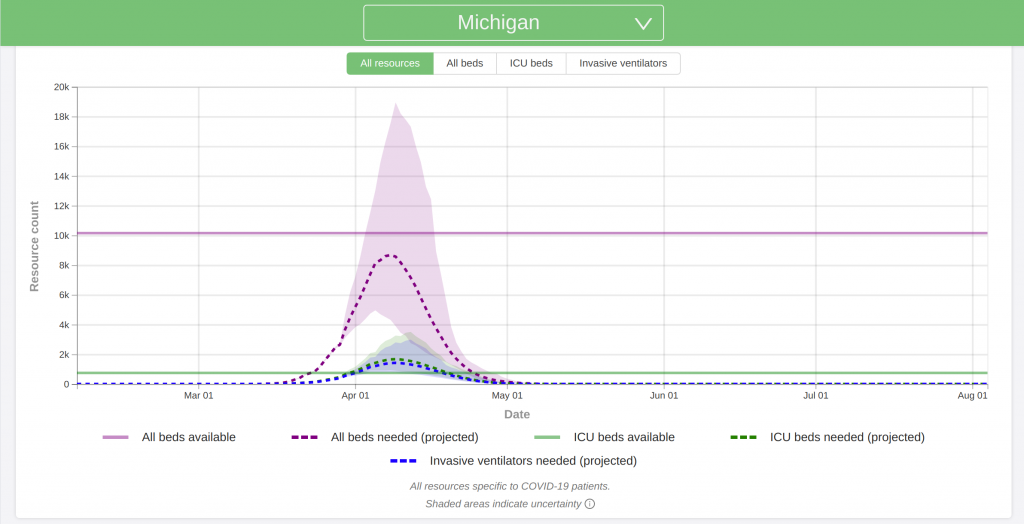
Looking at the University of Washington Model
A model developed by the University of Washington has made headlines over the past several weeks. It is one of the most trusted models out there for predicting the pandemic (at least in the United States). However, I worry that too many people are focusing only on this one model and are not considering what other models are forecasting.
Like every model, the University of Washington model makes its fair share of assumptions:
- The model accounts for social distancing restrictions, such as closing businesses and schools and issuing stay-at-home orders. However, it does not address how social distancing restrictions are lifted. It assumes that Americans continue to practice full social distancing practices through at least sometime between June 1 and August 1.
- The model does not account for any resurgences or additional waves that may occur later this summer or fall.
- The model does not account for hospital staff shortages due to being out sick, running out of supplies, or any other reason.
- It is also important to note that the University of Washington model forecasts deaths and hospital usage. It does not predict the total number of cases.
I believe that this is probably the most accurate model out there right now. My gut instinct is that because of the assumptions, it may slightly underestimate both the hospital needs and death counts.
Also note that the plots below are for hospital needs. It looks like 20 to 25 percent of all COVID-19 cases require hospitalization. Multiply the y-axis values by 4 to 5 to get the approximate number of cases the model is predicting.
My Predictions
Because of the fluidity of the situation and how fast everything seems to be changing, focusing my predictions on exact numbers will only contribute to the spread of misinformation. Instead, I will be focused on general trends, as I discussed earlier. These predictions are based on the two models I discussed in this post, as well as several others.
Expectations for the United States and Canada
- Nearly every city and state in the United States will reach its apex within the next 4 to 5 weeks. I’m still working on projections for Canada.
- At the end of the pandemic, total case counts in every major city in both the US and Canada will be in the tens of thousands, if not more. New York City is currently just shy of 80,000 cases.
- Total or cumulative case counts for the both the United States and Canada will be in the millions. I think Canada can still keep their case count below 1 million with proper social distancing. That ship has long since sailed for the US.
- For perspective, let’s use the Centers for Disease Control’s recent prediction of 80,000 deaths in the United States. Using the current death rate based on data from the past week, it works out to about 2.5 to 3.5 million total cases in the US.
- In Canada, the Government of Ontario recently released a study projecting at least 15,000 deaths in the province. Using the same calculation as above, that works out to 500,000 to 750,000 cases in Ontario alone.
- New cases will be reported in both the US and Canada every day through at least late June/early July. Expect government mandated social distancing protocols to remain in effect through at least the end of May in most states/provinces. These restrictions include stay-at-home orders, closures of restaurants, schools, and other places of gathering, etc.
- The outbreak in Canada will have a flatter curve and grow slower than the outbreak in the United States. As a result, Canada will peak later than the outbreak in the US.
- Don’t forget that like weather forecasting, the models get less accurate the further into the future you get. I will be posting routine updates as new case data comes in.
One Final Thought
When a hurricane makes landfall, it ravages the coast with the eye wall – the most powerful part of the storm – before the calm of the eye passes over. Inside the eye, winds drop down close to zero, the sun comes out, and it looks like a beautiful day. In the first half of the 20th century, before weather radar became mainstream, coastal residents commonly mistook being inside the eye to mean the storm was over. They then went back to their normal lives. As a result, they were then blindsided when the back side of the eye wall came ripping ashore like a buzzsaw. They didn’t realize that they still had the whole second half of the hurricane to go. Such a mistake undoubtedly caused numerous injuries and deaths that should have been preventable.
Don’t Repeat Past Mistakes
I am a bit concerned that a lot of people will be making the same mistake by going back to their normal lives once their city and state hits the apex of the pandemic. Like the eye of a hurricane, the apex is only the half-way point. You still need to come down the back side of the curve. Look at any of the plots above. In fact, the apex is likely not even the half-way point. It almost always takes longer to come down the back of the curve than it does to go up the front of it. Expect the Stay at Home orders to remain in place for at least 4 to 6 weeks after your state passes its apex. We will likely be into June before we can even begin to think about going back to our normal lives.
Look, I understand the cabin fever is real. You want to go see your friends and loved ones. Be patient and be smart. We don’t need any more people dying from this virus than already are.
