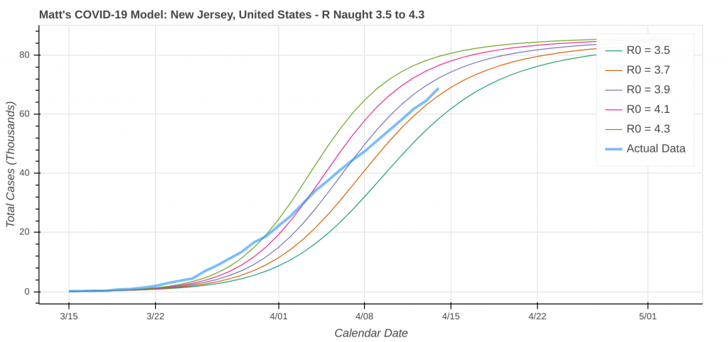
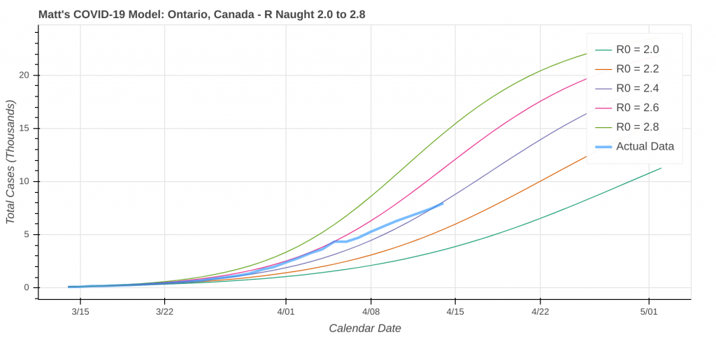
My COVID-19 model is actually giving me results. Let’s open the hood and look at some of the mathematics, methodologies, and logic I use to make my projections. I wrote the model in Python. It has a simple graphical user interface that runs in a web browser.
The SIR Model: A Solid Foundation to Build On
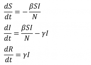
The foundation of the model is based on the Susceptible-Infected-Removed, or SIR model. The SIR model uses a system of three differential equations to predict outbreaks of infectious disease. I discussed the model, as well as its equations and variables in detail in an earlier post. The equations are as follows:
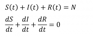
The relationships between the three equations is:
Issues With the Out-of-the-Box SIR Model
About a month ago, I ran some initial forecasts using the SIR model that weren’t even “in the ballpark” close. This was due to the following assumptions that the model makes “out of the box”, which can be significantly limiting.
- Population is evenly distributed across the entity (country/state/city) being modeled. In other words, population density is constant.
- R Naught remains constant throughout the run.
- The model ignores social distancing.
- The model does not take into account other restrictions, such as stay-at-home orders, travel bans, closed borders, and bans of large gatherings.
- Due to the high contagiousness of COVID-19, 100% of the population becomes infected when you run the model “out of the box”.
The Key Factor: Accounting for Social Distancing
There are two possible ways to account for social distancing:
- Decrease the R Naught value
- Introduce a Social Distancing Parameter into the equations.
Let’s start with Number 1. The R Naught value is the average number of susceptible people an infected person spreads the disease to during the period in which they are contagious. The susceptible-infected contact and transmission is defined in the first two terms of both the dS/dt and dI/dt equations. We use β, the transmission rate, and γ, the recovery rate, to calculate R Naught.
From a mathematical standpoint, the concept is simple for COVID-19. Social distancing will decrease the transmission rate, and thus decrease the R Naught value. The million dollar question is how much does it decrease the R Naught value? When I first starting developing this model in March, the United States had not implemented any social distancing measures. In Europe, they hadn’t been in effect long enough to see results in the data. I made a conservative guess for how much R Naught decreased, and not surprisingly, I was way off.
The mathematics of the COVID-19 model are not as simple as they seem.
Further complicating the matter was trying to figure out what percentage of the population would become infected over the course of the entire pandemic. By introducing a social distancing factor, which we’ll call f, we can at least start to get an idea of the infection rate without having to simply guess. That social distancing factor reduces the fraction of the susceptible and infected population interacting by a factor of (1 – f) and defines the corresponding equations as:


The social distancing parameter got us a lot closer, but still wasn’t close enough to make me happy. You still had to estimate the base R Naught value at 0% social distancing efficiency. Thankfully, there’s still one more big tool in my toolbox that will solve all of the issues we’ve faced so far.
Accurately Forecasting R Naught and the Total Infection Count: Best Fitting the Observed Data Time Series
Statistical regressions and best-fit curves/equations are one of the most powerful weapons in a mathematician’s arsenal in a situation like this. There’s one big problem here. A proper statistical regression requires a standard function – i.e. y = f(x). We don’t have that, as we are dealing with differential equations. Time to dig deeper into the toolbox.
There is a branch of calculus where you can use simple numerical calculations to approximate both finite derivatives and finite integrals (a derivative or integral between two defined points on a plot). Not surprisingly, this technique is called Numerical Analysis. Most mathematical models use numerical methods to make their predictions, including the COVID-19 SIR model.
The goal of a numerical analysis is to be able to calculate either a finite derivative or a finite integral in situations where you have either a lot of unknowns or complex equations that can’t be easily solved via traditional calculus. This is exactly what we need, as we have a lot of unknowns, so let’s dive into the math.
Which curve do we best fit with the model?
The actual data to which we will be best-fitting the model output is the total or cumulative case counts. While the SIR model specifically doesn’t calculate the cumulative case counts, it’s easy to calculate. Because this is a novel coronavirus, it means that at the start of the outbreak, the entire population is susceptible. We can define the cumulative case count T as:

Taking the derivative yields:

The last two terms cancel, yielding:

To perform the numerical analysis for the best-fit line, we need to break the data up into as small a time-step as we can in order to numerically approximate the derivative. The smaller the time step, the more accurate the approximated derivative calculation will be. Since case data is only recorded once per day, our time step, Δt, will be one day. We can now approximate the above derivative (dT/dt) as:

A Stroke of Brilliance
Now, here’s where the brilliantly simple aspect comes in. Because Δt = 1 day and case counts are only logged once per day, do you know what T(t) is over that one day period? A line. Yes, you read that right. It’s a simple line: y = mx + b. In fact, ΔT/Δt is just the slope of that line. Because we’re looking at such a short time period, the x and b values are of little interest or use.
To run the model, we input R Naught and the percent of the population that is infected at the end of the pandemic. Let’s recall the equation for R Naught:
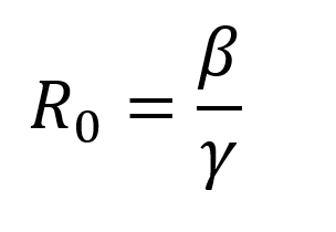
γ is the average recovery rate, which is constant, so R Naught changes directly as β changes. N is the total population, so let’s introduce a parameter p that represents the percent of the total population that has been infected at the end of the pandemic. Our approximation of dT/dt is now:

To complete our numerical analysis, we want to compare the model’s ΔT/Δt with the actual data ΔT/Δt for each day actual data is logged. We will then find the closest match. Before we dive into methodology, let’s take a step back and make a list of what we know:
- ΔT: The change in total number of cases for that day.
- Δt: 1 day
- γ: The recovery rate (constant)
- N: The total population
- We want to figure out R Naught and p.
One Final Mathematical Wrinkle
There is one thing that throws a bit of a wrench into the mix. The actual data only reports cumulative case counts. Therefore we don’t know the values of S and I variables, but we do know them for the model. Additionally, we know ΔT for the actual data, but not the model. Remember that the model only outputs S, I, and R. Thankfully, we know the value of everything on the right-hand side of the equation for the model. We can calculate ΔT/Δt for the model outputs and compare to ΔT/Δt for the actual data.
I wrote a Python algorithm that determines the closest ΔT/Δt match between the model and the actual data for each 1-day segment. As soon as we make that closest match, we record the R Naught and p values for the closest match on that day. After analyzing the entire dataset, we calculate the average R Naught and p values for the most recent 10 days of those matches. We then input those into the model. The algorithm is not perfect, so we can manually tweak and adjust those input values as necessary.
How Accurate Is Modeling By Numerically Piecewise Fitting the Curve to Differential Equations?
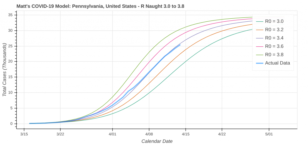
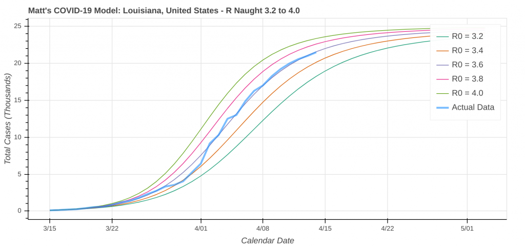
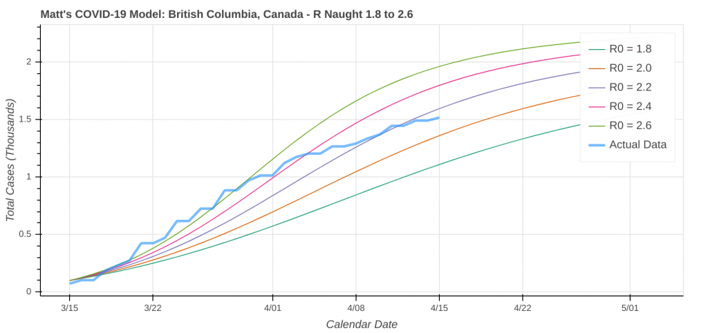
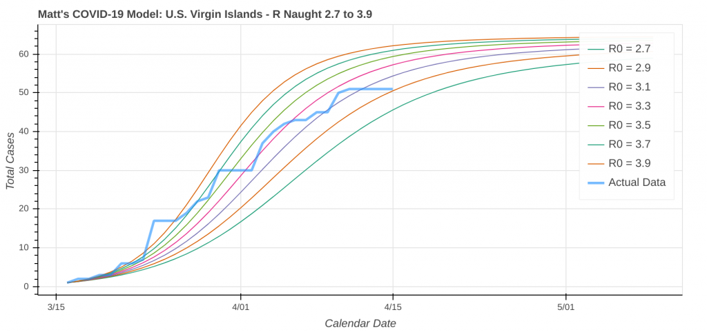
Overall, it’s disturbingly accurate. Like most models, it struggles in areas where minimal data exists. It also struggles for large entities like big countries due to the SIR model’s assumption that the population density is constant throughout the entity, though the best-fitting algorithm does help mitigate that to an extent.
So just how good does it do? Its two best performances in the latest run were for Pennsylvania and Louisiana.
Here are a couple instances where the model struggled a bit due to low case counts, though it still did an okay job overall.
Fun Aside: See the Effect of Social Distancing Restrictions in the Model Runs
Did you know you can actually use these model runs to gauge how good your state has been at social distancing? Each line on the plot that represents a model prediction is a line of constant R Naught, which is also a line of constant social distancing.
By implementing social distancing restrictions, such as stay-at-home orders and the closing of public establishments, the blue curve representing the actual or observed data will move toward the right across the constant R Naught lines, indicating that the curve is being flattened. As social distancing restrictions are relaxed, the big question will be just how much and how fast that curve shifts back to the left.
I’ll leave you with a couple of plots of states where you can really see the effect of implementing social distancing restrictions. Stay healthy and stay safe, everyone.
Top Picture: McDowell Mountains – Scottsdale, Arizona – October, 2016
