It was all over the news yesterday: a key coronavirus model’s projected COVID-19 death counts by early August nearly doubled overnight after seeing a just-as-rapid decline in projected deaths about three weeks ago. What’s with that? A lot of people on TV seem to want to point the finger at social distancing restrictions and stay-at-home orders. Yes, social distancing restrictions certainly contribute to these projections, but they are not the be-all and end-all. The main culprit actually lies down in the nuts and bolts of the model.
All models, regardless of what they are forecasting, use past data and assumptions to make future projections. This is where that saying “models are only as good as the assumptions they make” comes from. Many models, including those well outside of the realm of COVID-19, try to do some form of “fitting the curve” to existing data and then use assumptions, known facts, and the best-fit curve to make projections.
Turns out there is more than one way to best fit the curve.
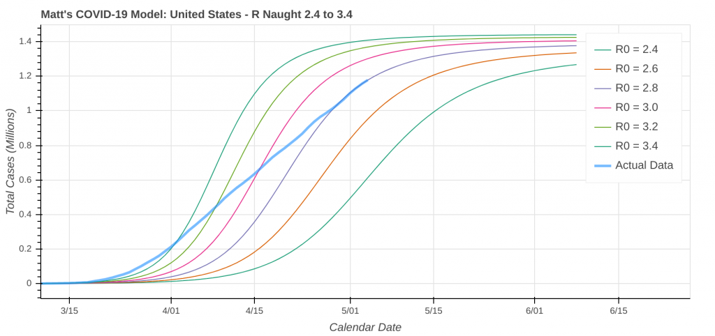
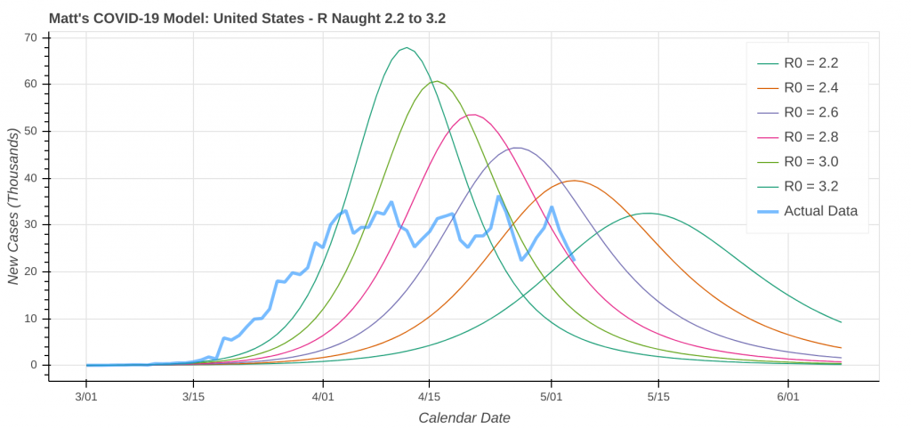
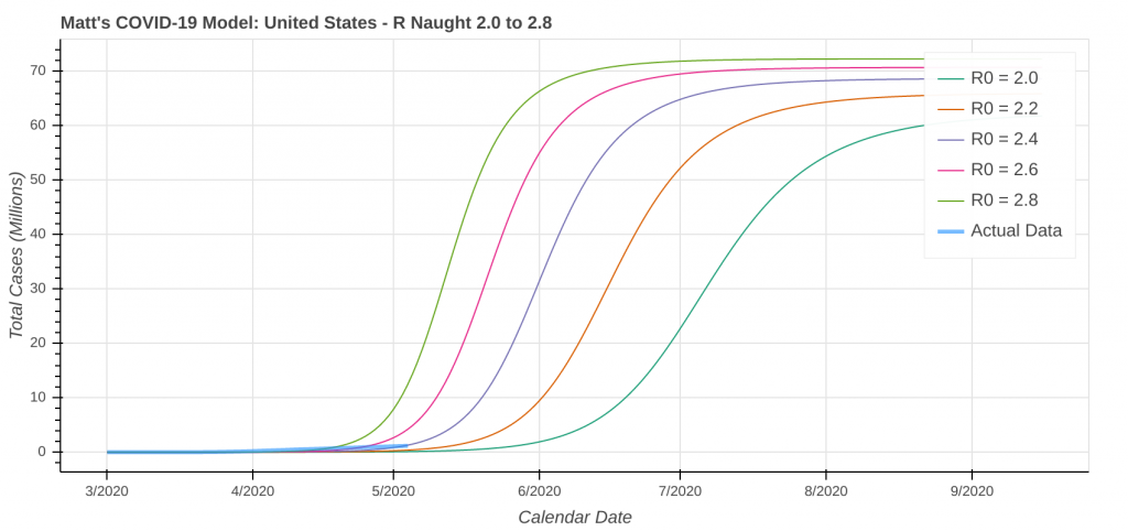
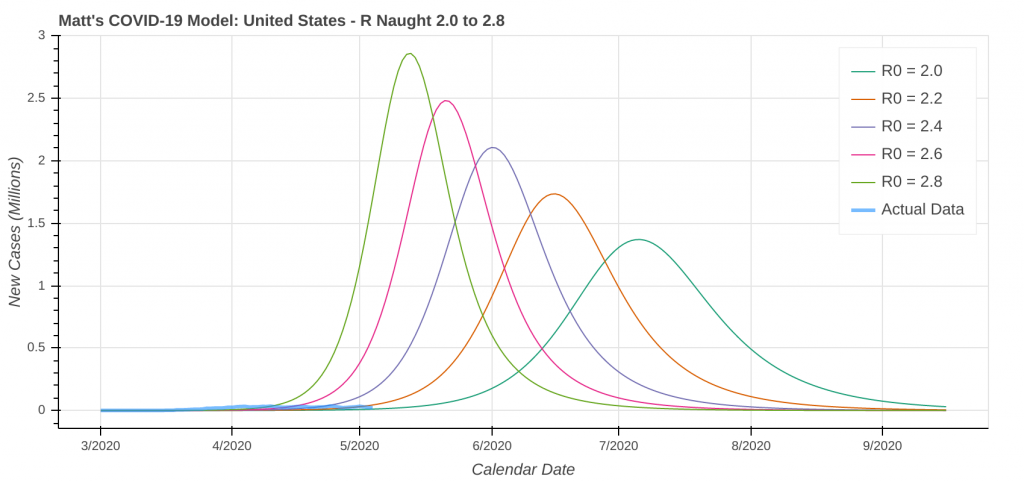
It turns out that two possible “best fit” scenarios exist when you apply this “best fitting” methodology to COVID-19. I’ll call them Scenario 1 and Scenario 2. You can see them below in model forecasts for the United States.
- The thick blue line is the actual COVID-19 case data, and the multi-colored thin lines are the model projections.
- The top plot in each scenario shows the total or cumulative case counts.
- The bottom plot in each scenario shows the new cases reported each day.
Scenario 1
Scenario 2
So what causes the drastic swings in projected cases and deaths? It’s simply the model flipping from Scenario 1 to Scenario 2 and vice-versa. Even the simple model I have been running has flip-flopped between the two scenarios. Here’s what happened with my model. The same thing likely happened with the model that’s been in the headlines.
How Models Switch Between Scenarios
- At the beginning of the outbreak, the model has very little data to work with, so you assume the worst-case scenario (Scenario 2). Remember, hope for the best, but prepare for the worst. People are always much more receptive to natural disaster projections when a worst-case scenario improves, as opposed to the other way around.
- As governments implement social distancing restrictions, such as bans on large gatherings, business closures, and stay-at-home orders, the model interprets the resulting “flattening of the curve” as approaching the top of the total cases (top plot in each above scenario) curve, regardless of whether or not you are actually leveling off. As a result, it flips to Scenario 1. Projected case and death counts plummet overnight.
- At some point, you’ll hit a “floor”, where you can’t flatten the curve any more, and the curve will resume its natural trajectory, albeit at a lower transmission rate. Once that floor is reached, one of two things will happen:
- If you are actually at the top of the total cases curve, the total case count will stay flat and the model will stick with Scenario 1.
- If you haven’t reached the top of the total cases curve, the increase in case counts will start to accelerate again once you hit that “floor.” That increase accelerates even further as states begin to reopen. If that rate of increase increase is high enough or a significant percentage of the population is still susceptible to the virus, the model will flip back to Scenario 2, causing projected case and death counts to soar very rapidly.
A Timeline of Coronavirus Model Flip-Flops
So how do the numbers work out? The model that’s been in the news has projected death totals for the entire United States by early August. The timeline of its projections is as follows.
- Late March: Projected 100,000 to 240,000 deaths. Most Stay-at-Home orders were issued during this time frame.
- Mid-April: The model flips to Scenario 1 and projected deaths quickly plummet to 60,000. This is also the same time frame where the model can start detecting the curve flattening due to the Stay-at-Home orders in the data.
- Late April: Many states begin to loosen social distancing restrictions and start reopening their economies.
- May 4: The model flips back to Scenario 2, and projected deaths rapidly jump to 135,000.
So can we look at some real-world model outputs showing Scenario 1 states versus Scenario 2 states? You bet. The below images are from this morning’s run of my model. Keep in mind that a state being in one scenario today does not necessarily mean it won’t flip over to the other scenario in the next model run. Click on any image to enlarge it.
Scenario 1 States
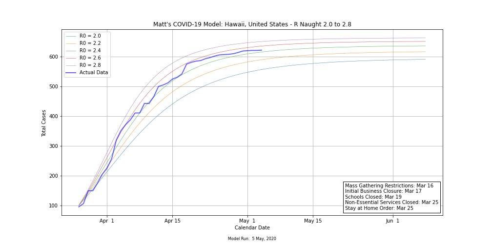
Hawaii 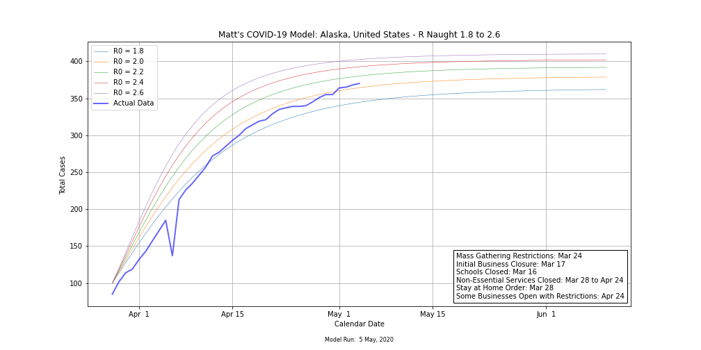
Alaska 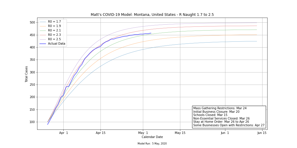
Montana 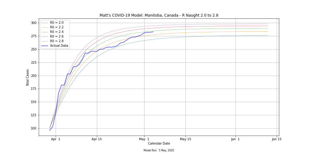
Manitoba, Canada
States That Showed Signs Of Leveling Off, But Flipped Back to Scenario 2
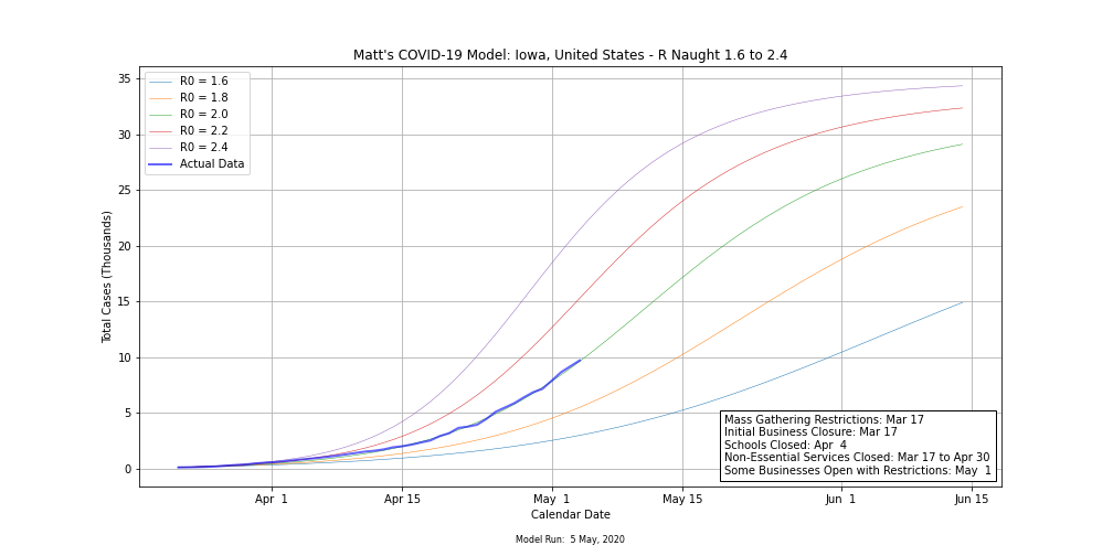
Iowa 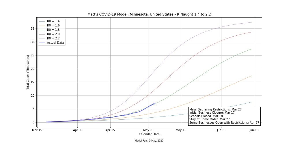
Minnesota 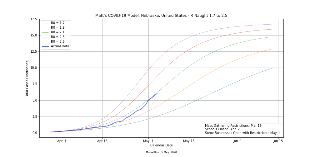
Nebraska 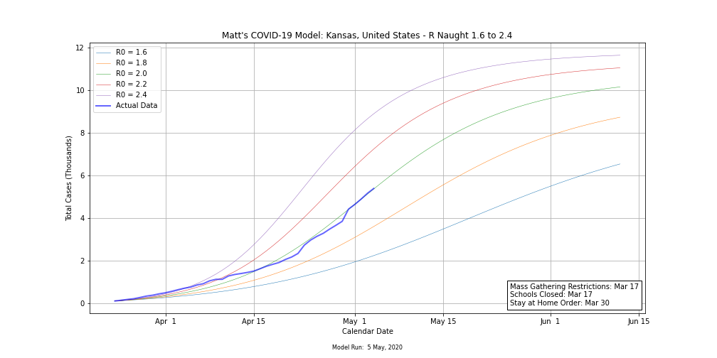
Kansas
So what can we take out of this? Don’t pin your hopes and expectations on just one model because models are wrong way more often than they’re right. There is a reason hurricane forecasters use spaghetti plots. To be able to confidently make any kind of predictions from models, you need to look at multiple models. If the models are in agreement and are stable from run to run, you will have much more confidence in your prediction than if they are all over the place and swing wildly from run to run, which is what we’re currently seeing with COVID-19.
I expect with so much uncertainty of what will happen as states reopen, model runs will be all over the place over at least the next two to three weeks. What does that mean as far as what will actually happen? Only time will tell. I’m certainly rooting for Scenario 1.
Top Photo: Lava Flows at El Pinacate Biosphere Reserve – Los Norteños, Sonora, Mexico – July, 2017