Tip: Check out my COVID-19 model predictions and performance on my COVID-19 Dashboard.
You can ask anyone I know, and they’ll all tell you the exact same thing: I know very little about anything that has to do with the medical field and absolutely nothing about epidemiology and disease. So how did I build a COVID-19 model that averaged getting 70-90% of its predictions correct on its May and June runs? Amazingly, I used my knowledge of meteorology to do it.
Now, I know your next question. Doctors and disease experts are constantly being criticized that their models are not accurate. How does an average Joe such as yourself get as much as 90% of your predictions correct on a single run? My response is quite simple: the models that have been under scrutiny project too far out into the future to have any kind of reliable accuracy. Those models make predictions 4 to 6 months into the future, while my model only forecasts 2 weeks and 1 month out. I’ll elaborate on this in a bit.
Before we dive in, it is long been my philosophy that modelers should stand by their model’s projections and take responsibility for them. That said, please hold me accountable for my model’s performance, which you can find on my COVID-19 Dashboard. If it stinks, please don’t hesitate to call me out on it.
1. I may not know anything about epidemiology, but I know a lot about mathematical modeling, especially in the context of meteorology.
While completing my Bachelor’s degree in math and physics, I developed a passion for numerical modeling. In classes and projects, I modeled everything from Hopf Bifurcations to Lorenz Systems to Fractals. For one of my senior seminars, I presented the efficacy of various weather models’ predictions of Hurricane Katrina.

By the time I arrived at the University of Oklahoma to continue my education in meteorology, I knew I wanted to study meteorological models extensively. During my time at OU, I worked with some of the most widely-used weather models, including the Global Forecast System (GFS), North American Mesoscale (NAM), Rapid Refresh (RAP), European Centre for Medium-Range Weather Forecasts (ECMWF), and the High Resolution Rapid Refresh (HRRR).
That knowledge forms the foundation of my COVID model. We usually don’t associate meteorology with epidemiology and disease, but it turns out that in the context of a pandemic, there is one very common thread that runs through both fields.
2. All outbreaks behave the same way, regardless if it’s a tornado outbreak or an outbreak of disease.
Back in March, we looked at modeling different types of outbreaks using Gaussian Functions, or bell curves. Remember that, in general terms, outbreaks tend to go through three phases:
- Some kind of trigger kicks off the initial case of the outbreak, causing initial growth to accelerate rapidly, often exponentially.
- The outbreak will at some point hit a ceiling or peak, causing new cases to level off and begin to decline.
- Cases will decline until they run out of fuel, at which point they will cease.

Example #1: A Tornado Outbreak
For example, the phases for a tornado outbreak would be:
- Peak heating in the afternoon maximizes extreme instability in the atmosphere. Storms begin to fire along the dryline, and rapidly grow in count and intensity.
- As the sun goes down, instability decreases, weakening existing storms and making it more difficult for new storms to form.
- As the evening cools, instability drops rapidly. While it may not drop to zero, it drops low enough to prevent new storms from forming. With their fuel supply cut off, any remaining storms eventually fizzle out, ending the outbreak.
Example #2: An Outbreak of Disease
Likewise, the phases for an outbreak of disease are:
- A new highly contagious disease starts rapidly spreading through the vulnerable population, often undetected at first.
- People begin taking precautions to protect against the spread of the disease, which slows the exponential spread. In extreme cases, the government may implement restrictions such as bans on large gatherings, business closures, mask mandates, and lockdowns.
- To end the outbreak, one of two things happens
- The virus can’t spread fast enough to maintain itself and fizzles out on its own.
- The population gains immunity, either through a vaccine or through herd immunity.
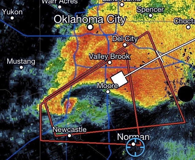
You’ve probably heard people on TV talking about multiple waves of COVID-19. It turns out that all types of outbreaks can have multiple waves. One of the worst multi-wave tornado outbreaks I witnessed occurred from 18 to 21 May, 2013. You can think of each day as an individual wave of the outbreak. In total, 67 tornadoes were confirmed across four days in the southern Great Plains, including the horrific EF-5 that struck Moore, Oklahoma on 20 May.

3. Keep how far in the future you’re forecasting to a minimum
The Global Forecast System, or GFS, is an American weather model that is the base of almost every forecast in North America. It makes worldwide projections in 6-hour time blocks up to 16 days in the future. While the model is well-known for its very accurate forecasts less than 5 days into the future, it’s shocking how quickly that accuracy drops once you get beyond 5 days. Do you know how many of its forecasts are correct 10 days away? Less than 10% of them. And if you go out to the full 16 days? Forget about it.
This phenomenon is observed in all models, including our COVID-19 model. Any guesses as to why it happens? When you break any model down to its nuts and bolts, every calculation a model makes is essentially an approximation, no matter how fine the resolution is. Small errors are introduced in every calculation, which are then passed to the next calculation. Repeat the process enough times, and the errors can get big enough to send model predictions off course.
Using Weather Models as a Basis for our COVID-19 Model
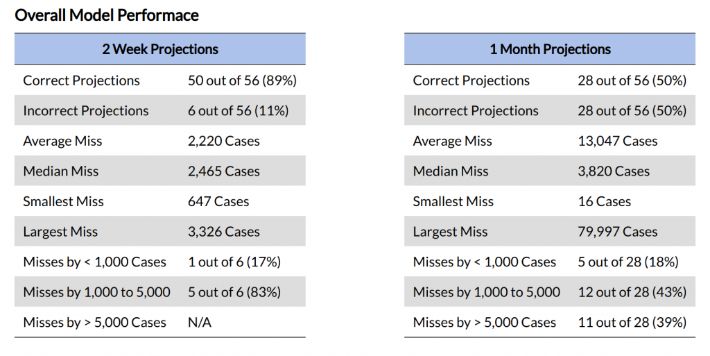
I used the GFS’s 5-day accuracy threshold as a basis for our COVID-19 model. The question seems simple: How far out is the threshold where COVID-19 predictions start to rapidly decline in accuracy? After some trial and error, I discovered that our COVID-19 model could hold its accuracy up to about 2 weeks out. I decided that the model would make the following predictions.
- 2-Week Projection
- Goal: 65% correct rate, with 80% of incorrect projections missing by 5,000 cases or less
- 1-Month Projection
- Goal: 50% correct rate, with 50% of incorrect projections missing by 5,000 cases or less
So how has the model performed? While it performed well above expectations in May and June, here is how it’s done overall.
| Time Period | Correct 2 Week Projections | Correct 1 Month Projections |
|---|---|---|
| May and June | 75 – 90% | 35 – 50% |
| Entire Pandemic | 65 – 85% | 30 – 45% |
So why have other COVID-19 models been criticized for being wrong so often? They simply have been trying to make projections too far into the future. Many of the models cited by the media, as well as federal, state, and local governments are trying to make forecasts up to 4 to 6 months into the future. Look at the drop in accuracy in my model just going from 2 weeks to 1 month. How well do you think that’s going to work going out 4 months?
4. Past performance is the best indicator of future behavior.
You hear this said all the time on both fictional and true crime shows on TV. Investigators use this technique to profile and catch up to criminals when they’re a step behind.
It’s no different in terms of COVID-19 modeling. In fact, you can actually use it on two fronts. First, let’s look at human behavior. Remember the protests to the stay-at-home orders across the United States back in April? That was the writing on the wall for the current explosion of cases throughout the US. We just didn’t see it that way at the time.
As expected, the minute the stay-at-home orders were lifted, too many people went back to their “pre-pandemic” routine, and the rest is history. I have yet to meet anyone who doesn’t want to get back to normal, but there’s a right way and a wrong way to do it. The European Union, Australia, and New Zealand all did it right. The US, well, not so much.
Fitting the Curve of Our COVID-19 Model
On the mathematical front, implementing “past performance is the best indicator of future behavior” is as simple as best-fitting the actual data to the model data. To do that, I wrote a simple algorithm:
- Using a piece-wise numerical integration, best-fit each day’s worth of actual data to the model’s two inputs: the R Naught value and the percent of population expected to be infected at the end of the pandemic.
- Using the most recent 10 days best fit parameters, calculate the weighted average of those best-fit parameters to get a single value for each parameter that is input into the model. The most recent days are given the strongest weight in the calculation.
Is the best fit method perfect? No, but it works pretty darn well, especially in the short term. Best of all, it eliminates the need to make assumptions about extra parameters (a model is only as good as the assumptions it makes), which leads right to my next point.
5. K.I.S.S. – Keep It Simple, Stupid
I live by this motto. In the context of mathematical modeling, complexity is very much a double-edged sword. On one hand, if you can add complexity and at the same time get all of your assumptions and calculations right, you can greatly improve the accuracy of the model’s projections.
On the other hand, every additional piece of complexity you add to the model increases, often greatly, the risk of the model’s forecasts careening off course. Remember what I said earlier that every calculation the model makes adds to the potential for small errors to be introduced, and many small errors added together equal one big error. Every piece of complexity adds at least one additional calculation, and thus adds additional risk of sending the model’s predictions awry.
So just how much complexity is in our COVID-19 model?
6. Break the outbreak down into its nuts and bolts to better understand the mathematics.
Our COVID-19 model consists of a system of three differential equations. Come on, you can’t be serious? Yup, three pretty simple equations are all that make up the model. And you know what? Those three equations drive a lot of other COVID-19 models, too. Those three base equations make up the Susceptible – Infected – Removed, or SIR, model, and are defined as:
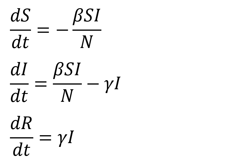
In laymen’s terms, these equations mean:
dS/dt: The Change in Susceptible People over Time
dS/dt models interactions between susceptible and infected people, and calculates the number of transmissions of the virus based on its transmission rate. It states that for every unit time, the susceptible population decreases by the number of susceptible people who become infected.
dI/dt: The Change in the Number of Infected Individuals over Time
dI/dt calculates the infection rate per unit time by subtracting the number of people who either recover or die from the number of susceptible people who became infected during that time period.
If the outbreak is accelerating, the number of new infections will be greater than the number of people who recover or die, so dI/dt will be positive, and the rate of infection will grow.
If the outbreak is waning, the number of new infections will be less than the number of people who recover or die, so dI/dt will be negative and the rate of infection will decline.
dR/dt: The Change in the Number of People Who Have Recovered or Died over Time
dR/dt calculates the change in the number of people who are removed from the pool of susceptible and infected population. In other words, it means they have either recovered or died. The calculation simply multiplies the recovery rate by the number of infected people.
To calculate how many people have died from the disease, simply multiply the number of “removed” population by the death rate.
The model uses Python’s Scipy package to solve the system of ordinary differential equations.
7. As uncertainty in a prediction increases, the model output must respond accordingly.
While it may not be obvious, the output of all forecasts is the expected range in which the model thinks the actual value will fall. In terms of weather forecasting, you’ve probably heard meteorologists say things like:
- Today’s high will be in the upper 70’s to low 80’s
- Winds will be out of the south at 10 to 15 mph
- There’s a 30% chance of rain this afternoon
So why do models output a range of values? There’s actually two reasons.
Reason #1: It accounts for small deviations or errors in the actual value.
Let’s consider two hypothetical wind forecasts. One says winds will be out of the southwest at 12 mph. The other says winds will be out of the southwest at 10 to 15 mph. These forecasts wouldn’t be a second thought for most people. Now, what happens when it blows 13 mph instead of 12? The first forecast is wrong, but the second one is still right. While this may not seem like a big deal in day-to-day weather forecasting, it can be the difference between life and death when you’re modeling, planning for, and responding to extreme events like natural disasters and pandemics.
Reason #2: The model will have a high likelihood of being correct even when uncertainty is high.
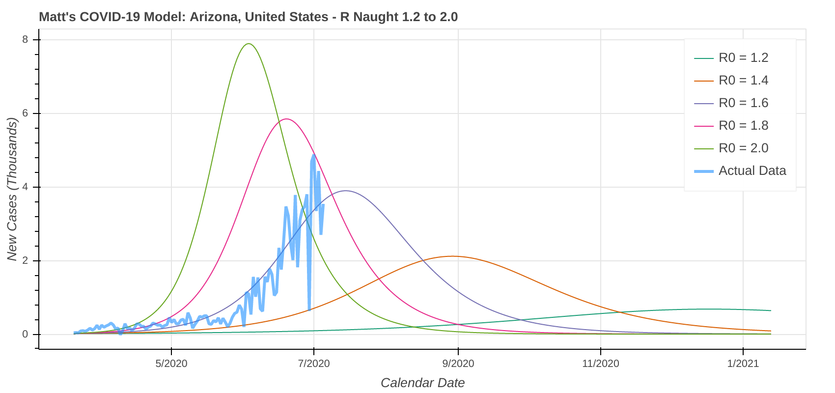
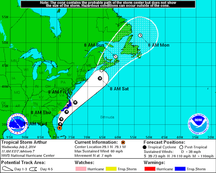
As I mentioned earlier, uncertainty gets larger the further out in time a model makes predictions. How do we counteract that increase in uncertainty? By simply making the range larger. There is no better real-world example of this than the “Cone of Uncertainty” that is used to forecast the track of a hurricane.
In the example hurricane forecast below, take note of how the Cone of Uncertainty starts off narrow and then gets wider as you get further out in time because uncertainty increases.
Defining a Cone of Uncertainty for Our COVID-19 Model
Now, let’s look at how this translates into COVID-19 modeling. We’ll have a look at two states: one where cases are spiking and one where cases are stable. Take a second and think about what uncertainties might be introduced to each scenario and which plot you would expect to show higher uncertainty.
Here are a few uncertainties I though up that might impact the scenario where cases are spiking:
- Will the government implement any restrictions or mandates, such as bans on large gatherings, business closures, or lockdowns to help slow the spread?
- When will these restrictions be implemented?
- Even in the absence of government action, does the general public take extra precautions, such as wearing masks and not going out as much, to protect themselves against the rapid spread of the virus? When does this start happening? How much of it is happening already?
A Graphical Look at Our COVID-19 Model’s Cone of Uncertainty
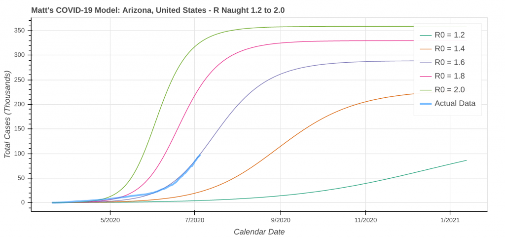
You can probably see that once you start thinking about these, it snowballs really quickly. As a result, you see huge uncertainties in COVID-19 model forecasts for states where cases are spiking, such as Florida, Texas, and Arizona, while you see much less uncertainty in states where COVID-19 has stabilized.
Let’s compare COVID-19 uncertainties for Florida, which is averaging close to 10,000 new cases per day right now, to New York, which was hit viciously hard back in March and April, but has since stabilized. The plots are from yesterday’s model run. Take note of how closer together the model output lines are on the New York plot than the Florida plot because of the lower uncertainties in the projections for New York.
Florida 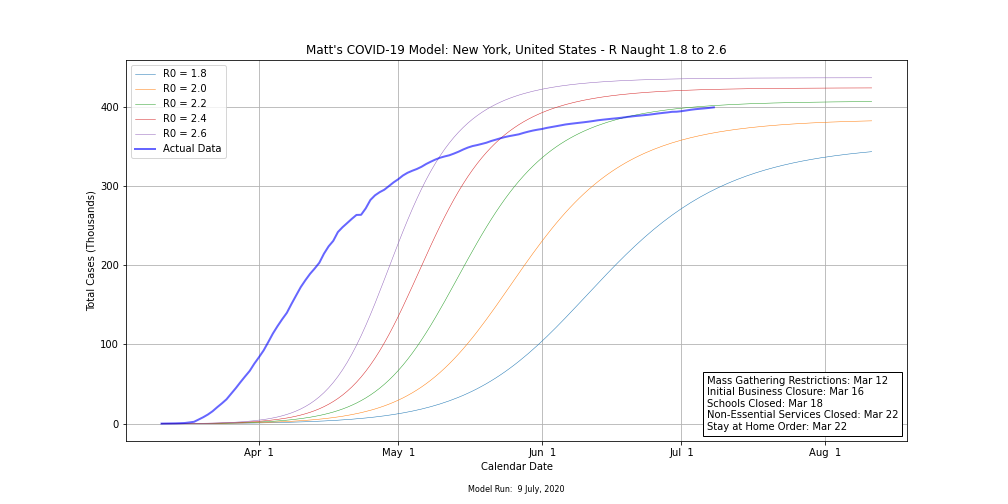
New York
Here are the same projections from yesterday’s model run in table form. Note the difference in the size of each range between the two states.
| State | Fcst. Apex Date | Fcst Cases 23 July | Fcst Cases 9 August |
|---|---|---|---|
| Florida | Jul 10 to Oct 8 | 224,000 to 1,113,000 | 224,000 to 1,515,000 |
| New York | May 13 to Jun 2 | 399,000 to 423,000 | 399,000 to 437,000 |
Conclusion
A mathematical modeler has a vast array of tools and tricks at their disposal. Like a carpenter, he or she must know when, where, and how to use each tool. When properly implemented, model outputs can account for high levels of uncertainty and still be correct in their projections. Just don’t take it too far. You don’t want to lose credibility, either.
Top Photo: The sparkling azure waters of the Sea of Cortez provide a stunning backdrop to the Malecón
Puerto Peñasco, Sonora, Mexico – August, 2019