At first glance, a road trip across the United States during the COVID-19 pandemic doesn’t seem like the smartest idea in the world. With so many restrictions in place and experts constantly telling you not to travel, you start to wonder if it’s even possible to pull off such a trip. With the help of a few COVID-19 models, I was able to make it safely across the country.
The most ironic part of it all is that COVID-19 itself was what forced me to make this trip. COVID-19 had cut me off from my family on the east coast for over a year and a half. It left me essentially stranded on an island all by myself. Add on top of that all of the violent politically-motivated threats I had been receiving doing mundane tasks such as getting the mail and buying groceries and the choice became painfully obvious.
I based my travel rules and strategy off of my road trip to visit relatives in Oregon last summer. You can read the full list of travel protocols here, but the primary rules include:
- Self-isolate for two weeks prior to departing
- Do not enter any public buildings
- Do not stop for anything other than quick fuel and bathroom breaks
- Wear N-95 masks whenever you’re outside the truck
- No foreign objects are to enter the truck cab
For pandemic travel, a summer road trip from Arizona to Oregon was one thing. A cross-country odyssey in the middle of winter ratcheted up the complexity exponentially. And that’s before taking into account the US averaging nearly 250,000 new cases per day just a few weeks prior to departing.
Where Do You Get Your COVID-19 Data From?
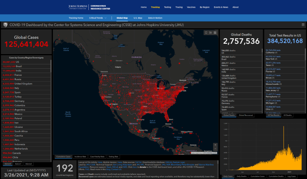
I get all of my data from John’s Hopkins University. In addition to their COVID-19 dashboard, John’s Hopkins also publishes their data repository publicly on GitHub.
Moving the COVID-19 Data into a Database
The John’s Hopkins data repository consists of a collection of Comma Separated Values files. CSV files work fine for archiving data, but are unwieldy if you want to make any calculations with said data. Don’t even think about scaling up as the pandemic progresses. Larger CSV files will quickly bloat and bog down even the most efficient code that tries to parse and analyze them.
The easiest solution is to put the data into a database. In addition to being faster, you can also make complex queries from a database. That’s simply not an option with a CSV file without complex coding. Our COVID-19 dashboard, model, and Python scripts can all connect to the database for easy analysis of that data.
Automate the Data Entry Process
Our COVID-19 database currently has over 1.4 million rows of data from countries, states, territories, and counties. Because the database is updated daily, any manual data entry is beyond a Herculean effort. We use Python and Bash script to enter the data. The automated scripts update the database in only a couple of minutes.
- Download the latest data from the John’s Hopkins COVID-19 GitHub repository.
- Back up the database so it can easily be restored if something goes wrong.
- Call a Python script that parses the CSV file and adds the data to the database.
- Export the updated database and upload it to our COVID-19 dashboard.
Adding Geographic Data
Because so many of our applications use geographic or location data, we have a centralized database of geographic data. That geodatabase contains data about countries, states/provinces, cities, and much more around the world.
For each entity, the Python script looks up its primary key in the geodatabase and adds it to the COVID-19 database. The entity names are not stored in the COVID-19 database. You can also use the ISO codes, such as “us”, “mx”, and “fr”, to link to the geodatabase.
How Do You Display the COVID-19 Data?
When the COVID-19 outbreak first started in January, 2020, the Johns Hopkins dashboard was the only resource available. However, I found their map increasingly difficult to read as the pandemic rapidly spread across the globe. By the end of March, I had launched my own COVID-19 dashboard. It’s come a long way in the past year. The COVID-19 dataset now includes state data in 17 countries, and data for all territories around the world.
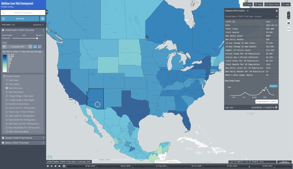
The Matthew Gove Web Development map also comes with a timeline so you see how the pandemic has progressed over time. You can only view the most recent data on the John’s Hopkins site.
How Do You Put COVID-19 Data to Work to Stay Safe on the Road?
I planned my route the same way you choose a target area when you go storm chasing. The strategy for storm chasing is pleasantly simple.
- Consider several parameters that tell you where storms are going to form.
- Look for trends in those parameters in both the actual data and model predictions.
- Determine when those parameters will all be in place and maximized simultaneously.
- Go to the location at the time the parameters show the greatest likelihood of storms.
Obviously, when dealing with a once-in-a-century pandemic, your goal is to figure out where the parameters will all be minimized. You want to be passing areas where you are least likely to contract COVID-19.
What Parameters Do You Use to Evaluate COVID-19 Risk Level?
While I initially considered as many parameters as possible there are four that I most heavily rely on. You can look at these at the country, state, and county level.
- Daily New Cases
- 14-Day Trend in Daily New Cases
- Odds any One Person is Infected
- Number of Active Cases
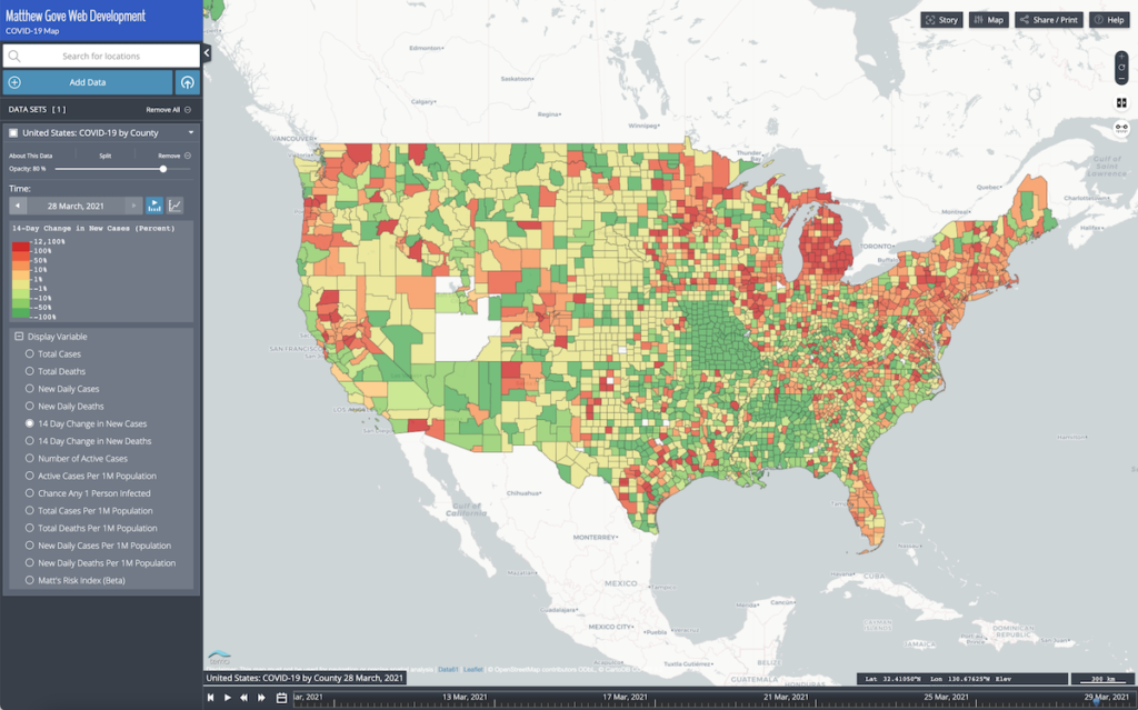
It is easy to analyze each parameter on the COVID-19 dashboard map. Unfortunately, my COVID-19 model cannot output forecasts for all four of the above parameters. Sure, you can update the model, but why not find a much easier way that uses the existing model.
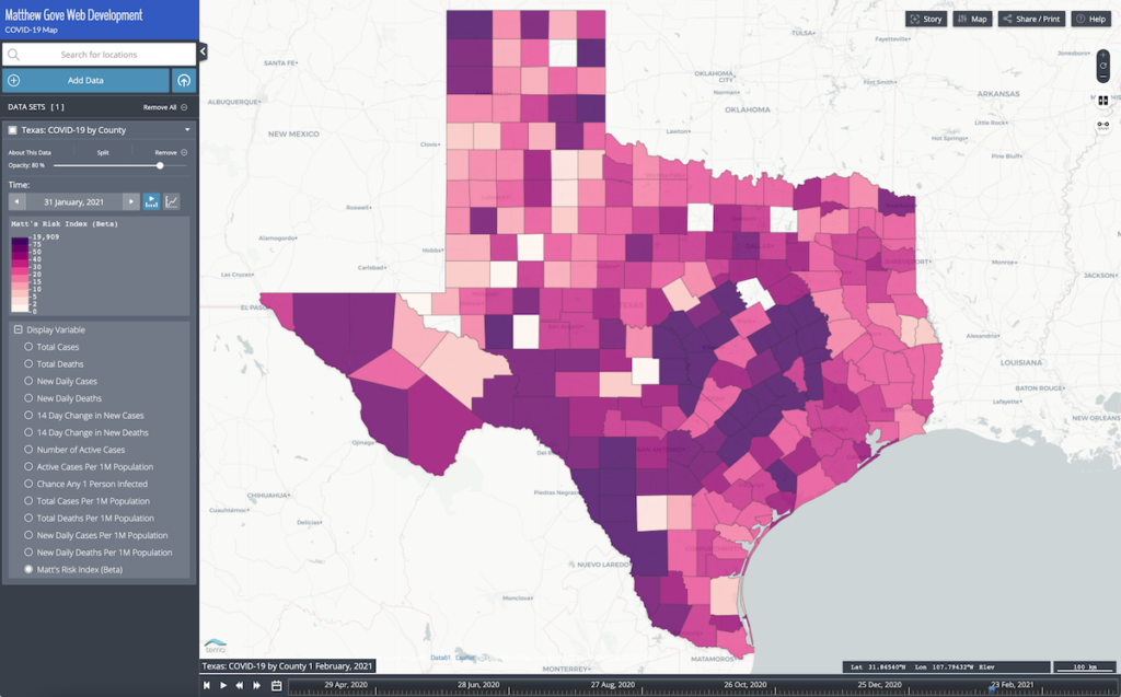
Enter Matt’s Risk Index
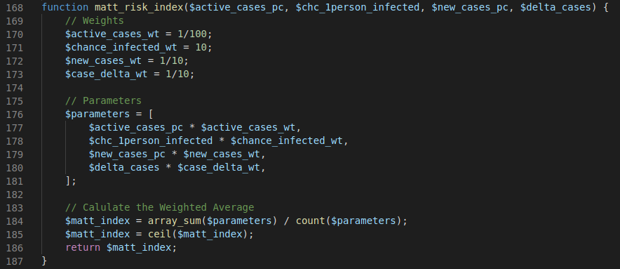
Instead of updating the model output, let’s instead combine those four parameters into a simple index that the existing model can easily predict. The best way to combine the parameters is to use a weighted average. We’ll use normalized per capita data so the risk can be calculated at any level, including country, state, and county. Let’s start with a base equation for the risk index.

Next, we need to figure out what our weights will be. Not surprisingly, there’s an easy way and a hard way to do it. You could simply use trial and error to see what works. However, that is no different than just taking a wild guess and seeing what sticks.
Instead, we’ll break it into a logical two-step process to get much more precise scaling factors. First, we’ll scale the parameters so they’re all the same order of magnitude. This prevents the issue of 5,000 new daily cases having far more weight than a 1% someone is infected.

Next, all you have to do is determine how much weight you want to give each parameter. Then just multiply the two scaling factors together. When it was all said and done, I was left with the following equation to calculate the risk index. To keep the math simple, I rounded each scaling factor down to the nearest factor of 10n.

Finally, the risk index is rounded up to the nearest whole number before being output. It’s as simple as that
Modeling: The Holy Grail of COVID-19 Safety
As the world shut down and business ground to a halt just about a year ago, it piqued both my passion for mathematical modeling and my interest in the so many unknowns at the time. I decided to use the spare time to build my own COVID-19 model. The model runs in a Jupyter Notebook (Python), and the code is publicly available for download on my COVID-19 dashboard.
The Susceptible – Infected – Removed Model
Like so many COVID-19 models out there, mine is built on the foundation of the Susceptible – Infected – Removed, or SIR model. The SIR model uses a system of three differential equations to forecast how an infectious disease spreads through a population over time. If you want more details, we covered the mathematics and design of the SIR model in detail both last April and last March.
My COVID-19 model uses several parameters to make its predictions.
| Data Parameter | Source |
|---|---|
| Date of 100th Case | COVID-19 Database |
| Population | Master Geodatabase |
| R Naught | Best-Fit Line or User Input |
| Percent of Population Infected by the End of the Pandemic | Best-Fit Line or User Input |
My model pulls city, state, and country names from the master geodatabase. It also gives you the option to enter all four parameters manually for a completely customized scenario.
Assumptions
Every model is only as good as the assumptions it makes. I know I sound like broken record saying this, but it’s critically important. When you create a mathematical model, you want to minimize the number of assumptions it makes. The more assumptions you make, the less accurate your model will be. The SIR model is no different in the assumptions that it makes.
- R Naught is constant throughout the duration of the pandemic
- You can run the SIR model in piecewise chunks to approximate changes in R Naught values over time
- The population is evenly distributed throughout the entity being modeled.
- As a result, the SIR model is much more accurate modeling small entities such as counties and cities.
Aside: What’s a Piecewise Analysis
A piecewise analysis has different expressions and parameters depending on where on the x-axis it’s being evaluated. In the case of COVID-19 models, those parameters vary over time.
Matt’s Risk Index Changes the Modeling Game
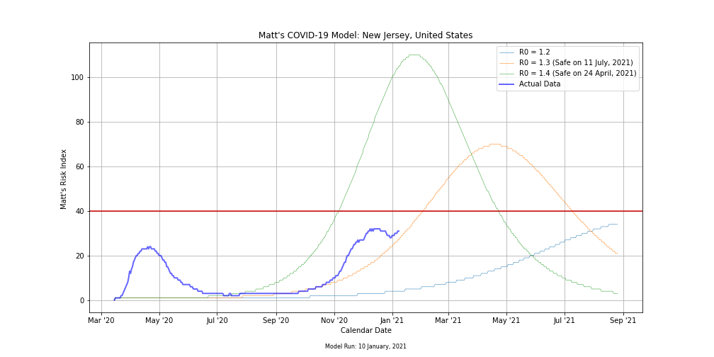
Combining our 4 key parameters into one index that can be displayed on a single map or figure is significant. I designed the risk index primarily for this trip, specifically with modeling in mind. In addition to the predicted levels of risk index, the model also outputs the exact date the risk level crosses the danger threshold in either direction. Being able to model down as far as the county level and know exactly when it would be safe to travel really put a lot of worries to rest.
Limitations of the Model
Because of the simplicity of the SIR model, it can only model one wave or surge of COVID-19 at a time. Interestingly, I found that as long as you fit the model’s output curve to the current or most recent surge, it does not matter how poor a fit any previous surges are. The model’s predictions will be the same. Therefore, you don’t have to add the complexity of breaking the pandemic into chunks, fitting each wave individually, and stitching them back together in a piece wise analysis.
Unfortunately, it also means that the model cannot predict any future surges until they begin. Again, you can use a piece wise method to predict additional waves. But don’t forget that models rapidly lose their accuracy the further into the future you run them. I decided That my model would be both much simpler and much more accurate focusing on short-term predictions. We won’t worry about any future COVID-19 surges until we’re done with the current one.
You Must Consider Other Models to Make the Most Accurate Predictions
Because each model makes different assumptions and has different limitations, you can get around any road blocks by looking at multiple models. This is the exact strategy weather forecasters use.
Consider the following scenario. Its the fall of 2012 and a new hurricane named Sandy just formed in the Caribbean. You’re in charge of issuing warnings and evacuation orders based on the model predictions.
As Hurricane Sandy clears the Bahamas and the Turks and Caicos islands in the northern Caribbean, you turn your attention to the east coast of the United States. You’re only looking at one model to make your decisions. It’s a well-known model that is trusted throughout the meteorological community.
This model shows Hurricane Sandy running parallel to the coast of Florida, Georgia, and the Carolinas, staying far enough offshore to not cause any major disruptions. Once Sandy gets north of Cape Hatteras, the model shows it making a gentle turn to the northeast, and passing harmlessly out to sea between Bermuda and New England. Because you’re only looking at this one model, you decline to issue any warnings or evacuations on the east coast. By the time Sandy makes its hard left turn and puts New Jersey in its crossbars, its too late to safely conduct an evacuation.
Amazingly, this scenario could have actually played out in real life. While every model out there showed Sandy making a hard left turn and slamming into New Jersey, there was one stubborn ensemble run of the GFS model that kept bringing the storm harmlessly out to sea. Thankfully, no professional weather forecasters are that incompetent. Officials issued warnings and evacuations long before Sandy arrived, and were able to get everyone out of harm’s way.
What Other COVID-19 Models Did You Use to Make Your Official Decision?
In addition to my own model, I also analyzed the following models in my official prediction.
- Institute for Health Metrics and Evaluation (IHME) model from the University of Washington
- Both the Trump and Biden Administrations, along with numerous medical experts and governors have referenced the IHME model extensively.
- The COVID-19 Simulator
- Run by a team of infectious disease doctors from Georgia Tech, Harvard Medical School, Massachusetts General Hospital, and the Boston University School of Medicine
How Did the Models Perform?
Before we dive into performance, let’s go back to last fall and revisit the official predictions we made based off of my model, the IHME model, and the COVID-19 Simulator. After a thorough analysis of the three models on 14 November, 2020, we made the following forecast.
The peak of the winter wave will occur around New Year’s Day (1 January, 2021)
There will be 320,000 to 400,000 new daily COVID-19 cases in the United States at the peak of the winter wave
By next spring, there will be 30 to 50 million total confirmed COVID-19 cases in the United States
Matt’s Official COVID-19 Forecast on 14 November, 2020, based on three models
So how did we do? I’ll let the results speak for themselves.
| Parameter | 14 Nov, 2020 Forecast | Actual Value (7-Day Avg) | Actual Value (Raw Data) |
|---|---|---|---|
| Peak Date | 1 January | 11 January | 2 January |
| Peak New Daily Cases | 320,000 to 400,000 | 256,663 | 299,087 |
| Total Cases by Spring | 30 to 50 million | N/A | 30.94 million on 31 March |
Thankfully, all three models remained largely in agreement throughout the winter, so I felt very confident in letting the models guide my decisions. The finer details of timing and route were tricky to nail down, but the models got it right in the end. I made it across the country safely without contracting COVID-19.
Up Next
To wrap up the series, we’ll look at lessons learned and observations made traversing a country that’s so bitterly divided and has lacked so much leadership throughout the course of this once-in-a-century pandemic. Make sure to come back next Friday at 9 AM Pacific Time. See you then.
Top Photo: Badwater Backcountry
Death Valley National Park, California – February, 2020