Custom, branded maps are one of the best ways you can stand out from your competition, especially in the world of travel and content creation. With so many people, groups, and organizations still relying on products like Google Maps, you’ll not only stand out from the crowd, but also come across as way more professional. And Adobe Illustrator makes it incredibly easy to create a custom map for your next video, presentation, or any other type of content.
Last time, you learned how to import GIS shapefiles into Adobe Illustrator. Today, you’re going to use those imported shapefiles to create a custom map in Adobe Illustrator.
Where We Left Off Last Time: Importing GIS Shapefiles into Adobe Illustrator
In the previous tutorial, we began the process of creating custom maps in Adobe Illustrator. That tutorial focused on importing GIS shapefiles into Adobe Illustrator, which consisted of several steps.
- Load several shapefiles into QGIS to create vector outlines
- Export those vector outlines from QGIS into SVG Format
- Import the SVG Map into Adobe Illustrator
- Scale and Position the Map to Fill our Illustrator workspace
What We’re Going to Learn Today: Finishing Your Custom Map in Adobe Illustrator
Today, we’re going to finish the process of creating a custom map in Adobe Illustrator. In this tutorial, you’ll learn how to do the following:
- Extract parts of the vector and sort them into layers
- Add titles, labels, and the background imagery
- Set up your map for animation
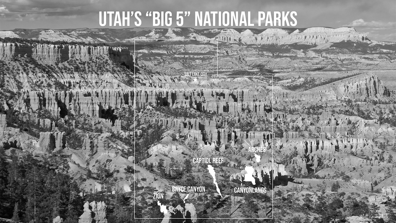
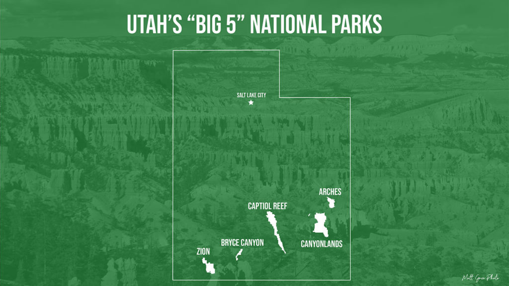
At the end of the day, you’ll wind up with a beautiful final map product that looks like this:

1. Extract Your Custom Map Features from the SVG File in Adobe Illustrator
To make it easier to manage your custom map assets in Adobe Illustrator, put each feature (or group of features) into their own layers. We covered this briefly in the previous tutorial, but I want to go over it in much more detail. First, let’s recall where we left off. We had just imported the SVG (vector image) file into Adobe Illustrator using File > Place.
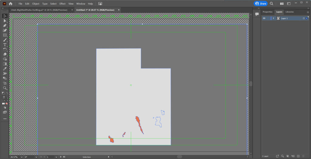
Before we do anything in Illustrator, make a list of the features you will be extracting from the SVG file. For the Utah National Parks, we want to extract the following:
- The Utah State Boundary
- Zion National Park Outline
- Bryce Canyon National Park Outline
- Capitol Reef National Park Outline
- Canyonlands National Park Outline
- Arches National Park Outline
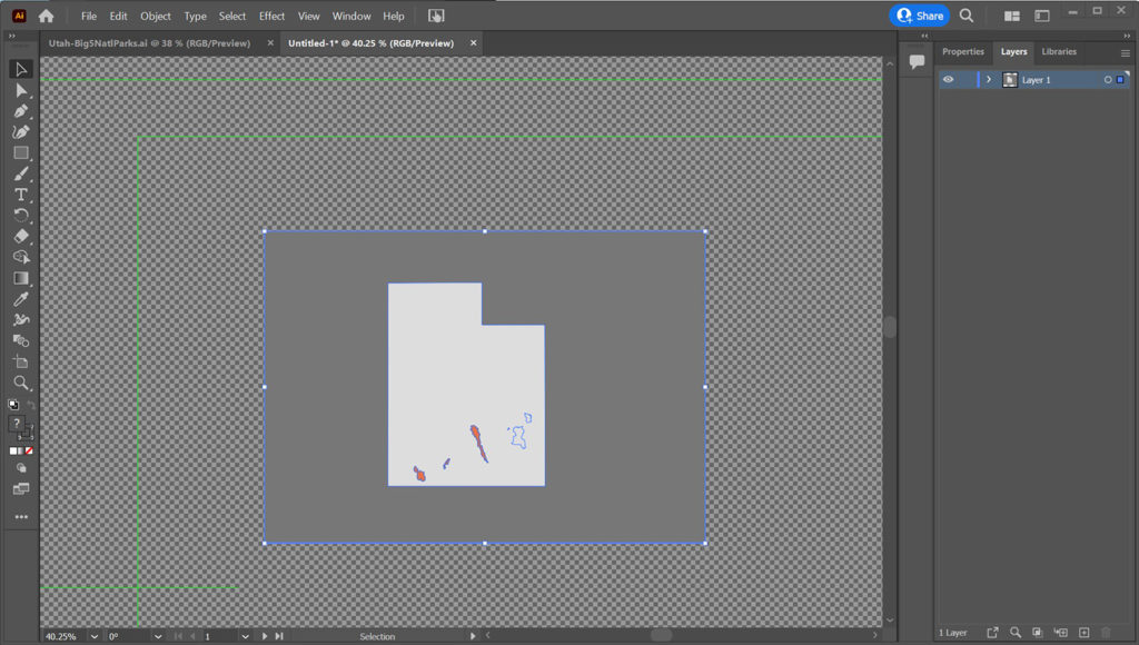
If it helps, you can also make a list of everything you want to exclude from the final map. For our map of the Utah National Parks, we only need to exclude the rectangle that bounds the SVG image, which is outlined in blue in the above screenshot. Don’t worry about colors at this point. We’ll address them shortly.
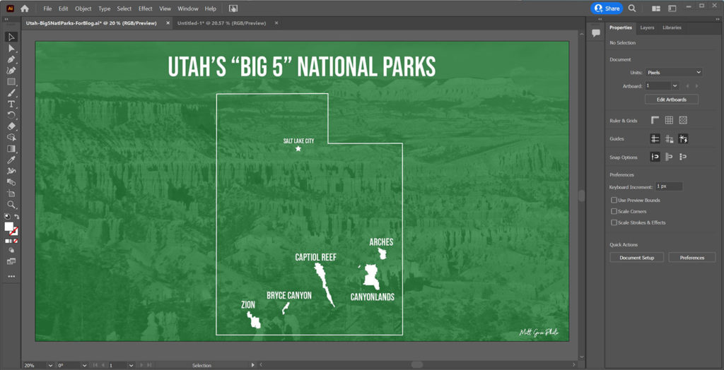
Scale and Position Your Custom Map in Adobe Illustrator Before Extracting Any Features
Before you extract any features from the imported SVG file, I highly recommend that you scale your custom map and move it into its final position on the Adobe Illustrator artboard. You can always make minor to its position and scale as you go. However, it’s much easier to do any major moving and scaling while it’s still just a single entity.
To scale the SVG file in Illustrator, simply grab any of the anchor points on the corner or side of the SVG file and drag it to its desired size. To prevent image distortion, hold the Shift key down as you scale it, which maintains the original aspect ratio.
The green rectangles in Illustrator mark the boundaries of your artboard, so scale it to fill as much of the artboard as possible. If you need to scale the SVG beyond the boundaries of the Adobe Illustrator, that’s perfectly fine. Illustrator will crop everything to fit the artboard when you go to export it.
Additionally, make sure that you leave room for any titles, subtitles, and labels you’ll be adding to the map later. You should also center the map horizontally in the frame. Your scaled and centered custom map of Utah should look something like this in Adobe Illustrator.
Extract Each Feature of Your Custom Map into Its Own Layer in Adobe Illustrator
On the initial extraction, you should put each feature into its own layer in Illustrator. We do this for two reasons.
- It best sets the map up for animation
- It’s much easier to merge multiple layers into one than it is to separate one layer in several.
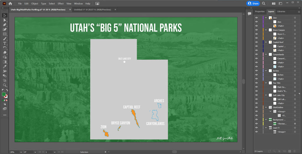
To begin your feature extraction, first open the Layers panel. Click on the carat to reveal the components of the SVG layer.
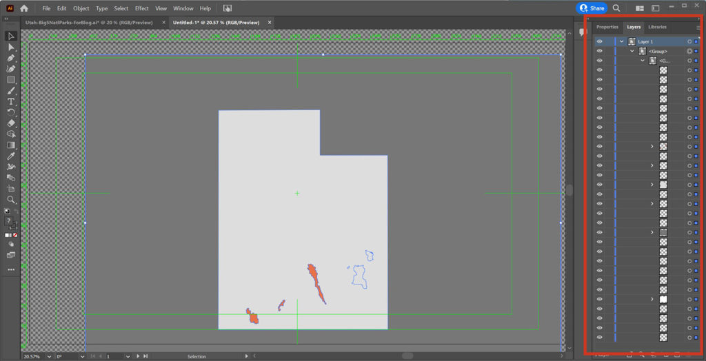
Despite there being so many components, the features you want to extract are only going to be in a small subset of those components. The easiest way to find your map features is to click on the eyeball next to each component in the layers panel. If your feature disappears from the map, that’s the component you need to extract.
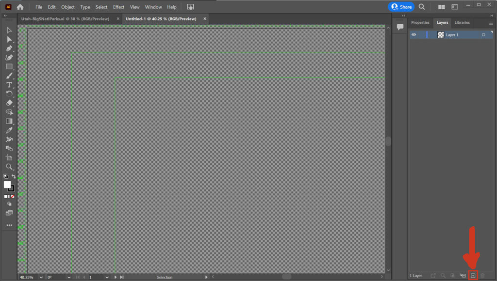
To extract the component you’ve identified, create a new layer to put it in. Don’t worry about the order of layers for now. The new layer button is in the bottom right corner of the main Adobe Illustrator window. Give it an easily identifiable name, such as “Zion Boundary” or “Canyonlands Outline”.
Click and drag the component from the original SVG file to the layer you just created. You should see the feature now listed under the new layer. Do note that your feature may be divided into several components in the SVG layer. In that case, drag each component of your feature to your new layer.
To confirm everything copied correctly, click the eyeball to show and hide your new layer. Your feature should disappear from and reappear on the map.
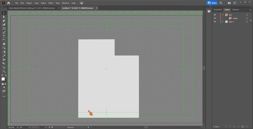
Finally, repeat the process for each feature you will be putting on your final map. Once everything is extracted into their own layers, you can hide or delete the original SVG layer. We will not be using it anymore.
A Note on Dealing with Complex Features
If you have a complex feature you are trying to extract or if two features you want on your map are combined into a single component of the SVG file, you can still extract them. Use Illustrator’s Eraser tool to delete any unwanted parts of the SVG components. You can separate multiple features from a single SVG component with Illustrator’s Direct Selection Tool. Please consult the Adobe Illustrator documentation for more details.
2. Add a Background Image
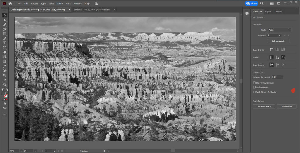
Next up, we’ll add the background image. In our Utah National Parks map, the background image is of the hoodoos at Bryce Canyon from my trip in 2017. Your background image should be a high enough resolution to fill the artboard of your Adobe Illustrator project. Remember that while Illustrator is a vector editing program, your images still consist of pixels. If you scale them up beyond their full resolution, they will become pixelated and grainy.
Before you add your background image, though, you will need to do a couple things. These are both optional, but I highly recommend doing them.
- Crop your image to match the aspect ratio of your artboard in Adobe Illustrator. For videos, that aspect ratio is 16:9. I do this mainly for my own sanity so I don’t accidentally put features outside of the artboard boundaries that will get clipped off.
- If you plan to use a background overlay that’s any color other than black or white, make your image black and white. Colored overlays can do wonky things to the colors of your image, often with undesirable results. If you’re using your own branding, black and white images help ensure that the map stays the recognizable colors of your brand.
Use Illustrator’s File > Place function to embed your background image into Illustrator. The features you imported in the previous step may disappear from view, but don’t worry. They’re just underneath the image. We’ll correct that shortly. Then, drag each corner of the image to the corners of your artboard to fill it.
3. Add a Background Overlay
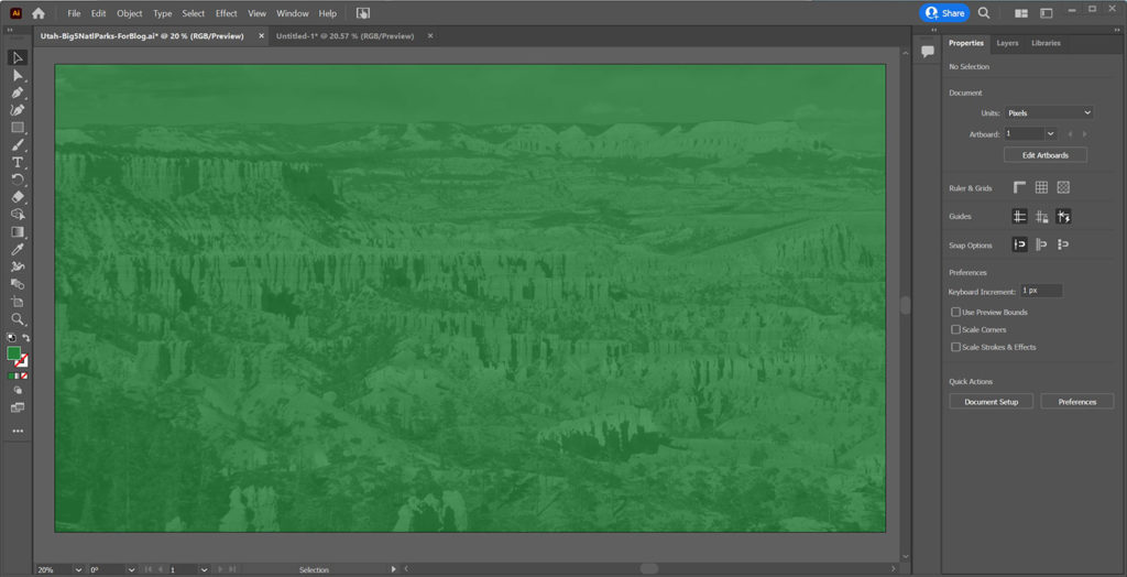
A background overlay is a solid color, semi-transparent overlay that goes on top of your background image. Its primary purpose is to make the content of your map easier to read. Not only does it increase the contrast, but it also makes the background image much more subtle. Remember, you want your viewers’ eyes to be drawn to the content, not to the background image.
Use the slider below to see the difference between having a background overlay vs having nothing. The difference in readability is night and day.

Background Overlay Setup in Adobe Illustrator
You should put the background overlay either in the same layer as your background image or in its own layer. The easiest way to add the background overlay is with Illustrator’s Rectangle Tool.
After creating the rectangle in Illustrator, drag the corners so the rectangle fills the artboard.
Background Overlay Color and Opacity
Your background overlay should never be anything besides a single color. It will be too distracting otherwise. If you want to use a secondary color, make the text and content of your map that color. Remember, color can be very powerful for invoking emotions in your audience. Use it wisely.
So what color should you make your background overlay? I recommend one of three options.
- Your Primary Brand Color
- Black
- White
Unless you want to put more emphasis on your background image, you should use your primary brand color for the background overlay. For example, Coca-Cola would use red, UPS would brown, and John Deere would use green.
Start with the opacity set at 75 to 85%, and adjust it as needed. You should be able to see your background image through the overlay and be able to immediately recognize what it is. However, you don’t want the background image to distract from the content on your map.
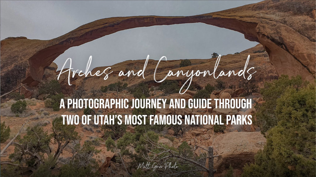
Interestingly, you may have a situation where you want to emphasize the background image a little more. It comes up more often than you’d think. I use it on the title screens of pretty much all of my videos.
In that case, you should use a black or white background overlay, and set the opacity to 30 to 50% to start. Like before, you’ll need to adjust it as necessary. I also recommend using a color background photo, because the black or white overlay won’t distort the colors of your image.
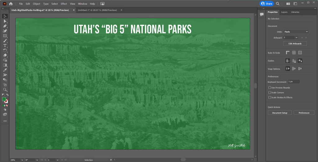
4. Add Any and All Map Titles, Subtitles, Labels, and Branding
The final elements to add are the title, labels, and branding. Like the background overlay, most of these should go either in the same layer as the background image and/or overlay, or in their own layer. However, there is one distinct exception. All feature labels should go in the same layer as the feature itself, or in their own layer. If you plan to animate the feature labels independently of the features themselves, each label must go in its own layer.
Use the text tool in Adobe Illustrator to add text to your custom map. Set the font to either match your brand fonts, which I highly recommend, or, to an easy-to-read font. The last thing you want is your viewers struggling to read the beautiful map you put such effort into.
5. Arrange the Layers in the Correct Order
Now that we’ve got all of the elements of our map in place, it’s time to put the layers into the correct order so you can see all of your features. If you’re not familiar with the concept of layers, it’s very similar to making a sandwich. For example, the layers of a ham sandwich, from top to bottom, would be something like this:
- Bread
- Mayo/Mustard
- Cheese
- Veggies
- Ham
- Mayo/Mustard
- Bread
Likewise, we can arrange the layers of our map in a similar order. From top to bottom, the layers of our map are as follows.
- Features and Feature Labels (unless they overlap, the order of each individual feature layer does not matter)
- Titles, Subtitles, Labels, and Branding
- Background Overlay
- Background Image
To rearrange the order of your custom map layers in Adobe Illustrator, open the Layers panel. Then, all you have to do is click and drag the layers into the correct order. Make sure you don’t accidentally put one layer into another. However, if you do, a Ctrl/Cmd-Z is all it takes to undo your mistake.
6. Set the Colors of Your Custom Map Features in Adobe Illustrator
All right, we’re almost there. All that’s left is to set the colors of our map features. And thankfully, that’s an easy, straightforward task. On the map, hold down the Shift key and click on all of the features you want to color to select them. To set the color, go to the properties tab and set the fill and stroke colors. You can also add opacity to each feature if you wish. On the Utah National Parks map, we left the opacity at 100% for all features.
Congratulations, you’re all done! You should have a final map that looks similar to the one below.
Conclusion
Creating a custom map in Adobe Illustrator is a fantastic way to increase brand awareness. And now, you’re completely ready to take the next big step into the world of map animation. You’ll learn all about that in the next installment of this series.
Additionally, custom maps are much easier to read and will put you leaps and bounds ahead of your competitors who are still using Google Maps. They’ll also make you look way more professional. Are you ready to get started with your own custom, branded maps? Get in touch with us today and get started with a free info session.
Top Photos: Hoodoos in the Late Afternoon Sun
Bryce Canyon National Park, Utah – May, 2017