From a mathematical standpoint, figuring out when a country, state, province, county, or city has hit the peak of the COVID-19 pandemic is not an exact science. Instead, it relies on pattern recognition in the data. We’re going to look at data from several countries and states to identify examples of the actual peak. We will also look at places that may be approaching the peak and some false indicators of the peak.
How Do We Define the Peak of the COVID-19 Outbreak?
There is a bit of a gray area here. The peak you hear medical experts, politicians, and people on television talking about is defined as one of the following:
- Maximum Number of New Cases in One Day
- Most commonly used by politicians and medical experts when they talk about “Flattening the Curve”
- This is the definition I will be using in this post.
- Maximum Number of New Deaths in One Day
- Most commonly used in models, especially the IHME model from the University of Washington
- Maximum Number of Hospitalizations or Hospital Use in One Day
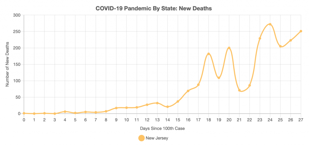
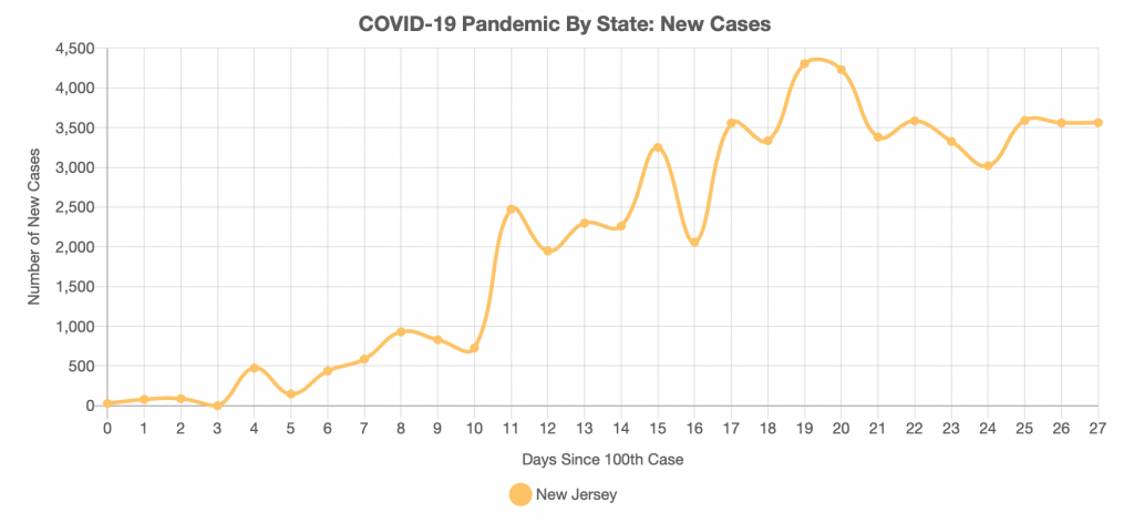
Now, here’s where it gets tricky. Depending on which definition you use, the peak will occur on different days. For example, defining the peak based on deaths lags behind the peak defined by number of cases by about two weeks. In New Jersey, the case counts are showing signs of starting to level off, but deaths are still increasing.
Two Types of COVID-19 Peaks
Regardless of which of the above definitions you are using, you will see one of two things happen on the time-series plot when you hit the peak:
- The peak will look like a spike or mountain peak. New cases will abruptly stop increasing and rapidly start to decrease.
- New cases will gradually level off. You’ll have a multi-day plateau of peak activity before new cases gradually taper off.
Social distancing and flattening the curve will drive the pandemic toward having a multi-day plateau of peak activity before seeing new cases start to gradually taper off. Let’s consider a purely hypothetical situation modeled in the chart below.
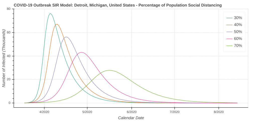
Note the difference in the shape of the curve between 30% vs 70% of the population social distancing. When fewer people are social distancing, you’ll see the big spike. Cases will rapidly increase, hit the peak, and then rapidly decrease. Social distancing and flattening the curve stretches the timeline out. Cases will gradually ramp up, followed by a multi-day period of peak activity and then a gradual ramping down of cases.
A Real-World Example of a COVID-19 Peak
The best real-world example of a peak happened in South Korea in late February and early March. Let’s take a look at the new cases per day data plot for South Korea.
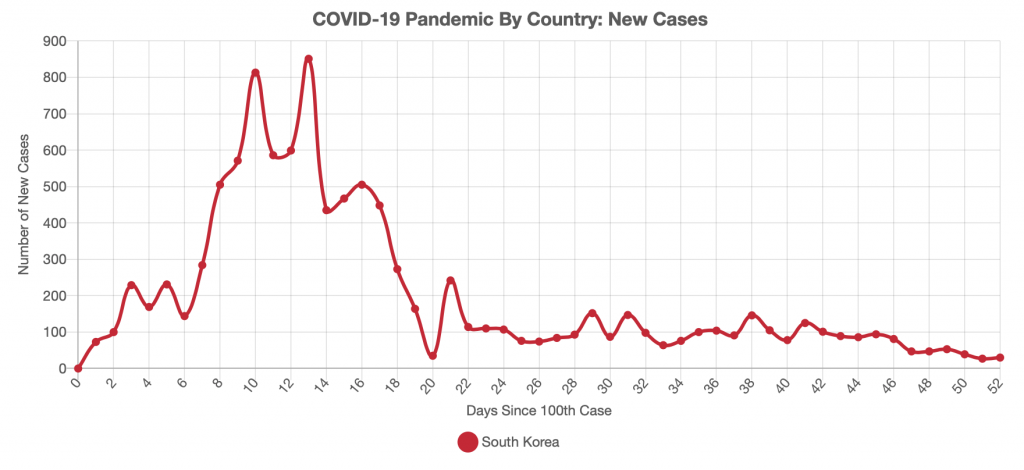
The South Korean peak is a bit of a combination of the spike and the plateau. Notice how the number of new cases significantly increases from day 5 to day 9. It then levels out for a plateau that lasts from day 9 to about day 15, before rapidly decreasing. This is likely due to South Korea’s rapid response and widespread testing.
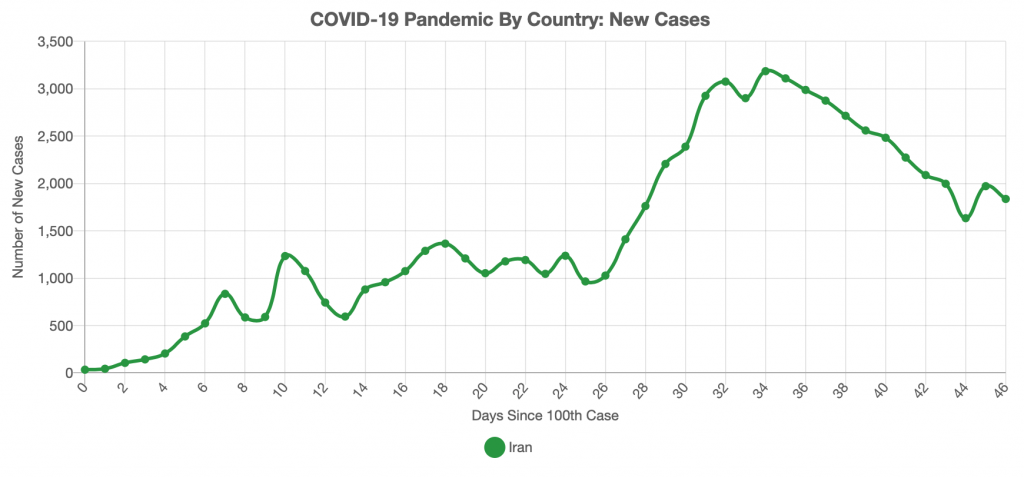
Initial data from countries such as Iran, Italy, and Spain are showing much more of a smooth, traditional plateau. Their peaks are similar to what is shown in the above model. However, it’s still a little too soon for me to say that those countries have hit their peak.
How to Tell You’re Actually at the Peak of the COVID-19 Outbreak
Remember that in any kind of outbreak, the curve will follow a bell-shaped curve. Look for the point where the number of new cases starts to decline. You want to see the best-fit line for new cases per day steadily decrease for at least 10-14 consecutive days.
In the real world, the curves will wobble. Wobbles can be due to anything from fluctuations in the number of tests being run each day to people being better at social distancing on some days than others to natural variances in the data. Waiting to see steady decreases for 10-14 straight days will rule out anything that’s causing the curve to wobble. As a result, you actually are seeing cases decrease and not a second peak or data anomaly.
The only country that has been hard-hit by COVID-19 in the past month that is in that 10-14 day window of declining cases is Iran. Some European countries are showing signs of having peaked, but still have at least another week or so to go before they can get into that 10-14 day window.
Multiple Peaks
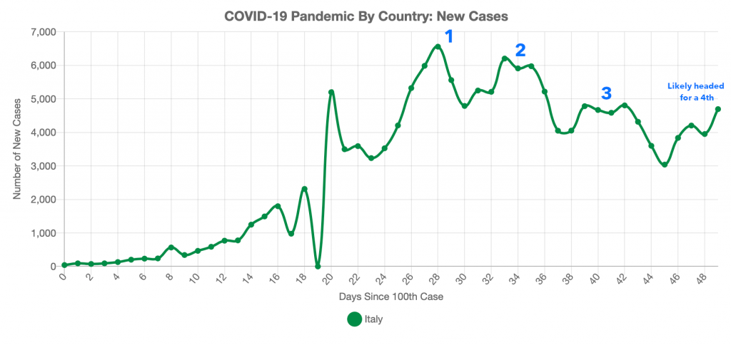
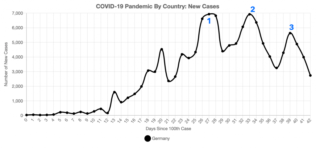
In larger countries, you will likely see multiple peaks on the country’s time series plot of new cases per day over the course of the pandemic. Multiple peaks are caused by the outbreak affecting different regions of the country at different times.
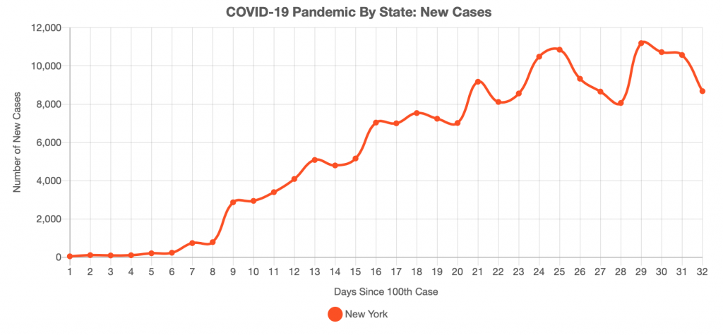
In the United States, New York and the greater New York City area seem to be reaching their peak imminently. On the other hand, California is not expected to reach its peak until late April. Other places are not expected to peak until May. If you watch the new cases per day plot for the entire United States, cases will start to decline as New York comes down off of its peak. They will increase again when another region, such as California or Louisiana hits its peak.
Based on both observed data and what models are forecasting, I expect these multiple peaks will continue in the US through at least early May. You can already see multiple peaks, which I’ve labelled in blue, occurring in both Italy and Germany as different regions in both countries reach their apex.
A Glimmer of Hope: US States That Are Showing Signs of Peaking
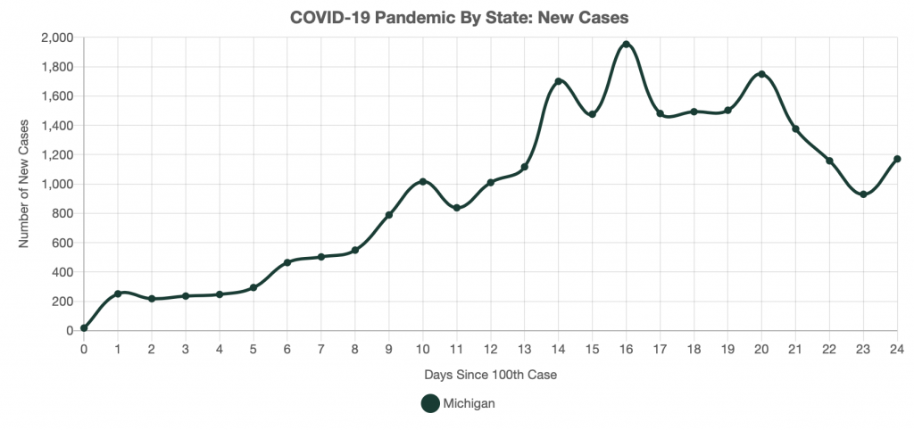
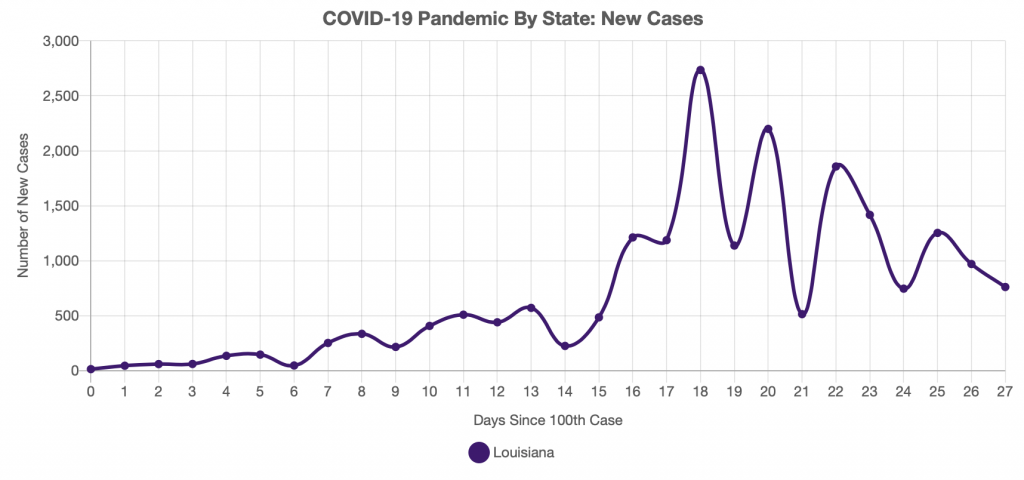
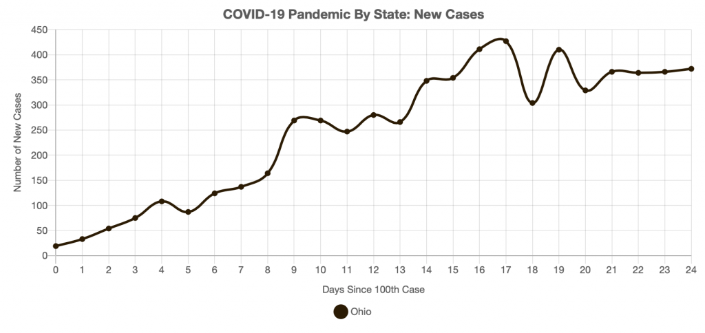
When will things start peaking in the United States? That is the million dollar question. While it is still way too early to tell if any US state has reached its peak using my 10-14 day rule, there are a few that are showing signs they are at least starting to level off. These plots are not in any particular order.
New Jersey
New York
Michigan
Louisiana
Ohio
A Data Anomaly or Signs of Peaking: A Closer Look at California and Connecticut
One thing I really want to emphasize here is don’t pin your hopes on one or two days of decreasing cases actually being the peak in your state. Let’s have a closer look at two states, California and Connecticut, which have on multiple occasions both briefly shown signs of leveling off only to have increases shortly thereafter.
COVID-19 Peak in Connecticut
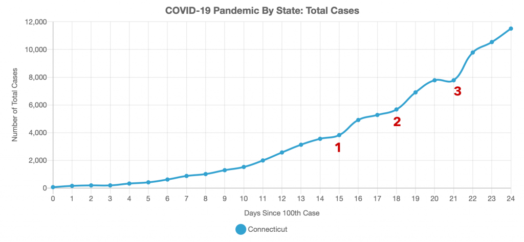
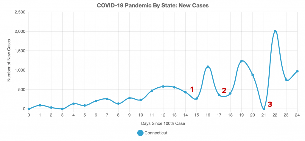
Let’s have a look at Connecticut first. I have identified three points of interest in the dataset where the curve hints at leveling out, but then goes right back to increasing.
So what is causing these wobbles in the dataset? Let’s start with the easy one. Wobble number 3 is simply a day where for whatever reason, there was no data reported. I’ve seen it happen in datasets for other states, too. The next day then contains 2 days’ worth of cases. You can easily extrapolate the curve to see where the missing day’s case count should have been.
Now, what is causing the other two wobbles? I can’t tell you for certain, but the most likely cause is simply that fewer tests were processed those days. To confirm that these are just data anomalies, look at the cumulative cases curve. If the wobbles are for only a day or two and corrects itself the next day, it’s just an anomaly in the dataset. The corrections will look like high-amplitude sine waves or spikes in the new cases per day plot, which you can also see in the Connecticut data immediately after all three anomalies.
On the other hand, if the trend continues for more than a few days and you see the cumulative cases start to trend more horizontal, you may be starting to show signs of leveling off. Based on the models I have looked at, I expect to see cases in Connecticut at least start to level off in the next week or two.
COVID-19 Peak in California
Now let’s take a look at California with the same mindset, looking for anomalies and signs of reaching the peak.
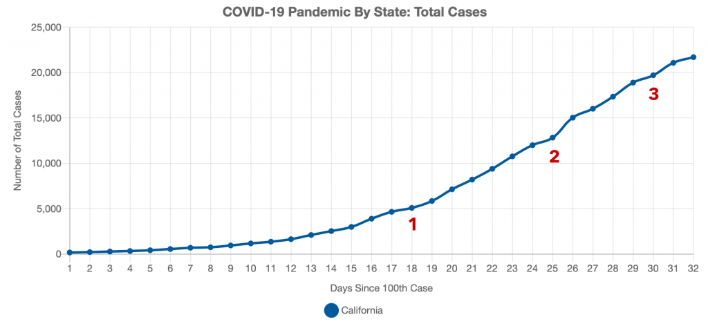
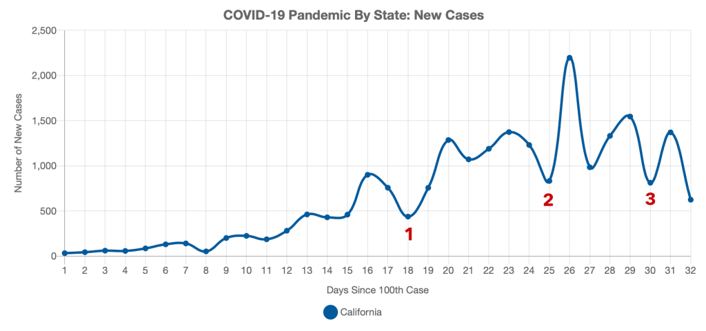
While we should be doing the same analysis as we did with Connecticut, there is one additional thing we must consider. We can treat California like a small country because of its large size and population. With over 40 million residents and the fifth largest economy in the world, California has a larger population than all of Canada, so we may see multiple peaks as San Francisco, Los Angeles, and other cities in California reach their apex at different times.
So what are the wobbles labelled in California’s plots? You can see the corrections on both plots after each wobble, so they are just data anomalies. To confirm this, many models show California reaching its peak sometime in late April, which is consistent with our conclusion that these are just data anomalies. What will be interesting to watch is the drop in new cases yesterday. Is that just another anomaly, or is the start of something much more promising?
Stay tuned this week as we will be diving back into the models and looking at updated model runs.
Top Photo: Cave Rock Overlook at Lake Tahoe – Lakeridge, Nevada – February, 2020
