We are exposed to color theory every single day of our lives. Most of the time, we don’t think twice about it. However, did you know that judgements of your credibility are 75% based on the design of your website? First impressions are 94% related to the look and design of your website. And 46% of customers base their purchasing decisions on the aesthetic appeal of your website. Indeed, color theory and graphic design is that important.
Unfortunately, the vast majority of people have a terrible eye when it comes to graphic design, and many organizations cut corners on their designs. While any of us can choose colors, professional graphic designers have a knack for choosing colors that are just stunning together. So how do they do it? They don’t just pull these colors out of thin air.
It turns out we can use mathematics to better understand color. The mathematical color theory we’re looking at today is aimed at web and application design, but you can certainly use it for painting your house, coordinating fashion outfits, or any other type of design.
The Color Wheel: The Foundation of Color Theory
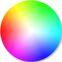
Isaac Newton invented the color wheel in 1666. Mapping the color spectrum onto a circle easily allows us to identify relationships between colors. You probably saw a color wheel when you were in elementary school. However, you can easily find color wheels that professionals use through a quick Google Images search. Here’s an example of one.
A New Take on Primary Colors
Time for another flashback to elementary school. Do you remember the primary colors? I know you do. If you’ve forgotten, they are are red, yellow, and blue, or RYB for short. You cannot make primary colors by combining mixtures of other colors.
Did you know that that’s not the only set of primary colors? Those primary colors you learned in elementary school are only telling part of the story. The other set of primary colors consists of red, green, and blue, or RGB. Wait, what? Nope, that’s not a type-o. You actually use the RGB primary color scheme in your day-to-day life than you do the RYB.
So how on earth can green possibly be a primary color? I thought yellow and blue made green. You’re right, but only partially right. Here’s the rest of the story. The RYB primary color scheme you were taught in elementary school applies to mixing colors of paint or ink. Whenever you mix colors of light, you use the RGB color scheme.
Where Do We Use the RGB Primary Color Scheme?
It’s everywhere. First and foremost, your eyes use the RGB primary color scheme to interpret color. Anything with a screen also uses it. Your phone does. So does your computer and your television. So do those electric signs you see on the freeway. The next time you’re in a studio or at the theatre, look up at the lights. You’ll see they are red, green, and blue.
Thankfully, mathematical color theory remains the same, regardless of which primary color scheme you’re using.
Denoting Color Mathematically
In order to apply mathematical theory to color, we’re going to have to put some numbers behind it. Isaac Newton, the man who invented the color wheel, was one of the greatest mathematicians of all time, so most of the heavy lifting is done for us. We simply use the RGB Model break the color down into its red, green, and blue components. You can think of it either as a three-dimensional vector or as a 1×3 matrix.
color = RGB(red, green, blue)So what numbers do we put in each component? 0 to 100 would be a good guess. That’s actually an accepted way to do it, but when you’re working with computers, there’s a better way. Computers use the binary system, which uses powers of two. A single byte consists of 8 parts called bits. As a result, the maximum value a byte can hold is 28, or 256. We’ll set each component of our color to a number between 0 and 255.
black = RGB(0, 0, 0)
white = RGB(255, 255, 255)
red = RGB(255, 0, 0)
green = RGB(0, 255, 0)
blue = RGB(0, 0, 255)
Choosing a Coordinate System for Our Color Wheel
To fully understand color theory, we’ll need to plot the color wheel on a graph. By default, most people start with a cartesian (x, y) coordinate system. And cartesian coordinates work just fine for color theory. However, there’s one big catch. The color wheel is circular, which means we need to deal with angles. And in a cartesian grid, that means trigonometry, and lots of it.
I don’t know about you, but I’d rather not have to bring sines and cosines into this. Thankfully, there’s a much better coordinate system to use. And best of all, the only math you’ll need is addition and subtraction. There’s no trigonometry required.
Enter the Polar Coordinate System
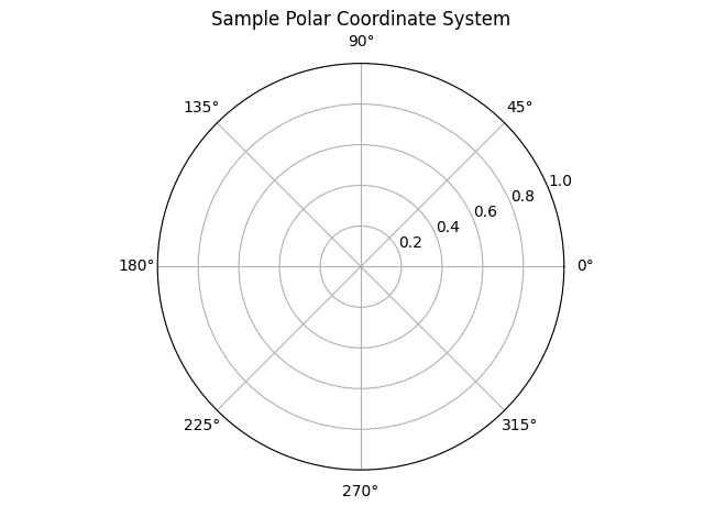
Instead of a rectangular grid, the polar coordinate system is based on concentric circles around the (0, 0) coordinate. Instead of (x, y), polar coordinates are given as (r, θ). The r coordinate refers to the radius, or how far you are from the origin. Theta (θ) is the angle from a horizontal line that extends to the right from the origin. In degrees, theta is a number between 0 and 360.
Convert RGB to Hue, Saturation, Lightness (HSL) to Make the Mathematics of Color Theory Even Easier
Here’s where the magic happens. The hue, Saturation, Lightness, or HSL model, is just another way to denote and analyze colors. Like RGB, it is comprised of three components. Can you tell which component will complement our polar coordinate system perfectly?
| Hue | The angle on the color wheel, from 0 to 360°. Red is 0°, green is 120°, and blue is 240°. |
| Saturation | The grey level, as a percentage. 0% is a shade of grey. 100% is full color. |
| Lightness | How light or dark the color is, as a percentage. 0% is black, while 100% is white. |
The hue component overlays perfectly with our polar coordinate system. To perform color theory, all we need to do is add or subtract hue values to obtain complementary colors. No trigonometry required. You don’t even have to touch the saturation or lightness values. The process is breathtakingly simple.
- Convert your primary color to HSL notation. The nuts and bolts of that conversion is beyond the scope of this tutorial. However, I wrote a Python script that does the conversion so you can perform your own color analysis.
- Add and/or subtract the hue angles to determine your complementary colors. We’ll do some hands-on exercises with that below.
- Convert the colors in your color scheme back to RGB notation.
For the examples below, let’s use red as the primary color because θ = 0 for red. That way, the angles on the plots will make much more sense.
Complimentary Color Theory
The complimentary color is the color that is directly across the color wheel from your primary color. Mathematically, just add 180° to the hue of your primary color and plot it on your polar coordinate system.
hue_complimentary = hue_primary + 180
saturation_complimentary = saturation_primary
lightness_complimentary = lightness_primary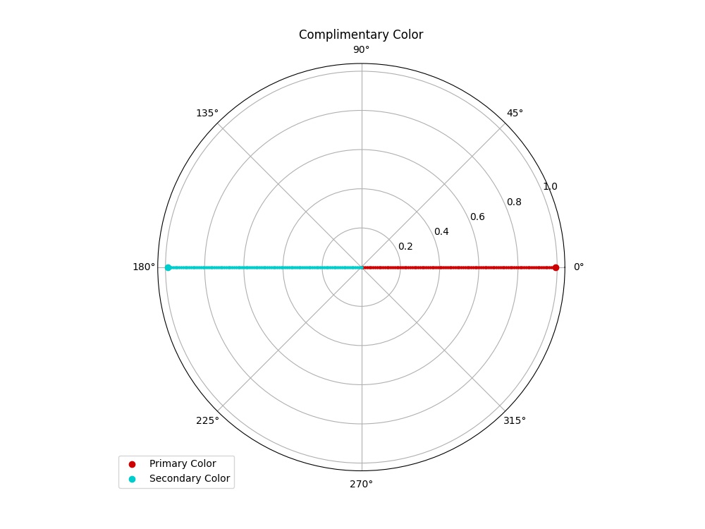
Real World Example of Complimentary Colors
Look no further than the world of North American sports to find logos that use complimentary colors.
Tricolor: Adjacent Color Theory
With adjacent colors, the goal is to have two additional colors that are compatible with your primary color. All three colors should be near each other on the color wheel. One of the adjacent colors should be slightly cooler than your primary color. The other should be slightly warmer than your primary color.
Adjacent colors work best with more subdued colors. When used with bright, vivid colors, they can really overwhelm your senses.
A Word About Angles in Color Theory
Using polar coordinates, your two adjacent colors are offset from your primary color by the same angle on the color wheel. Most designers find that 30° to 45° is the optimum range, but anywhere between 20° and 60° is acceptable. If you use an angle less than 20°, the colors will be so similar you’ll have a hard time telling them apart. Use an angle greater than 60°, and they’re really not adjacent colors any more.
In the equations below, the phi variable (φ) represents the angle your adjacent colors are offset from the primary. In the plot below, φ = 30°.
hue1 = hue_primary + phi
hue2 = hue_primary - phi

saturation1 = saturation2 = saturation_primary
lightness1 = lightness2 = lightness_primary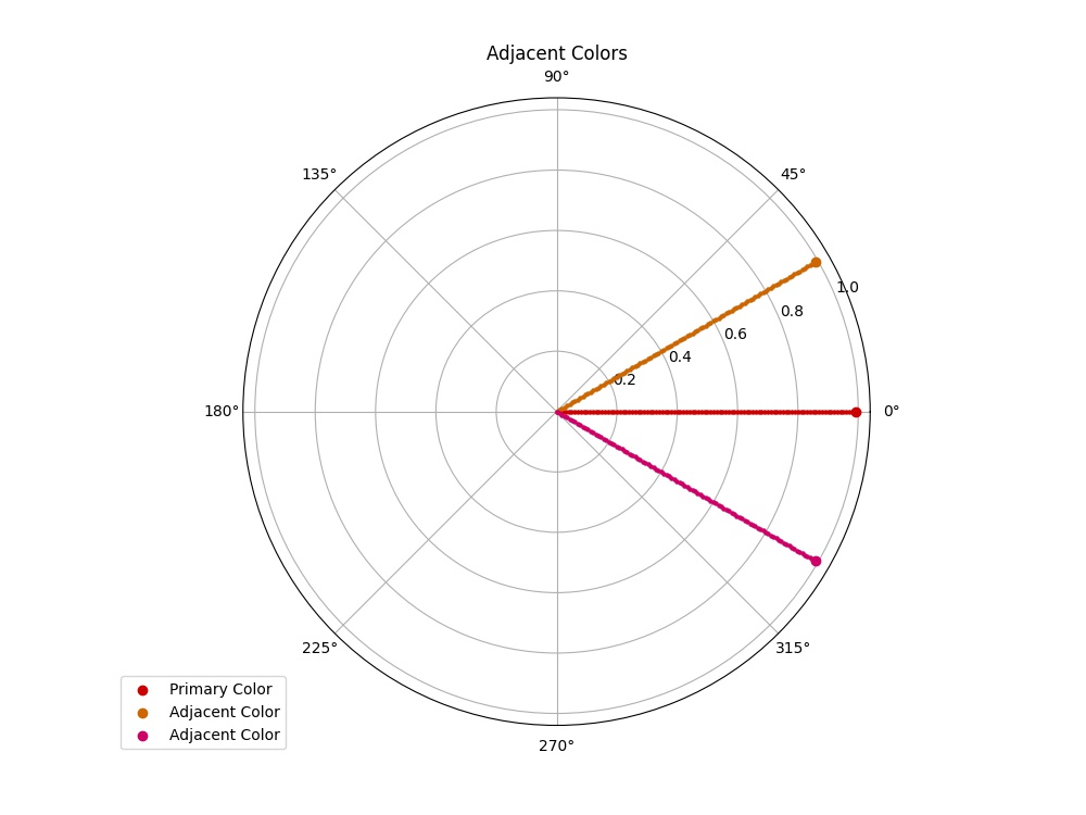
Real World Examples of Adjacent Colors
Many companies you interact with in day-to-day life use adjacent colors.
Tricolor: Triad Color Theory
The theory behind triad colors is identical to adjacent colors, with one distinct difference. Instead of being offset φ degrees from your primary color, triad colors are offset φ degrees from its complementary color. Instead of just a single complementary color, you’ll have two. If you’re looking for a tricolor scheme and have bright colors, triad colors work much better than adjacent colors.
Using a single triad color is also a great alternative to using a complementary color. Which one to use will largely depend on your project, but if you don’t like the look of your color scheme using a complementary color, try it with a single triad color. Out in the real world, there is no more textbook example of using a single triad color than the iconic bleu, blanc, et rouge of the Montréal Canadiens. Well, at least the bleu and rouge parts.

Mathematically, triad colors are calculated the same way as the adjacent colors, except they’re offset from the complimentary color. The same rules for the angles apply here. In the plots below, let’s again use 30° as the offset angle.
hue_complimentary = hue_primary + 180
hue1 = hue_complimentary + phi
hue2 = hue_complimentary - phi

saturation1 = saturation2 = saturation_primary
lightness1 = lightness2 = lightness_primary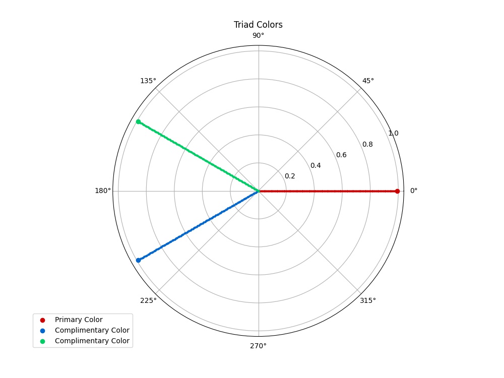
Real World Examples of Triad Colors
We’ll go back to sports team logos here. Can you spot the common thread in the color schemes? Do note that many of these teams use a single triad color like the Montréal Canadiens do.
So did you spot the common thread in the color schemes? Red, white, and blue are an incredibly popular triad color scheme in North American sports. It makes sense given the color scheme of the American flag. However, don’t forget that the Canadian flag had blue in it as recently as the 1960s.
Tetrad Color Theory: Make a Rectangle on the Color Wheel
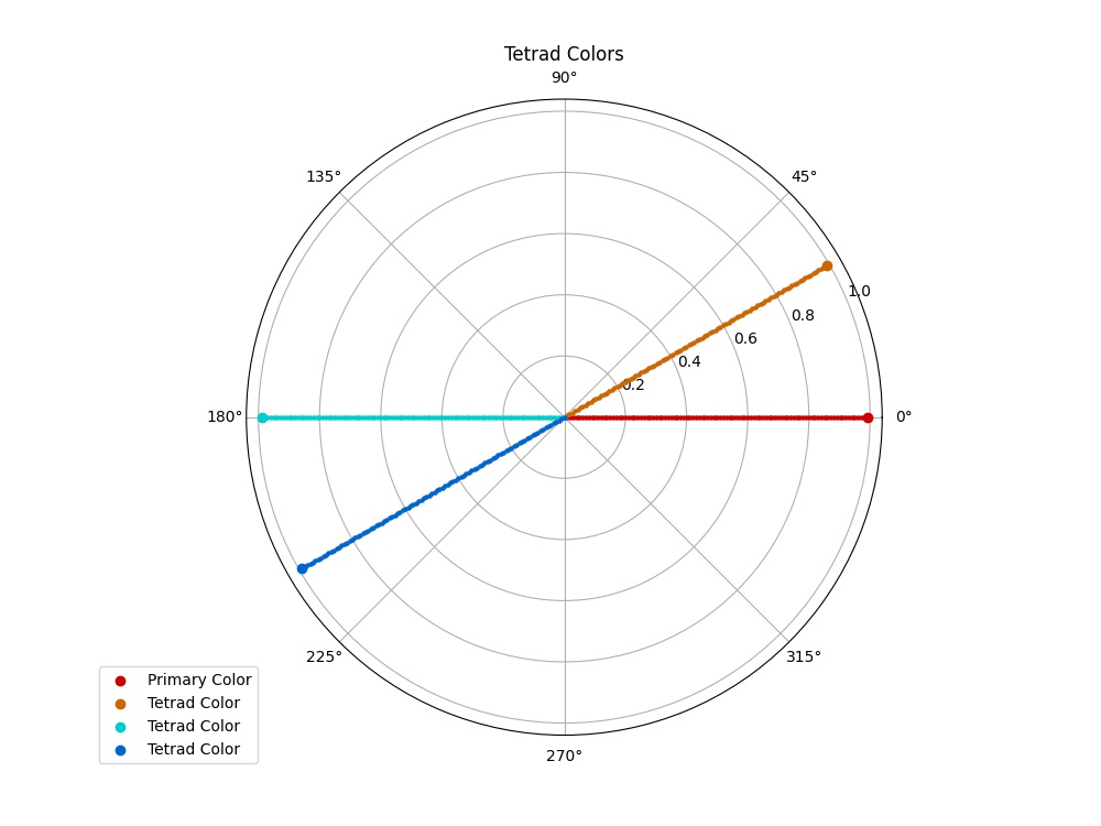
Tetrad colors combine the best of complimentary, adjacent, and triad colors into a beautiful 4-color scheme. Using the naked eye, it’s incredibly difficult to pull off a good tetrad color scheme, but it becomes much simpler when you put the math behind it to work. When done correctly, if you plot the four points on the color wheel and then connect the dots, you’ll have a perfect rectangle.
Also called “Double Complimentary Colors”, it’s actually quite easy to come up with a tetrad color scheme mathematically.
- Start with your primary color.
- Select one of the adjacent colors to your primary color. It does not matter which one.
- Calculate the complimentary color from your primary color.
- The triad color is simply the complementary color of the adjacent color you chose in Step 2.
hue_complimentary = hue_primary + 180
hue_adjacent = hue_primary + phi
hue_triad = hue_adjacent + 180 = hue_complimentary + phi

saturation1 = saturation2 = saturation_primary
lightness1 = lightness2 = lightness_primary
While the plot below uses an offset angle of 30°, I find tetrad colors work much better with a larger angle. Many of our real-world examples use angles of at least 45 to 60°.
Real World Examples of Tetrad Colors
You’ll need to look to the tech industry to find the best examples of tetrad colors in the real world.
Interestingly, there is one North American professional sports team that pulls off a tetrad color scheme incredibly well. Any guesses as to which team it is? I’ll give you a hint. It’s an NBA team.

Monochromatic Shading
Our final color theory is the simplest. You don’t have to worry about converting RGB to HSL notation. You’ll want to use RGB notation. Throw away your polar coordinates, too. They won’t be needed here.
Monochromatic shading is nothing more than making a lighter and darker version of your primary color. The secret to pulling it off is that both the lighter and darker versions must be scaled the same amount from your primary color.
The scaling factor should be a percent, in decimal form. In other words, use 0.25 to scale your colors by 25%. Like the tricolor schemes, scale in moderation. 25 to 60% is a pretty safe range.
red_light = red_primary * (1 + scaling_factor)
green_light = green_primary * (1 + scaling_factor)
blue_light = blue_primary * (1 + scaling_factor)

red_dark = red_primary * (1 - scaling_factor)
green_dark = green_primary * (1 - scaling_factor)
blue_dark = blue_primary * (1 - scaling_factor)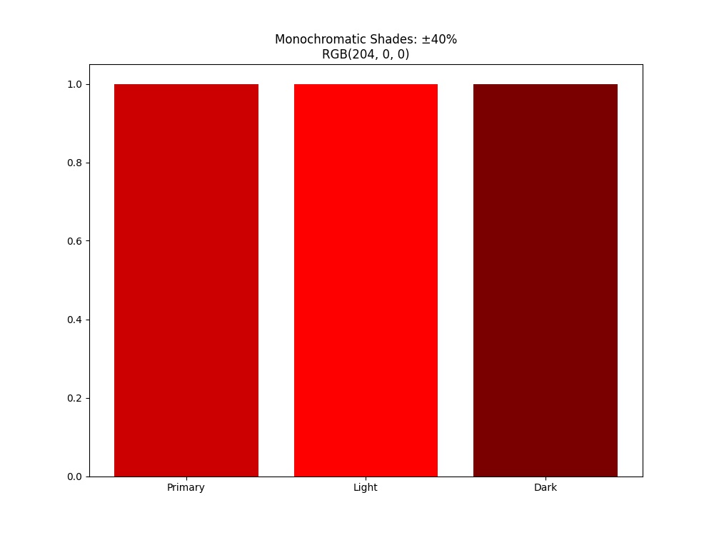
Our Strategy
On our websites, we employ a simple strategy. We start with a tetrad color scheme, choose primary and secondary colors from that, and compliment them with greys as necessary. However, we do actually use all 4 colors.
- Primary Color
- Secondary Color
- Accent Color that is used sparingly to complement the primary and secondary colors.
- Alert Color: A high-contrast color used to draw attention to certain items, such as error messages, warnings, sale announcements, etc.
- Greys accent headers, footers, and other parts of the website as needed
We also use monochromatic scaling to make buttons and links darker when you hover over them, and make them lighter when they’re disabled.
Conclusion
Choosing a color scheme can be incredibly difficult. While it’s no substitution for a professional designer, knowledge of basic color theory goes along way towards your success. Use color theory mathematics to know what you want prior to hiring a designer. They’ll be able to work much more efficiently, and you’ll save yourself some money as well.
If you want to explore color theory further and try out some of the color theory math for yourself, I’ve put Python scripts on the Bitbucket repository. And if you have any graphic design needs or just a general question, please don’t hesitate to get in touch today.
Top Photo: Brilliant Colors Light Up the Desert Sky During a Spectacular Winter Sunrise
Wittmann, Arizona – December, 2017


