Did you know that you can do simple GIS operations and analysis using nothing but Python? Python’s very popular matplotlib library has mapping capabilities built into it. It’s certainly not a substitute for a true GIS application such as ESRI ArcGIS. However, if all you need is that basics, it works pretty well.
If you’ve never heard of matplotlib, it “is a Python 2D plotting library which produces publication-quality figures in a variety of hardcopy formats and interactive environments across platforms” (source: matplotlib website). If you’ve ever used Matlab before, you will be right at home using matplotlib. It’s a very powerful tool for mathematics, science, and data analysis.
You will need to consult the matplotlib website for instructions on how to install it on your operating system. I recommend that you do not install it using pip. Matplotlib works much better if you install it via a direct download or via your operating system’s software repository. On Linux, use apt-get, yum, or brew. Once it’s installed, verify that the mpl_toolkits package was installed correctly. It should be installed automatically when you install matplotlib, but it doesn’t always work out that way. To test the installation, open a Python shell and type import mpl_toolkits. If you don’t get any errors, it’s installed correctly.
The Most Basic GIS Functionality with Python
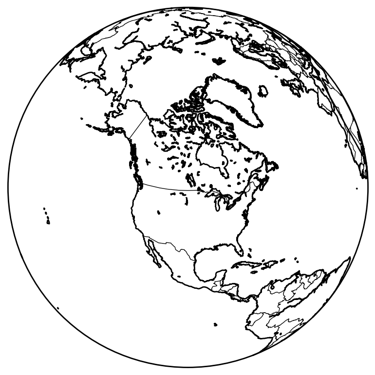
We’ll start by just generating a very simple map of a globe looking down on North America with the country boundaries drawn. The first thing you must do before doing anything is import the Python GIS Basemap module.
from mpl_toolkits.basemap import Basemap
We also need to import two other matplotlib packages.
import matplotlib.pyplot as plt
import numpy as np
To instantiate the map, we will use the Basemap class we just imported. There are a ton of options you can use to instantiate the object. Please consult the Basemap documentation for more details. We will instantiate a simple plot using the ortho projection looking down at North America.
my_map = Basemap(
    projection='oath',
    lat_0=50, lon_0=-100,
    resolution='l',
    area_thresh=1000.0
)

my_map.drawcoastlines()
my_map.drawcountries()
plt.show()
Jazz Up Your Map with shadedrelief()
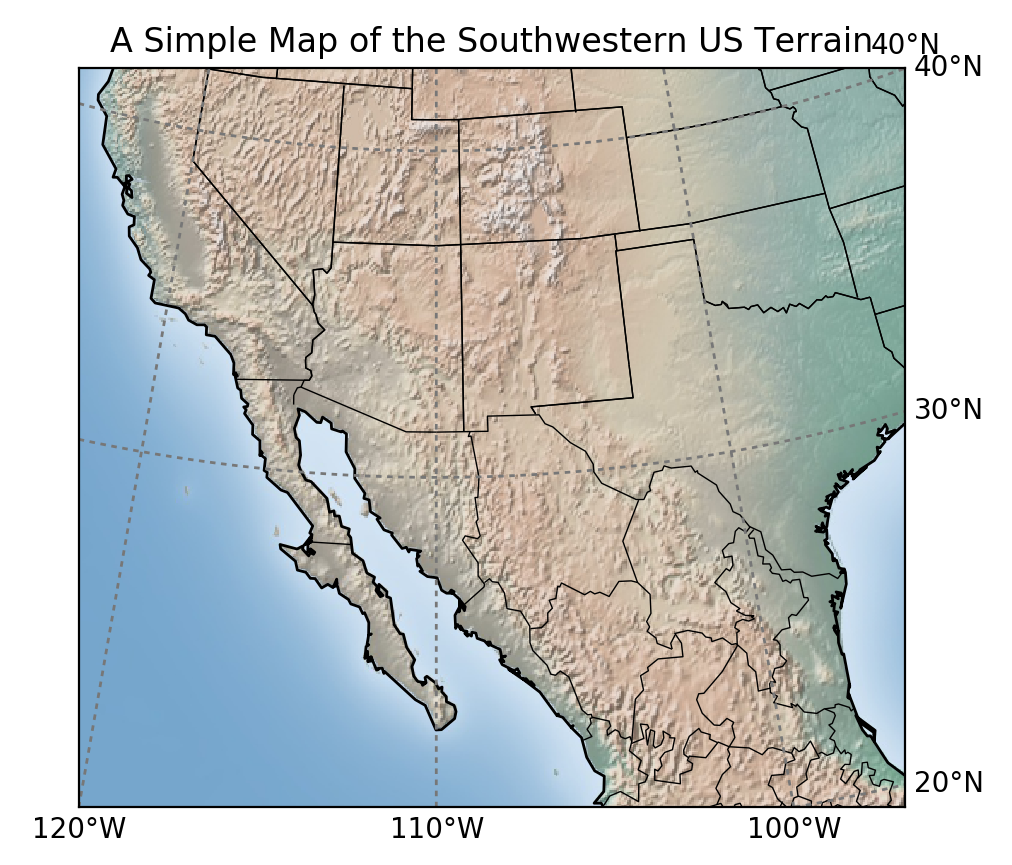
Now, I know you’re probably thinking that’s a pretty pitiful map. Well, it is, so let’s jazz it up a little. In the next map, we’ll zoom in on the southwestern United States. In the instantiation of the Basemap object, we can define the latitude and longitude values that mark the corners of the area you wish to display.
my_map = Basemap(
    projection='stere', lon_0=-110., lat_0=90., lat_ts=0,
    llcrnrlat=20, urcrnrlat=40,
    llcrnrlon=-120, urcrnrlon=-90,
    rsphere=6371200., resolution='l', area_thresh=10000
)
To make the map look a lot better, we’ll add a background to the map to distinguish between land and water. While you can individually set colors for the land and water, I think adding a terrain/topography background looks a lot better. There are several to choose from, but in this example, we will use the shadedrelief() option.
my_map.shadedrelief()
Add State Boundaries with drawstates()
Next, we will add the state boundaries to the map. At the time of this post, the Basemap class only supports states and provinces for countries in North and South America. In this example, you will see both US States and Mexican States.
my_map.drawstates()
Draw Latitude and Longitude Lines
Finally, we will draw the parallels (lines of latitude) and meridians (lines of longitude) on the map. The easiest way to define the range and interval for the parallels and meridians is with matplotlib’s numpy module. Because we’re looking at a zoomed in area, we have a bit more flexibility on how we define things. For purposes of this example, I’ll define the parallels and meridians for the entire world, displaying each multiple of 10. If you’re looking at a larger area, you’ll probably want to display each multiple of 30 or so instead.
parallels_color = "#777777"
parallels = np.arange(0., 81., 10.)
meridians = np.arange(10., 351., 10.)
After defining the range and interval, we need to define how they’re labelled on the plot. Figures in matplotlib are always displayed inside of a box, and we use a list of booleans to tell matplotlib which sides of the box we wish to display labels, in the format [left, right, top, bottom]. Here, we will label lines of latitude on the top and right sides of the box, which we will indicate with [False, True, True, False]. Lines of longitude will be displayed on the bottom and left sides of the box, which can be indicated with [True, False, False, True].
my_map.drawparallels(
    parallels,
    labels=[False,True,True,False],
    color=parallels_color
)

my_map.drawmeridians(
    parallels,
    labels=[True,False,False,True],
    color=parallels_color
)
The Complete GIS Solution Built with Pure Python
When we put the code all together and run it, we get the following:
my_map = Basemap(
    projection='stere', lon_0=-110., lat_0=90., lat_ts=0,
    llcrnrlat=20, urcrnrlat=40,
    llcrnrlon=-120, urcrnrlon=-90,
    rsphere=6371200., resolution='l', area_thresh=10000
)

my_map.shadedrelief()
my_map.drawcoastlines()
my_map.drawcountries()
my_map.drawstates()

parallels_color = "#777777"
parallels = np.arange(0., 81., 10.)
meridians = np.arange(10., 351., 10.)

my_map.drawparallels(
    parallels,
    labels=[False,True,True,False],
    color=parallels_color
)

my_map.drawmeridians(
    parallels,
    labels=[True,False,False,True],
    color=parallels_color
)
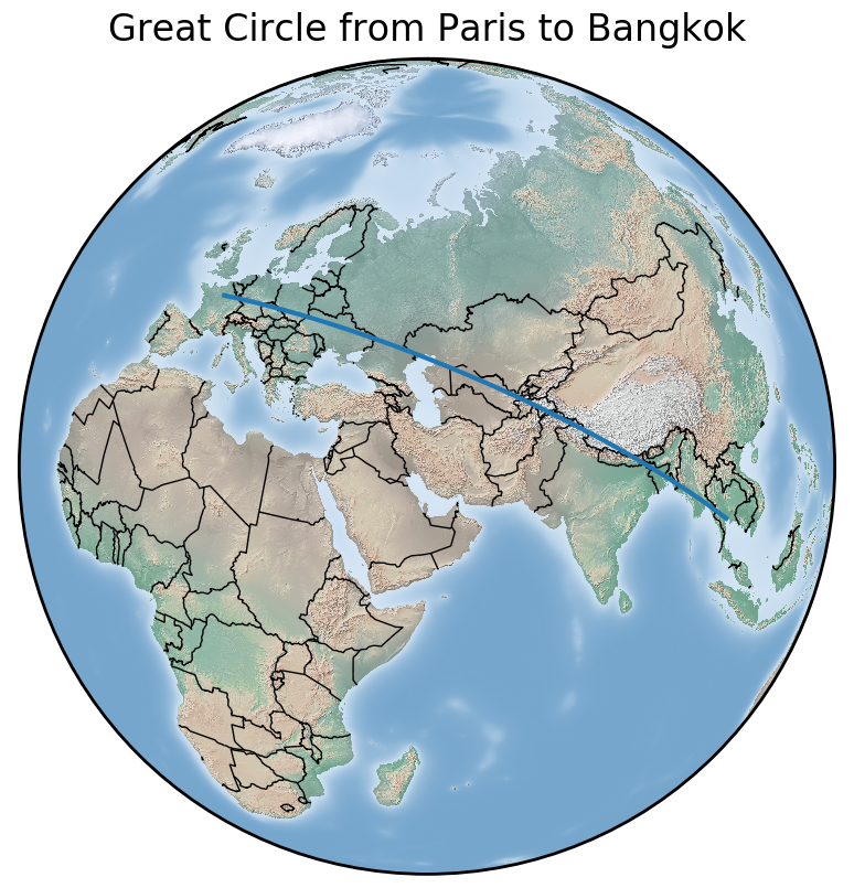
Example: The Great Circle Route
To introduce you to displaying data on a map, we will use one of the Basemap module’s built-in methods: drawgreatcircle(). If you’ve ever travelled in an airplane, you’ve flown a “Great Circle” route. You can also use the great circle route on ships or any other method of transportation where you can travel between 2 points without being restricted by roads or paths. The formula behind the Great Circle Route is called the Haversine Equation. I am not going to get into it in this tutorial, but it’s worth checking out. It’s just trigonometry, so it’s not overtly complicated.
To simplify things before I dive into the code, I am going to create a very simple class to hold latitude and longitude data for our origin and destination cities.
class City(object):

    def __init__(self, lat, lon, name):
        self.latitude = lat
        self.longitude = lon
        self.name = name
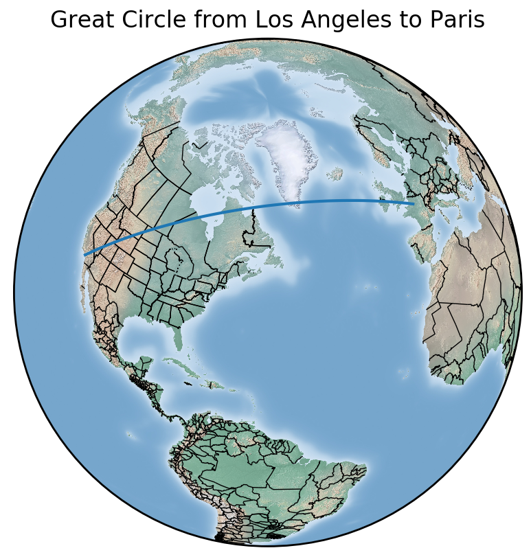
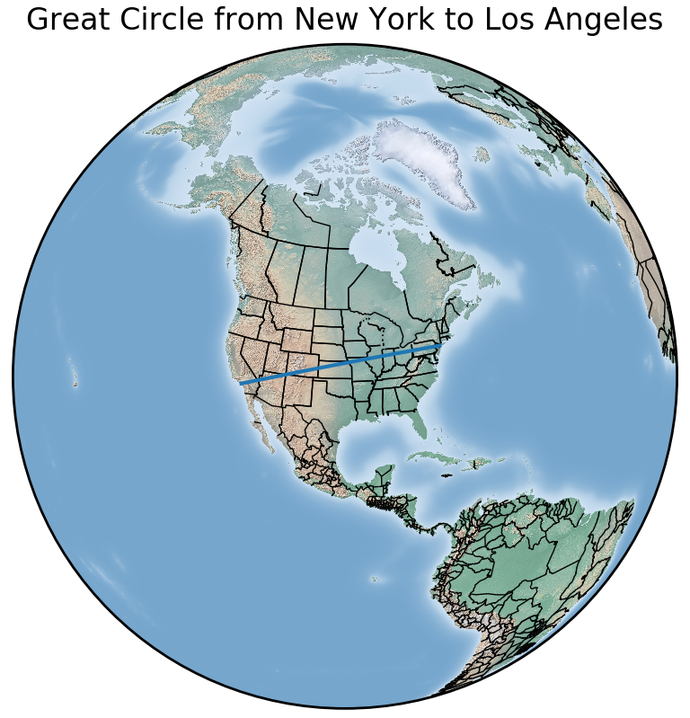
Now that we have our City class, we can define some cities that can be used for the origin and destination of our “flight”. I will define objects for New York City, Los Angeles, Paris, Tokyo, Bangkok, and Cape Town for you to play with. If you want other locations, feel free to add them.
new_york = City(40.78, -73.98, "New York")
los_angeles = City(34.052, -118.244, "Los Angeles")
paris = City(48.857, 2.352, "Paris")
tokyo = City(35.69, 139.692, "Tokyo")
bangkok = City(13.756, 100.502, "Bangkok")
cape_town = City(-33.925, 18.424, "Cape Town")
With our cities defined we can set origin and destination cities for our “flight”.
origin = los_angeles
destination = paris
Since we will be testing this code with cities all over the world, I have written a very simple algorithm to set the camera view for the map. If you don’t have to keep changing it manually, it gets old very fast. Please be advised that I wrote this algorithm for the general purposes of this example and it is not complete.
Avoid These Pitfalls
You may need to adjust the extra latitude and longitude that is displayed in each direction. Adjust the lat_lon_adjuster variable if the Great Circle Route goes off the page. If you plot a flight that crosses the 180-degree meridian, such as a flight between LA and Bangkok, the camera view will be 180 degrees off.
If this algorithm were going into a production application, I would obviously fix these issues, but I don’t want to confuse you any more than I have to for such a simple example. Finally, with everything calculated, we can put everything together and plot it on the map, just like we did in the examples above.
class City(object):

    def __init__(self, lat, lon, name):
        self.latitude = lat
        self.longitude = lon
        self.name = name

def city_file_name(city):
    return city.replace(' ', '-').lower()

new_york = City(40.78, -73.98, "New York")
los_angeles = City(34.052, -118.244, "Los Angeles")
paris = City(48.857, 2.352, "Paris")
tokyo = City(35.69, 139.692, "Tokyo")
bangkok = City(13.756, 100.502, "Bangkok")
cape_town = City(-33.925, 18.424, "Cape Town")

# Set Origin and Destination
origin = los_angeles
destination = paris

lat_0 = (origin.latitude + destination.latitude) / 2
lon_0 = (origin.longitude + destination.longitude) / 2
title = "Great Circle from {} to {}".format(origin.name, destination.name)
lat_lon_adjuster = 10

# Calculate max and min lats/longs
min_lat = origin.latitude if origin.latitude < destination.latitude else destination.latitude
min_lon = origin.longitude if origin.longitude < destination.longitude else destination.longitude
max_lat = origin.latitude if origin.latitude > destination.latitude else destination.latitude
max_lon = origin.longitude if origin.longitude > destination.longitude else destination.longitude

min_lat -= lat_lon_adjuster
min_lon -= lat_lon_adjuster
max_lat += lat_lon_adjuster
max_lon += lat_lon_adjuster

m = Basemap(
    llcrnrlon=min_lon, llcrnrlat=min_lat, urcrnrlon=max_lon, urcrnrlat=max_lat,
    rsphere=(6378137.00,6356752.3142),
    resolution='l',projection='merc',
    lat_0=lat_0,lon_0=lon_0,lat_ts=20.
)

m.shadedrelief()
m.drawcountries()
m.drawstates()

m.drawgreatcircle(
    origin.longitude,
    origin.latitude,
    destination.longitude,
    destination.latitude
)

plot_filename = "great-circle-{}-to-{}-globe.png".format(
    city_file_name(origin.name),
    city_file_name(destination.name)
)

plt.title(title)
plt.savefig(plot_filename, dpi=200)
plt.show()
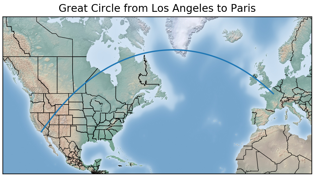
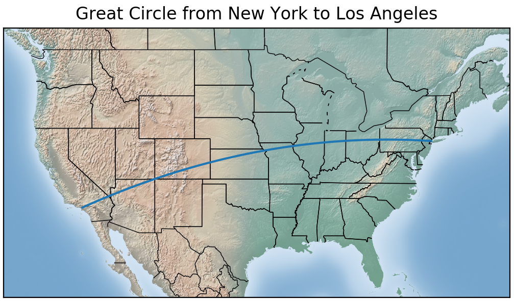
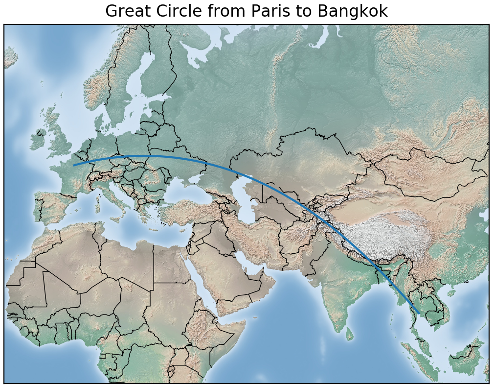
So why do people call it the Great Circle Route? Why do they take such roundabout ways getting from Point A to Point B? The Great Circle Route is the most direct way to move between two points on the surface of a sphere. The map’s projection makes it appear to be a very roundabout way.
If you plot the three plots above on a globe or sphere, the Great Circle Route will be a straight line if you look down on it from directly above. Check out the examples below. Note that any curvature you may see in the route is due to the camera not looking directly down on the route. Very small rounding errors in the calculation of the route may also introduce curvature.
Python can easily be used as a stand-alone GIS tool for basic applications. In the next post, we will look at adding data from external files to the map. Did you know that the Basemap package natively supports files such as ESRI ArcGIS shape files and NetCDF? You can easily configure it to display GeoJSON, KML, and much more. Happy mapping.