We recently looked at how to perform basic GIS functionalities using pure Python. In this tutorial, we will take that to the next level, and add meteorological data from a NetCDF file.
If you don’t know what a NetCDF file is, that’s perfectly fine. It stands for Network Common Data Form. It is designed “to support the creation, access, and sharing of array-oriented scientific data” (source: NetCDF website). Most meteorological data is presented in NetCDF format. Python can easily plot NetCDF data.
The Python script in this tutorial is left over from my meteorology courses at the University of Oklahoma. I have rewritten a significant portion of it to fit this tutorial. It takes data from a NetCDF file that contains output from the GFS model for August 11, 2012 at noon UTC. The file is quite lengthy, so I will be only touching on relevant parts. I put the entire script on Bitbucket if you want to see it in its entirety.
Depedencies
Like the previous tutorial, we will be using the matplotlib package to create the map. We will also need the netCDF4 package (which can be installed with pip), as well as a few of Python’s native packages.
import netCDF4
import os
import datetime
import numpy as np
import matplotlib as mpl
import matplotlib.pyplot as plt
from mpl_toolkits.basemap import Basemap, shiftgrid, addcyclic
After reading in the dependencies, we define the script/map’s parameters and settings, which you can find in the code. You can change what variable is being plotted, what height is being plotted, and much more. They are pretty self-explanatory, so I’m not going to go into them in too much detail here. I do want to point out that the level_option variable, which specifies the pressure (height) we want to plot the data for, should be read in as Pascals, except for if you want the surface data. For the surface data, set the level_option variable to -1. This will be an important distinction later in the tutorial.
Read the Data From the NetCDF File into Python
Before we can plot the data, we need to read the data from the NetCDF file into a format Python can understand. Thankfully, the netCDF4 package will do all of that for you. If you’ve ever used Python’s built-in open() method to read the contents from a file, you will find the netCDF4’s method is very similar. The ‘r’ stands for opening the file read-only, so you don’t accidentally overwrite any of the data.
f = netCDF4.Dataset(netcdf_path, 'r')
The next step is to define the latitude and longitude grid points the GFS model uses for its calculations. We also need to define the heights (the levels variable) at high the model runs its calculations. That way, we can get a full three-dimensional view of the atmosphere.
lons = f.variables['lon_0'][:]
lats = f.variables['lat_0'][::-1]
levels = f.variables['lv_ISBL0'][:]
The final step is to tell Python that we only want one plot for the height we defined in the user settings. The np.ravel() method creates an array of booleans that is the same length as the levels array. For each height (level), it will set the value to false for the heights that do not match the one we defined in the user settings. It will not plot those heights. It will set the matching value in the user settings to True, and plot the data at that height.
level_index = np.ravel(levels==plot_level)
Finally, we can parse out the data into Python. In this example, we will parse out the following.
- Geopotential Height (or Surface Pressure if we’re plotting surface conditions)
- Temperature
- The u (east/west) and v (north/south) vector components of the wind.
if level_option == -1:
    pressure = f.variables['PRMSL_P0_L101_GLL0'][::-1,:]/100
else:
    pressure = f.variables['HGT_P0_L100_GLL0'][level_index,::-1,:].squeeze()

temperature = f.variables['TMP_P0_L100_GLL0'][level_index,::-1,:].squeeze()
u = f.variables['UGRD_P0_L100_GLL0'][level_index,::-1,:].squeeze()
v = f.variables['VGRD_P0_L100_GLL0'][level_index,::-1,:].squeeze()

f.close()
Proper Unit and Grid Structure Conversions to Display the Data on the Map
After a quick unit conversion to convert pressure into millibars, temperature into Celsius, and wind into knots, it’s time to make sure our latitude/longitude grid is filled in with data and can be plotted on the map. Basemap’s addcyclic() method fills in gaps in data that spans a latitude/longitude grid, which we will apply to our pressure, temperature, and wind data.
lons_ = lons    # Dummy variable for calculations
pressure, lons = addcyclic(pressure, lons_)
temperature, lons = addcyclic(temperature, lons_)
u, lons = addcyclic(u, lons_)
v, lons = addcyclic(v, lons_)

# Refresh Dimensions
x, y = np.meshgrid(lons, lats)
With our grid filled in, the last piece of the puzzle before we can create the map is to define the data contours and wind barbs.
Define Contours and Wind Barbs
If you’ve made it this far, the majority of the hard part is behind you. We will use numpy’s arange() function to create an array of contour intervals, using the format arange(min, max, interval). For example, arange(4, 9, 2) would output [4 6 8]. For the pressure/height plots, we defined a base contour based on the height level of the plot (see code for more details).
# Set pressure contours
min_contour = base_contour - 20 * contour_interval
max_contour = base_contour + 20 * contour_interval
pressure_contours = np.arange(min_contour, max_contour+1, contour_interval)

# Set temperature contour from -80 to 50 C with intervals of 2 C
temperature_contours = np.arange(-80, 51, 2)

# Set wind contours
wind_contours = np.arange(0, 101, 10)
shade_contours = np.arange(70, 101, 10)
After defining the figure’s title, we can finally begin to create the map.
Create the Map
If you remembered how we created our figures in the previous tutorial, this time we will do the exact same thing, but with a few extra steps to ensure our data is displayed in the correct projection. The initial definition of the figure you should recognize from the previous tutorial.
# Create figure and draw map
fig = plt.figure(figsize=(8., 16./golden), dpi=128)
ax1 = fig.add_axes([0.1, 0.1, 0.8, 0.8])

if map_projection == 'ortho':
    m = Basemap(projection='ortho', lat_0=50, lon_0=260,
resolution='l', area_thresh=1000., ax=ax1)
elif map_projection == 'lcc':
    m = Basemap(llcrnrlon=-125.5,llcrnrlat=15.,urcrnrlon=-30.,urcrnrlat=50.352,
                rsphere=(6378137.00,6356752.3142),
                resolution='l',area_thresh=1000.,projection='lcc',
                lat_1=50.,lon_0=-107.,ax=ax1)

m.drawcountries()
m.drawstates()
m.drawlsmask(land_color='0.7', ocean_color='white', lakes=True)

# Draw latitude/longitude lines every 30 degrees
m.drawmeridians(np.arange(0, 360, 30))
m.drawparallels(np.arange(-90, 90, 30))
Next, since the wind vectors are stored in a different coordinate system from lat/long in the NetCDF file, we need to shift them by 180 degrees longitude with Python to get them into latitude/longitude coordinates, which can be accomplished using Basemap’s shiftgrid() method.
# Define wind vectors plotted on projection grid
u_grid, new_lons = shiftgrid(180., u, lons, start=False)
v_grid, new_lons = shiftgrid(180., v, lons, start=False)
After that, we need to transform the wind vectors from the lat/long coordinate system onto the map projection.
u_proj, v_proj, x_proj, y_proj = m.transform_vector(u_grid, v_grid, new_lons, lats,
                                                         41, 41, returnxy=True)
Finally, after defining the plot and contour parameters based on whether you’re plotting pressure, temperature, or wind, we can add our contour lines and/or wind barbs to the map.
# Plot Contour Lines
if plot_contours is True:
    # [Define plot variables and parameters here (see GitHub)]
    contours = m.contour(x, y, figure_plot, figure_contours, colors=color,
                        linestyles='solid', linewidths=linewidth)
    plt.clabel(contours, inline=1, fontsize=10, fmt='%i')

# Plot Wind Barbs
if plot_barbs is True:
    barbs = m.barbs(x_proj, y_proj, u_proj, v_proj, length=5,
                    barbcolor='k', flagcolor='r', linewidth=0.5)
Now, all we have to do is save and display the plot, just like we did in the previous tutorial.
# Generate plot
ax1.set_title(figure_title)
save_name = "{}.png".format(output_filename)
plt.savefig(save_name, bbox_inches='tight')
plt.show()
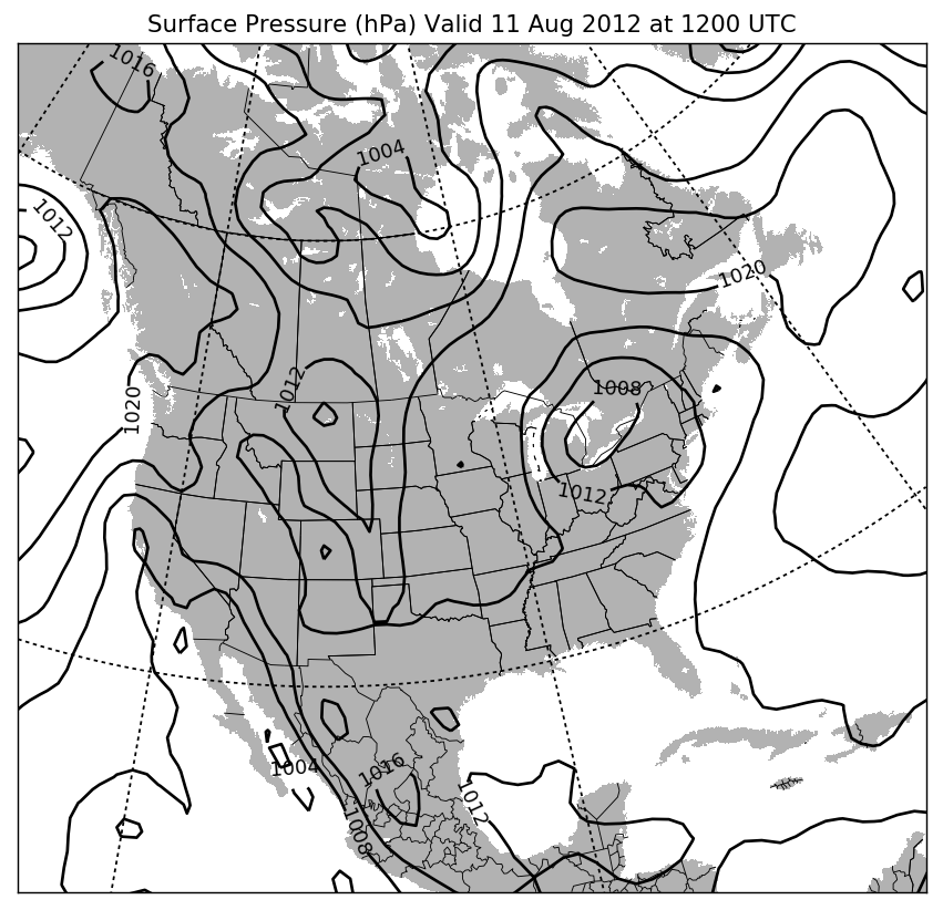
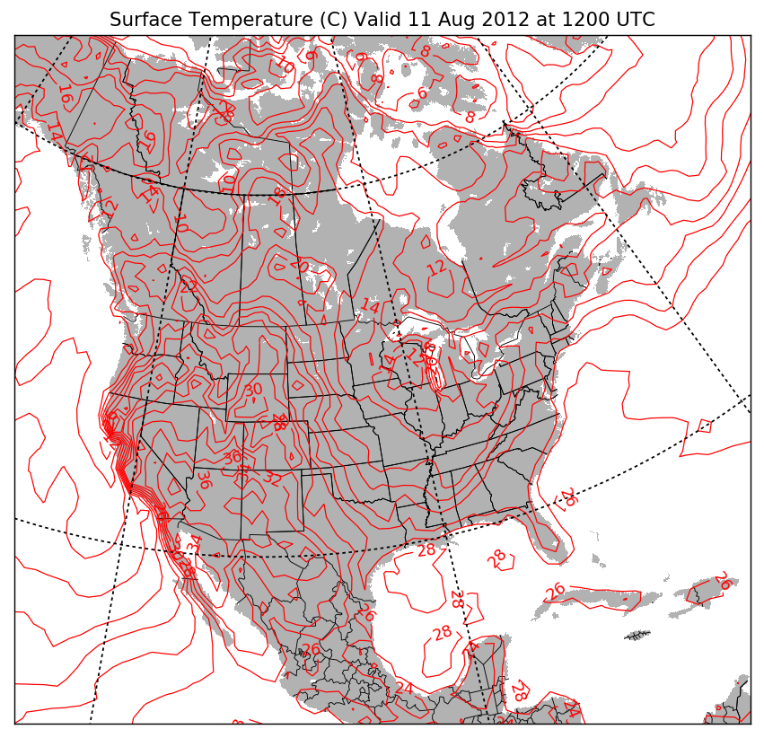
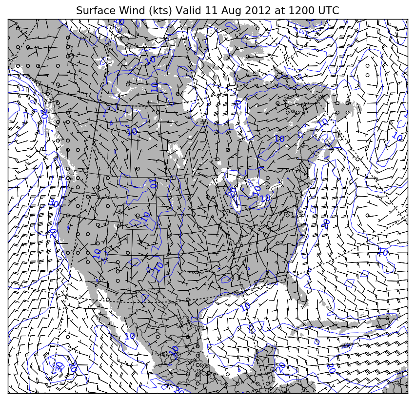
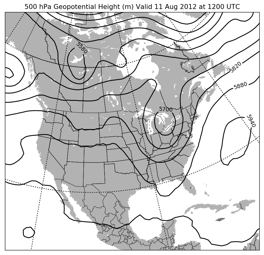
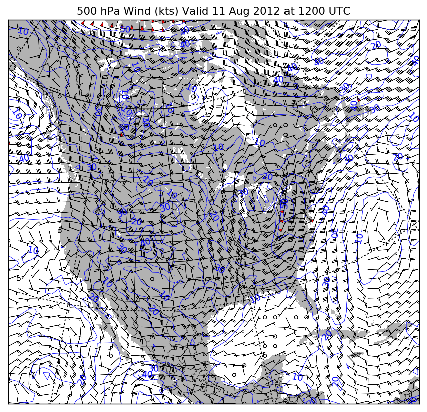
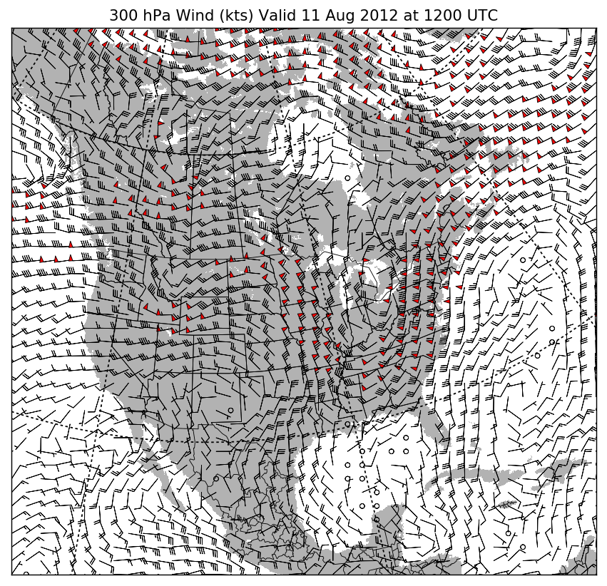
Below, you will find some sample maps I created with this script. They’re not the prettiest maps in the world, but they work. There are plenty of techniques we can use to make the maps look good enough to use in a publication, but that’s a discussion for another time.
If you want to view or download the script in its entirety, you can find it on my Bitbucket page. You can find NetCDF files to play with from the GFS model, and also on various weather data archives on the internet. Even though we have focused on North America, the GFS is a global weather model. You can run these plots for any location in the world you choose. Feel free to play around and experiment with that! Happy mapping, and happy Python-ing.