Many of you know that I did a lot of storm chasing during my time studying meteorology at the University of Oklahoma. When you chase storms, you will inevitably get yourself into some unnerving situations, and you learn pretty quickly that the best time to panic is never. That is especially true as COVID-19 cases spike across the southern United States.
Panicking only leads to making poor decisions, which in the context of storm chasing, can lead to injury and even death. You can read about my hairiest storm chasing moments, such as the time I got caught in five and a half inch diameter hail and the time a cluster of three tornadic supercells tried to merge right on top of me and cut off my only route home. Had panic set in, the outcome may have been different. My point here is that the same concept applies with the coronavirus pandemic. No matter how good or how bad things look, the best time to panic is never.
It’s Like Having the Check Engine Light Come On in Your Car
Earlier this week, the Arizona Republic used a very apt metaphor do describe the current situation: it’s like having the check engine light come on in your car. It’s telling you something is wrong and should be investigated as soon as possible, but is certainly not a reason to pull over right away and call a tow truck. Nor is it a reason to put a piece of black tape over the light.
Let’s have a look at 5 states that have made a lot of coronavirus headlines recently: Arizona, California, Florida, Oklahoma, and Texas. All of them except for California have been setting new daily case and hospitalization records left, right, and center over the past two to three weeks. We’ll look at the current and past data, as well as what to expect over the next month or so.
How Has the COVID-19 Model Performed?
Before we begin, I want to make one final point about the COVID-19 models. No matter what you are modeling, the accuracy of the predictions diminishes significantly the further out in time you go. For example, do you know how often models that are used to make our day-to-day weather forecasts are correct when they make predictions more than about 5 to 7 days out? Less than 10% of the time. You see the same phenomenon in the coronavirus models, just with a slightly different timeframe.
My coronavirus model is run twice per week and makes two predictions for 56 states and provinces in the US and Canada:
- Case counts 2 weeks from the date of the model run
- Case counts 1 month from the date of the model run
Have any guesses as to how it’s been performing since early May?
| 2 Week Projections | 1 Month Projections |
| 80% to 90% Correct | 35% to 45% Correct |
That’s a pretty stark difference. The incorrect predictions are often pretty close, but a miss is still a miss. Also, the model has underestimated over 99% of the incorrect predictions it has made since early May. In other words, when the model was wrong, the actual case count was higher than what the model predicted, which is to be expected during a COVID-19 spike. Please keep this in mind when viewing model projections in this post. You can view the full details of how the model is performing on my COVID-19 Dashboard.
All plots and maps below contain data through Thursday, 18 June, 2020.
General Overview
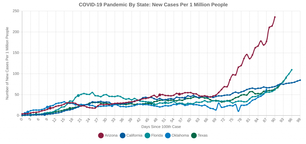
Before we dive into each individual state, let’s look at a general overview of how the five states stack up against each other. Click on any plot or map to enlarge it.
First, a map showing the change in new cases over the past 14 days:
And now, the time series plots. The new daily cases are a 7-day moving average.
Arizona
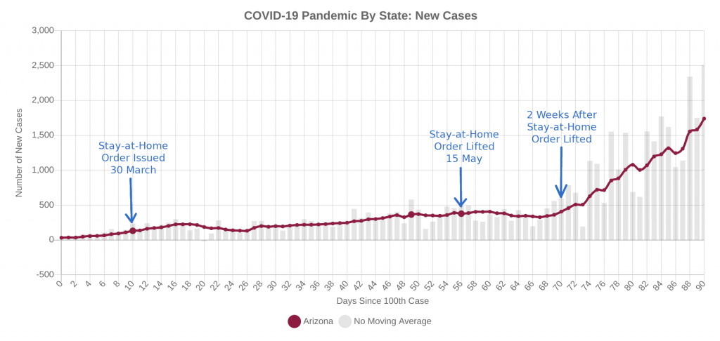
Arizona continues to be one of my biggest concerns, for reasons beyond just the fact that I live there. You can pretty easily trace the spike in case back to the state’s Stay-at-Home Order expiring on May 15th. I’ll let you decide for yourself whether or not the state opened too early.
Both hospital bed use and percent of positive PCR tests (the tests that say you currently have the virus) have been setting record highs routinely over the past week and half or so. Take a look at these numbers, direct from the Arizona Department of Health Services website.
The hospitalization statistics and percentage of positive of PCR tests are they key metrics to watch not just in Arizona, but in all of the states we’re looking at today.
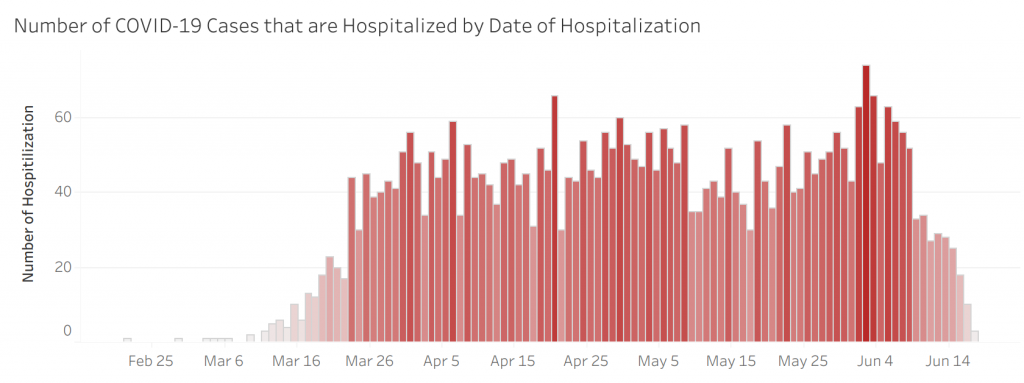
Now, while those numbers look grim, there are a few glimmers of hope. First, look at this chart of new COVID-19 hospitalizations per day. Full disclosure, though, I have heard numerous unconfirmed reports that this chart is missing data for the past week or so, and especially for the past few days.
However, I do have reason to believe that this chart is at least partially true. Look at the charts above showing the hospital beds and ICU beds in use. While they’re certainly not leveling off, the rate of increase in bed use is slowly starting to slow down. A couple days ago, Governor Doug Ducey also gave mayors the power to require face masks in public (many cities in Arizona and Maricopa County now require masks), which will also help slow the spread of the virus and dampen the spike.
Will Arizona Become the New Epicenter?
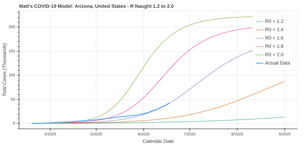
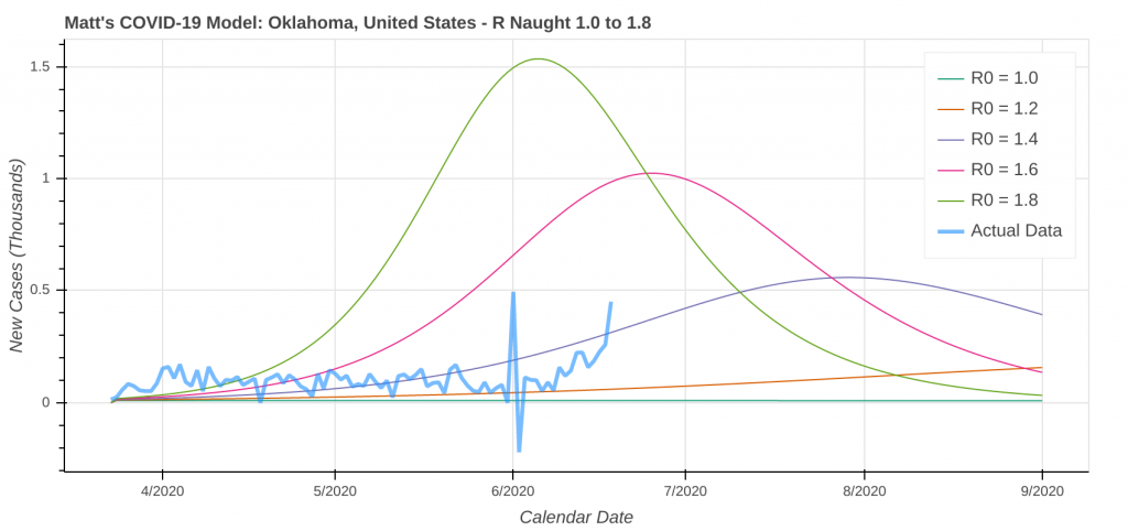
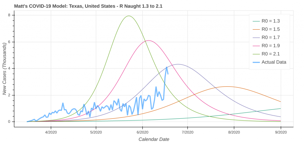
So, what should we expect going forward? Let’s look into the crystal ball and see what the model says. Don’t forget that while I ran the model out to the first of September, the accuracy of its forecasts drops significantly after the 4th of July.
My personal prediction is that while there is potential for Arizona to become the new epicenter, I think the chances of that actually happening are pretty low. I also think with face mask mandates going into effect, the chances of having to go back into a statewide lockdown or stay at home situation are low. However, should hospitals get overwhelmed, all bets are off.
California
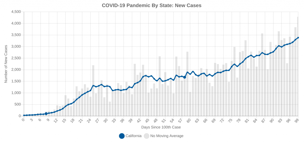
California is an interesting beast to tame on the COVID front, mainly due to its large size and its large population. At first glance, the chart of new cases doesn’t really show anything that jumps off the page at you. Instead, it just shows a steady increase in daily new cases over time.
What’s happening in California right now is actually a microcosm of what’s happening in the United States right now. Different parts of the state are peaking at different times as the epicenter moves around the state. Back in March and April, the San Francisco Bay Area bore the brunt of the COVID outbreak, while the epicenter has now shifted to southern California, primarily in the greater Los Angeles area. Here are the latest county-by-county data from this morning.
| County | Region | Total Cases | Daily New Cases |
| San Francisco | SF | 3,020 | 38 |
| San Mateo | SF | 2,678 | 25 |
| Santa Clara | SF | 3,363 | 75 |
| Alameda | SF | 4,638 | 105 |
| Los Angeles | LA | 78,348 | 1,088 |
| Orange | LA | 9,292 | 95 |
| Riverside | LA | 12,467 | 516 |
| San Bernardino | LA | 8,454 | 440 |
| San Diego | SD | 10,092 | 362 |
One very interesting observation: Los Angeles County currently has 47% of the California’s entire cases.
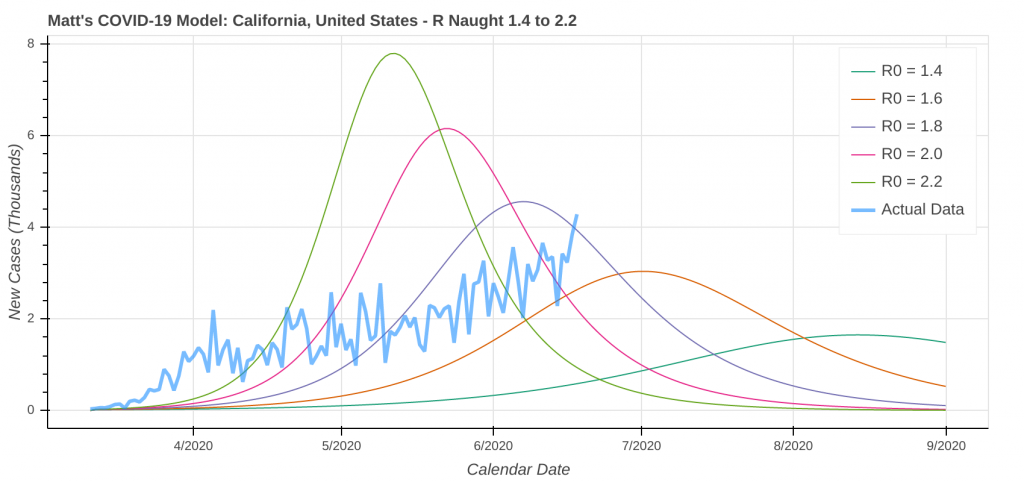
What is the model saying?
With the exception of LA County, I’m not too worried about California as whole right now. The spike you keep hearing about on the news is primarily contained to LA County and the surrounding areas, with smaller outbreaks happening in places like Fresno and the San Juaquin valley.
That being said, LA County is the most populated county in the US, so it must continue to be closely watched, especially if hospitals continue to be stretched. The whole Los Angeles area needs to we closely monitored. Governor Gavin Newsom just required masks to be worn in public statewide, but how much of an effect that has remains to be seen because many of California’s cities, including LA and many of its suburbs, already had local ordinances requiring them.
Looking into the crystal ball, I would expect the state’s steady increase to continue as the epicenter moves around the state, which will effectively cancel out the decrease in cases in other parts of the state. The model shows cases starting to level out once we get into July, but we’ll have to wait and see what happens. It’s shown that before for California and was wrong.
Florida
Oh, Florida. What are we going to do with you? You seem hell-bent on just putting the piece of black tape over the check engine light and continuing on your merry way. It’s been all over the news that Florida could be the next epicenter of COVID-19. However, note that all the reports and news headlines use the word “could”, not “will”. You can still avoid becoming the next epicenter.
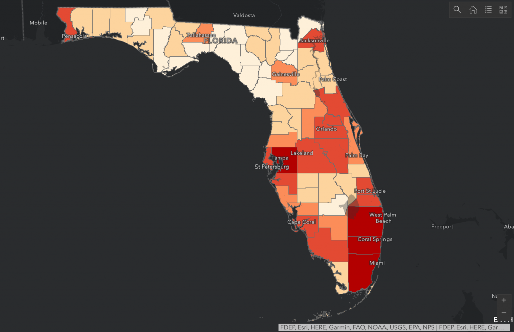
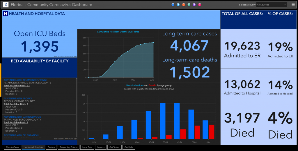
According to the State of Florida’s own COVID-19 dashboard, only 1 of its 68 counties meet the criteria to enter the next phase of reopening. The one county that does meet those requirements is Liberty County, which sits in a rural part of the Florida Panhandle west of Tallahassee.
The state’s dashboard also gives each county a letter grade for how well they are social distancing. Only 4 out of 68 counties graded higher than a C-, and all 4 of those counties got a C. If you’re looking to slow the transmission rate down, that’s where I would start. For a state that has openly admitted to doctoring its data, these numbers are pretty pathetic.
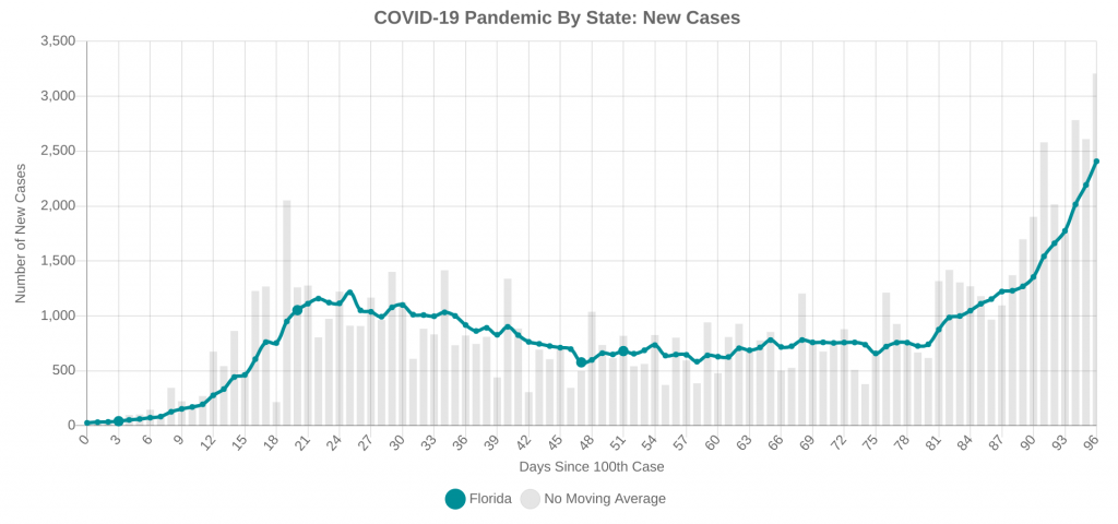
Not surprisingly, cases are exploding in cities across the state.
What’s going on in Florida hospitals?
The state’s dashboard doesn’t have a whole lot of useful information about hospitalizations, but it shows that there are 1,395 available ICU beds throughout the state. I have no idea what percentage of total ICU beds that is.
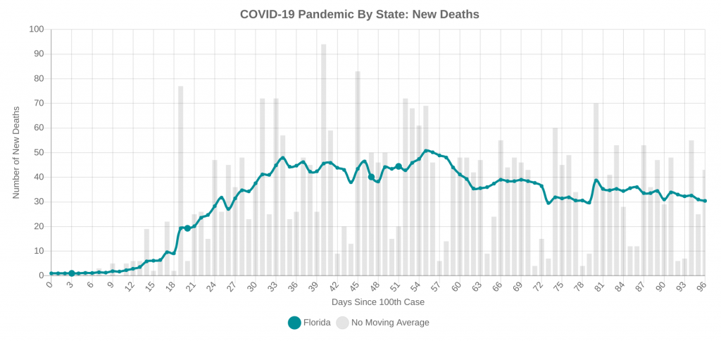
Now, there is a glimmer of hope that does come with a big “but”. The number of daily new deaths in Florida is actually going down right now…
…BUT, if you look closely at the new cases plot, you will notice that the spike in cases started at Day 80, which was 16 days ago (today is Day 96). Unfortunately, when you have an increase in cases, the increase in deaths usually lags the increase in cases by two to four weeks, which means that it’s likely coming and just hasn’t gotten here yet.
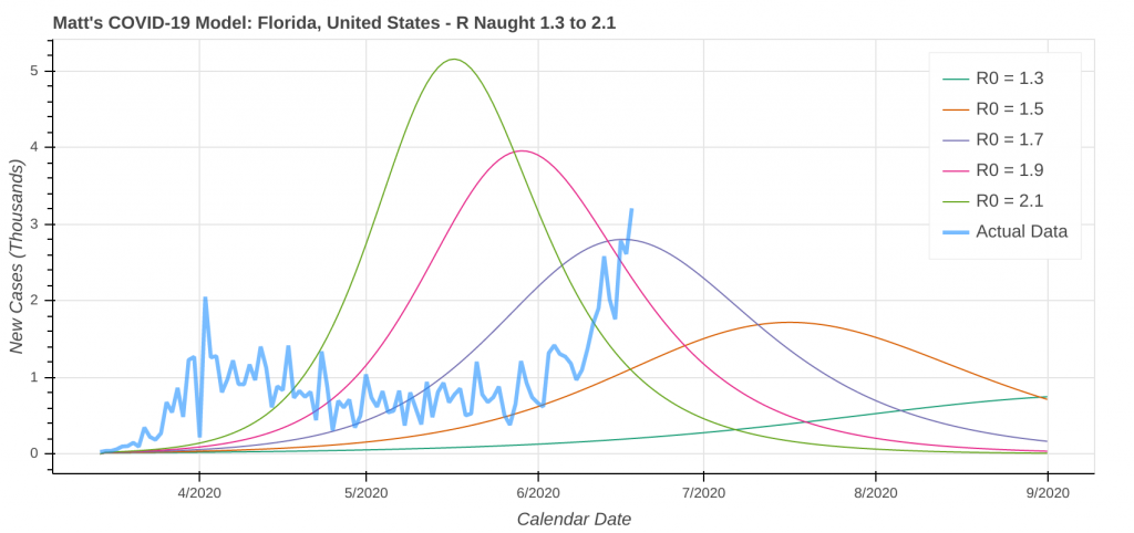
If we look into the crystal ball, here is the model’s best prediction of what’s to come. Please take note that if the state and its residents continue to do nothing about the outbreak, there will be a significant COVID-19 spike with many more cases than what the model is forecasting.
Remember, Florida, it’s not too late to do something about this. Be smart, use common sense, and don’t become the next Florida Man.
Oklahoma
This is another interesting case. Oklahoma’s numbers throughout the pandemic have been lower than the rest of the country, likely due to the lack of major population centers. However, I get the feeling that if the President wasn’t having a campaign rally in Tulsa tomorrow, there would likely be very little, if any, mention of Oklahoma’s coronavirus case numbers on the national news.
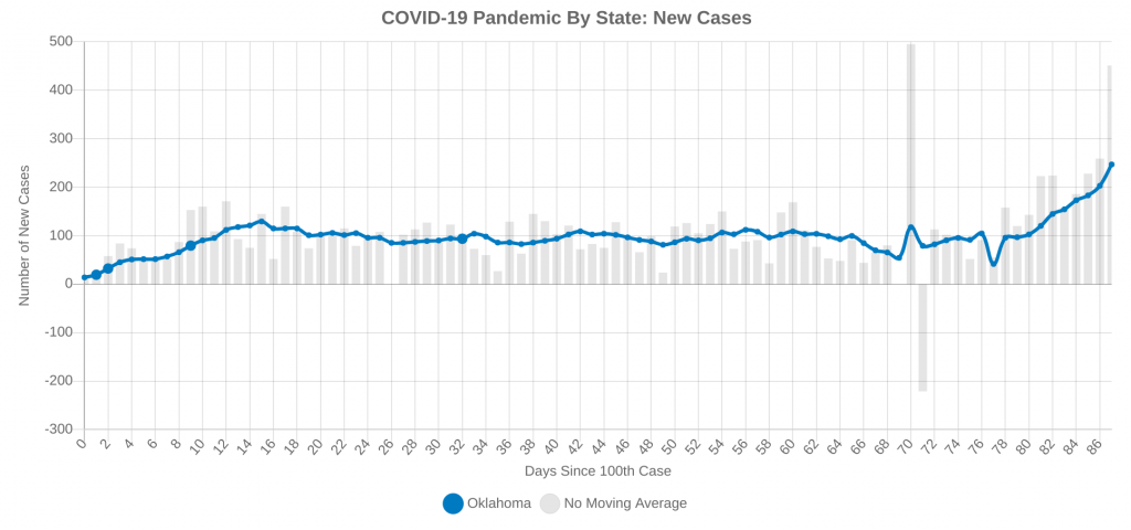
Yes, it’s true that new cases have ticked up and are at record highs, and I’m not trying to downplay this, but even these record numbers of new cases are an order of magnitude less what Arizona, California, Florida, and Texas are all seeing. Case counts are currently low enough that there is very little threat to the health care system being overwhelmed.
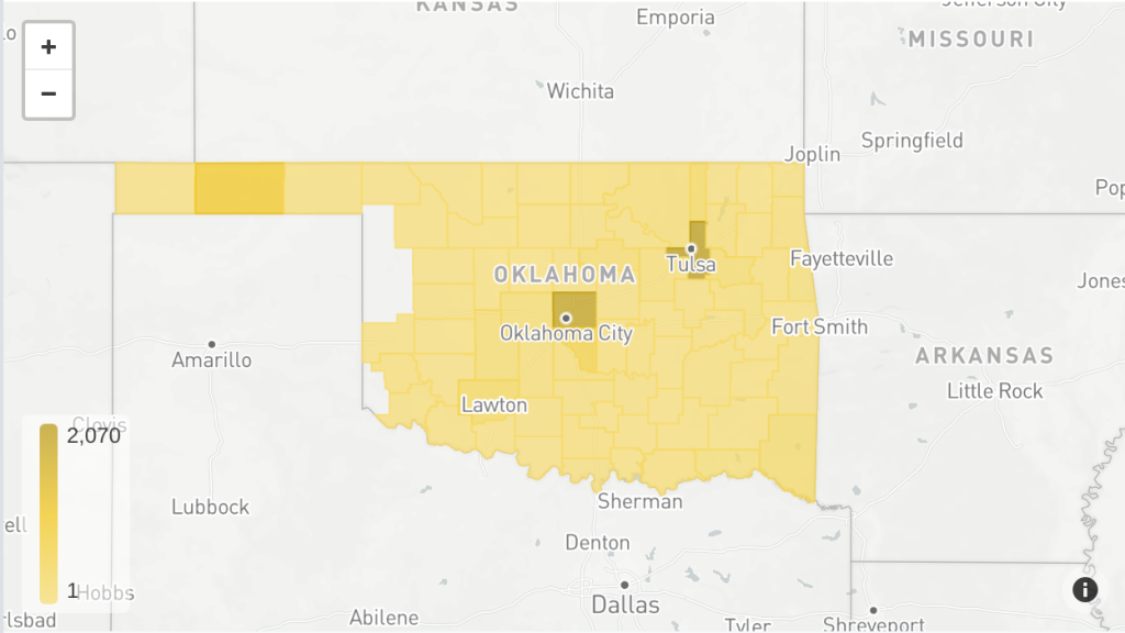
If we break things down by county, you will find that most of the state’s cases are clustered around the two major population centers: Oklahoma City and Tulsa.
An Interesting Twist that Could Seed COVID-19 Spread
Now, tomorrow’s presidential campaign rally in Tulsa is where things start to get tricky. Tulsa County currently has the highest case count in the state (2,070 confirmed cases), which account for just under one out of every four cases in the state.
The combination of the spike in COVID-19 cases with a large indoor gathering of people coming from all over the country has the potential to be a super-spreader event and seed outbreaks in other parts of the country, but it is not going to turn Oklahoma in to a coronavirus epicenter. It’s not a sure thing that it will be a super-spreader event, either, but it certainly has the potential to be. Attendees taking proper precautions is critical to keeping the super-spreader risk as low as possible.
A model that CNN ran showed that the rally could cause up to 1,000 new cases. That alone may not sound like very much, but once people go back to the various corners of the country from where they came and spreading it to friends, family, etc., that 1,000 cases can turn into a very big number very quickly. Keep that in mind whenever you’re out in public.
So what’s in store for Oklahoma? Here’s the model run, but keep in mind that it does not account for any effects of the presidential rally in Tulsa tomorrow night. If this forecast verifies, there should not be any issues with overwhelming the health care system. Residents should take the spike in COVID-19 cases seriously and be smart about taking precautions when out in public.
Texas
The Lone Star State seemed like they were trying really hard to put the black tape over the check engine light, but finally realized that doing so was a bad idea. This week, Governor Greg Abbott gave mayors the power to require masks in public. Like Arizona, many cities in Texas now require them, which I expect will slow the spike in COVID-19 cases.
While California was a microcosm of the United States, with its epicenter moving around the state, Texas is not seeing that same phenomenon. Most of Texas’ major population centers are seeing the same uptick in cases all at once.

Lubbock County 
Dallas County 
Harris County (Houston) 
Travis County (Austin) 
El Paso County 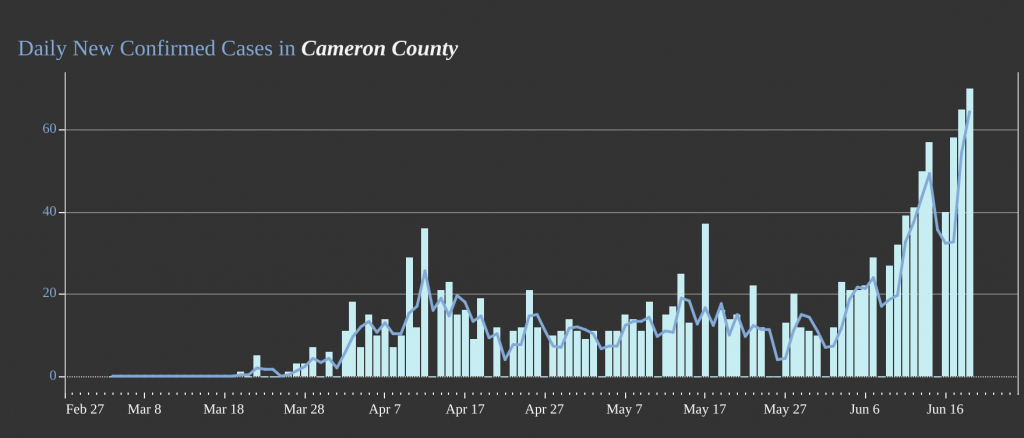
Cameron County (Brownsville)
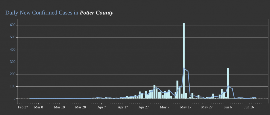
The one big exception to that rule is Amarillo, which saw a major outbreak at a meat processing plant back in May. The city put restrictions into place to curb that outbreak that were much more severe than the rest of the state, and it shows. The COVID-19 spike the rest of the state is experiencing is largely absent from Potter County data.
Hospital Statistics in Texas
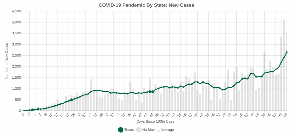
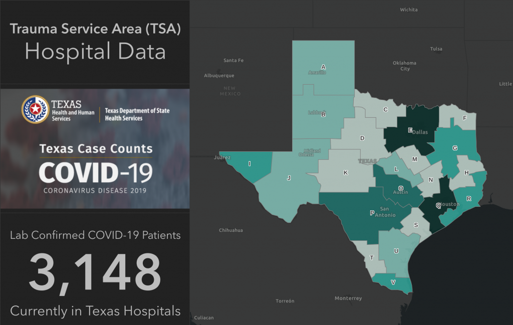
Hospitalizations are definitely trending up in Texas, and hospitals are currently 77% full, compared to 84% full in Arizona. The hospitalization data should be watched closely over the next month to six weeks. Hopefully the mask mandates will be able to keep the hospitals from having to activate their emergency or surge plans.
The good news is that if the model prediction verifies, Texas should have a pretty good chance at preventing its healthcare system from being overwhelmed, especially once the mask mandates go into effect. The big question will be when will the daily new cases start to turn the corner on the new daily cases plot. The longer it takes, the bumpier of a ride it’s going to be.
Wrapping It All Up
Whew, that was a lot of data that we covered today. Yes, that was a lot of data we absorbed, and it certainly can look pretty bad in all five states. The good news is that even if you don’t live in any of these states, we can all do our part to slow the spike by not panicking, being smart about when and how we go out and interact in public, and using common sense. Don’t wait around for your mayor, county, or governor to issue mandates. Act now. The sooner we slow the spread and bend the curve down, the sooner we can get back to our normal lives.
Top Photo: Grand Canyon National Park, Arizona – January, 2019


