COVID-19 maps and geographic information systems (GIS) are proving to be one of the best tools we have to fight the ongoing pandemic. In addition to being incredibly versatile, maps are easy to understand and can display so much more information than any bar or line chart can. This characteristic expands far beyond the reaches of the COVID-19 pandemic.
While we are primarily focusing on maps today, don’t forget that maps are just one tool in a vast toolbox. When used with other tools, they can become even more powerful. Putting that aside, let’s look at why maps are the best tool we have to fight the COVID-19 pandemic.
1. See Both the Big Picture and Local-Level Details at the Same Time
Back when I was chasing tornadoes in Oklahoma, we had several golden rules of storm chasing. The most important rule was to always pay attention to the big picture. Know what the storms in your vicinity that you are not chasing are doing. Why do you need to do that? Fair question. Here’s why.
One of the hairiest situations I got myself into storm chasing was the result of “tunnel vision” from not paying attention to the big picture. On 9 April, 2012, I got on a tornadic supercell just outside of Woodward, Oklahoma, which is in the northwest corner of the state. The storm produced the first few tornadoes I saw that season.

Almost all tornadic storms in the Great Plains move from southwest to northeast. Tornadoes typically form on the southwestern flank of a supercell, so the strategy is to set up to the southeast of the tornado and track parallel to it as it moves to the northeast. Because all of the rain and hail is north of the tornado, being south of the storm also gives you an easy escape route should you need it.
Losing Sight of the Big Picture
Unfortunately, I was so excited to see my first tornado of the year that I neglected to pay attention to the large scale system that was triggering the severe weather that day. The upper-level winds were atypical of the southern plains. Instead of going from southwest to northeast, these storms were moving from northwest to southeast. When I set up to the southeast of the storm, I inadvertently put myself right in its path. When the precipitation core inevitably swallowed me up, this was the result.

Unfortunately, in the case of COVID-19, the outcome of tunnel vision is already proving to be far more tragic than a blown-out windshield. People are paying for it with their lives. During the pandemic, I have observed instances of tunnel vision in both our elected officials and the general public.
How to Combat COVID-19 Tunnel Vision
The best way to combat COVID-19 tunnel vision is to coordinate with your neighbors. When Los Angeles County, California recently issued a stay-at-home order, there were immediately concerns that residents would travel to neighboring counties to eat, recreate, and more. Throughout the course of the pandemic, similar concerns have emanated far beyond southern California.
Here are a few examples of leaders getting it right and coordinating to combat the effects of tunnel vision.
- The governors of New York, New Jersey, and Connecticut coordinating closings and re-openings.
- California, Oregon, and Washington have coordinated some closings and re-openings as well.
- The United States coordinating with Canada and Mexico to restrict non-essential cross-border traffic.
- Border closures and travel restrictions for citizens and workers throughout the European Union
So how do COVID-19 maps factor into the equation?
On a map, going from the big picture to the local level and vice versa is easy. Just zoom in or out. This is the foundation of how maps are such a powerful tool to combat the COVID-19 pandemic.
2. Maps are Easier to Understand for the Average Joe
I consider myself an Average Joe when it comes to a lot of things. I hope you do, too. We all like to be presented with information that is easy to understand. Maps are a great way to do that, especially during the COVID-19 pandemic.
Let’s say you want to look at new case counts for your state and the surrounding states. The following two graphics show new cases counts for US States on 2 December, 2020. Which one do you find it easier to do that on?
The graph?

Or the map?
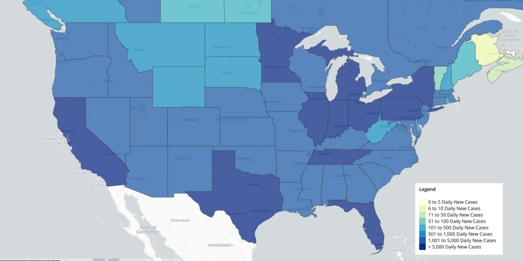
I rest my case.
3. Easily Detect Geographic Trends
Geographic trends are one of the most important metrics for slowing the spread of COVID-19, especially early in the pandemic. Stopping the virus from freely flowing in and out of your community is a significant step towards containing it. This is why all of the travel bans and restrictions have been issued.
Let’s stick with the graph versus map example we just looked at. Consider the following hypothetical situation. You’re in charge of mitigating the spread of COVID-19 in West Virginia. You need to identify where the biggest COVID-19 threats are.
If you were to look at the graph, you would need to know what states border West Virginia, as well as whether they are located north, south, east, or west of you. Then you have to find those neighboring states on the graph, since they’re listed in alphabetical order. It’s a hassle, and there’s a ton of room for error.
On the other hand, these patterns can be instantly identified using the map. Using the map, it’s clear that the states with the highest new case loads are the ones north of West Virginia. You can easily repeat this exercise to identify additional COVID-19 threats on the map, such as from air travel, as well as threats to the economy and more.
Come on, Matt, I can Identify Neighboring States on a Graph.
Okay, fair point. The geography of the US is familiar. Here’s the counter. Consider another hypothetical situation where you’re brought outside of your familiar local area and repeat the exercise.
Here is the same bar chart as above, except it’s for total COVID-19 cases in Mexico by state. Try to quickly identify the regions surrounding the State of Guanajuato that have the highest confirmed COVID-19 case counts.
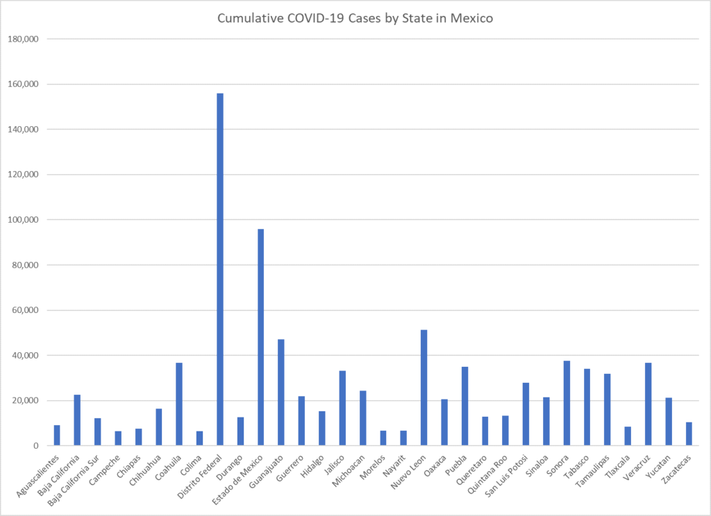
Were you able to do it? Unless you’re familiar with the layout of Mexican states, I’m guessing you probably couldn’t. Now, let’s introduce the map containing the same data as the bar chart. Try again to quickly identify the regions surrounding the State of Guanajuato that have the highest COVID-19 case counts. Guanajuato is pretty much smack dab in the middle of the country, just below the “Mexico” label on the map.
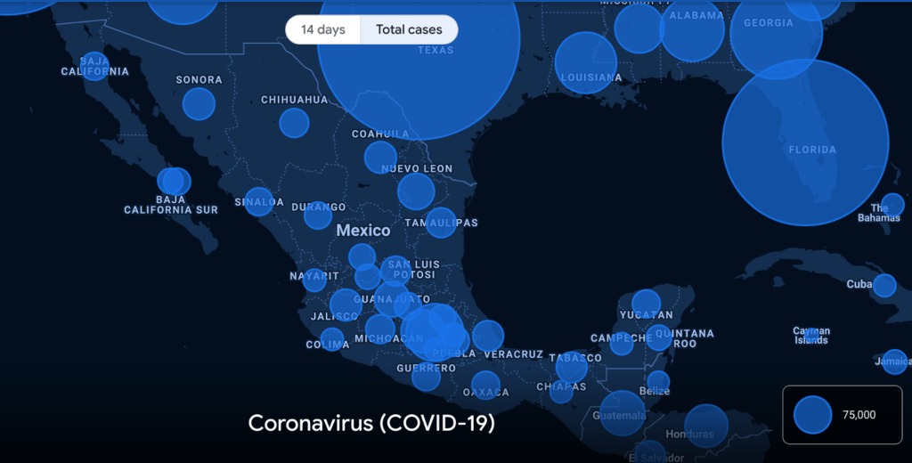
A quick look at the map shows that the highest case loads are to the southeast of Guanajuato, in the Mexico City area. Those high case loads are primarily in the State of Mexico (Estado de México) and the Federal District (Distrito Federal).
4. Analyze the Public’s Movement and Mobility Levels on COVID-19 Maps
I’m not talking about tracking people using their cell phone’s location data. That’s a debate I’d rather not get into. I’m talking about much less intrusive ways to monitor the movement of the general public. Depending on what country you’re in, these can include, but are certainly not limited to:
- Customs and Immigration
- Airport Security
- Department of Transportation Cameras
- Voluntary Surveys
- Other types of checkpoints
Analyzing these data on a map allows you to quickly and easily the mobility levels of the population. As a result, leaders can more precisely target any COVID-19 restrictions that need to be implemented or lifted. For example, did you see the map of flights over the United States in the days leading up to Thanksgiving?
5. Maximize the Efficiency and Targeting of Relief Efforts
Getting the proper relief into affected areas as quickly as possible is crucial in any disaster situation. The response to the COVID-19 pandemic is no different. A proper geospatial analysis on a map can facilitate the quick delivery of the following and more, ensuring that nothing goes to waste.
- Extra nurses, staff, and other essential workers
- Personal Protective Equipment
- Equipment required to treat COVID-19 patients, such as ventilators
- Cures, treatments, and vaccines
- Additional resources such as field hospitals and refrigerated trailers
- Economic relief to citizens and businesses
A proper geospatial analysis for expediting COVID-19 relief can be incredibly complex. Start simple with a map of COVID-19 trends.
Next, zoom in and start overlaying data that can help you pinpoint the areas that need relief. These areas can include, but are certainly not limited to the following.
- Low-income areas
- High population densities with multi-generational households
- Areas with few or overwhelmed hospitals
- Areas where the virus is surging
- Any disruptions to supply chains
Conclusion
Maps and geographic information systems are a critical tool in the response to the COVID-19 pandemic. They are powerful, versatile, easy-to-use, and provide an enormous amount of information on a single platform. At this point in the pandemic, we can only hope our leaders will make better use of COVID-19 maps.
Top Photo: Quartz Mountain State Park
Lugert, Oklahoma – January, 2012
Pingback:COVID-19 Dashboard Upgrades: 3 Phases That Will Help You Make Better Decisions