I am so excited to announce three phases of major upgrades to our COVID-19 dashboard and map. We are adding tons of new data and features that will help you better make the decisions you need to stay safe in your day-to-day life. The upgrades are being rolled out in three phases over the next several weeks. Some of the highlights include:
- Expand state/province support from 3 countries to 17
- Add support to plot and map territories, such as Puerto Rico, the Virgin Islands, and Martinique.
- Add county-level data for the United States’ states and territories
- Expand the map’s data fields from 6 to 14
Phase 1: Significantly Expand the Datasets on the COVID-19 Dashboard Map
Ever since the map launched back in April, I was not fully satisfied with the limitations on the available data as well as the lack of functionality on the map for the COVID-19 data by state and province. Once it became clear that the fall/winter wave in the United States was going to be really bad, it was time to upgrade the dashboard. The last thing I want is for people to get sick because of the lack of data and functionality on the COVID-19 dashboard and map.
The first order of business is to greatly expand the available data coverage within each country on the map. In addition to the map already displaying data by state/province for the United States and Canada, we have added support for Australia and Mexico as well. We will add even more countries in Phase 3 to bring the total to seventeen.
Next, we expanded the data fields that can be plotted on the map. We started with the old set of parameters.
- Date
- Total Cases
- Total Deaths
- New Daily Cases
- New Daily Deaths
- 14-Day Change in New Cases (Percent)
- 14-Day Change in New Deaths (Percent)
We added the following parameters.
- All original features per 1 million population
- Number of Active Cases
- Number of Active Cases per 1 million Population
- The approximate probability any one random person you run into in public is infected with COVID-19
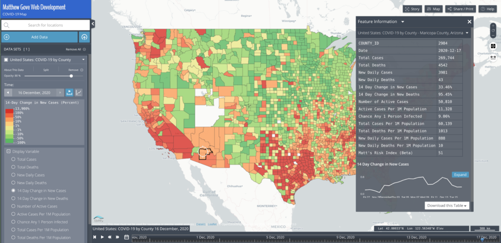
- Matt’s Risk Index
Matt’s Risk Index
With the pandemic raging so badly out of control in the United States, I wanted an easy way to assess general risk for normal day-to-day activities in public. These activities could include running errands, exercising, going to restaurants, and much more. Please be aware that I still consider the index to be in a “Beta” phase, and it will likely receive minor tweaks over the next few weeks.
The index is a weighted average comprised of the number of active cases, the odds any one person you cross paths with is infected, the daily new cases, and the 14-day trend in cases. We account for population by evaluating these parameters per capita. As a result, the index can be evaluated at the country, state/province, or county level. You can easily compare countries to provinces, states to counties, and more.

| Index Value | Description |
|---|---|
| Less than 5 | Virus is Under Control |
| 5 to 10 | Low or Marginal Risk |
| 11 to 20 | Enhanced Risk |
| 21 to 30 | Medium or Moderate Risk |
| 31 to 40 | Elevated Risk |
| 41 to 50 | High Risk |
| 51 to 60 | Critical Risk |
| 61 to 75 | Extreme Risk |
| Greater than 75 | Catastrophic Risk |
Any value greater than 40 is considered a Particularly Dangerous Situation, and your interactions with the public should be kept to a minimum.
New Map Features
Adding the time series charts to all datasets on the map and streamlining the process of selecting which parameter to display have been a top priority since April. The COVID-19 dashboard map now includes these features for all datasets.
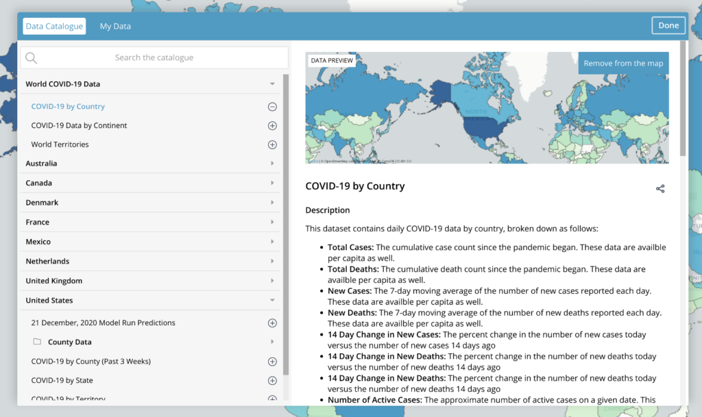
Additional Datasets
In addition to being able to plot data by country or state/province, we also wanted to greatly expand the available datasets. The data catalog now includes the following. Unless otherwise noted, there is currently support for Australia, Canada, Mexico, and the United States. We will be implementing support for additional countries in Phase 3.
- COVID-19 Data for All Territories
- Includes the four countries listed above, plus Denmark, France, the Netherlands, and the United Kingdom.
- COVID-19 Data for Counties (US only)
- Model Outputs from the most recent model run (US and Canada only)
- State or Province Mask Mandates (US, Canada, and Mexico only)
Phase 1 launched on Friday, 18 December, 2020.
Phase 2: Adding New Features to the COVID-19 Dashboard and Model
While many of the new features are on the map, the dashboard is getting a few updates as well. They may not be as significant as the map updates, but they’ll make an impact.
Chart Updates
The database rebuild allowed us to expand the countries that have data broken down by state from 3 to 17. The Plot by State tab will be updated to reflect those changes. In addition to states, you’ll also be able to plot territories’ COVID-19 data.
Additionally, the x-axis on the charts will default to showing the calendar date instead of the number of days since the 100th confirmed case. Like the other settings, there will be a menu to select which parameter you want to display on the x-axis.
Model Updates
Our COVID-19 model has gotten several minor updates over the past few weeks. A lot of things have changed since the spring, so the model has been updated to better reflect them. In addition, model output ranges have been refined to much more accurately and realistically show projected outcomes.
Since we added many more states to the database, I will be including additional states in each model run as well. I may include territories at a future date, but I currently have no plans to because case loads in the territories are so low. The states and provinces added to the model in this update include:
United States
- District of Columbia (I know, it’s not a state, but I digress)
Canada
- New Brunswick
- Newfoundland and Labrador
- Nova Scotia
Mexico
- Baja California
- Sonora
- Chihuahua
- Coahuila
- Nuevo León
- Tamaulipas
- Ciudad de México/Distrito Federal (Mexico City/Federal District)
- Estado de México
Additional states and provinces will be added to the model runs as case counts dictate.
I hope to launch Phase 2 by 31 December, 2020.
Phase 3: Add Support for Additional Countries’ States and Provinces to the COVID-19 Dashboard Map
Since we’ve expanded our dataset to now include state and provincial data for 17 countries, it would be foolish not to be able to plot those data on the map. The full list of countries spans 5 continents and by the end of Phase 3 will include the following.
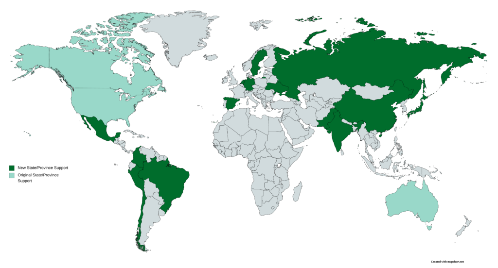
North America
- Canada
- Mexico
- United States
South America
- Brazil
- Chile
- Colombia
- Peru
Oceania
- Australia
Europe
- Germany
- The Netherlands
- Russia
- Spain
- Sweden
- Ukraine
Asia
- China
- India
- Japan
- Pakistan
Phase 3 will launch in early January, 2021.
Conclusion
As the COVID-19 pandemic continues to rage across the globe, access to complete, easy-to-interpret data and maps is critical to winning the fight against it. I hope these new updates to our COVID-19 dashboard go a long way towards accomplishing that goal. If there’s anything you feel is missing from the dashboard or map, please let me know in the comments below, and I will address them as soon as possible.
Links: Visit the COVID-19 Dashboard or the COVID-19 Map
Top Photo: The New Matt’s Risk Index Evaluated on a Map for All US Counties on 19 December, 2020