Last week, using Python GeoPandas, we generated two simple geographic maps from an ESRI Shapefile. After plotting a simple map of the 32 Mexican States, we then layered several shapefiles together to make a map of the Cone of Uncertainty for Hurricane Dorian as she brushed the coast of Florida, Georgia, and the Carolinas.
Today, we’re going to get a bit more advanced. We’re going to look at filtering and color data based on different criteria. Then, we’ll make some bar charts from the data in the shapefile. And we’ll do it all without using a GIS program. Once again, we’ll be looking at weather data. This time, we’ll be mapping tornado data from one of the busiest and deadliest tornado seasons ever.
A Review of the 2011 Tornado Season
We’re going to look at 2011 because it was one of the busiest and also one of the deadliest tornado season on record. In addition to the Super Outbreak across Dixie Alley on 27 April, there were two violent EF-5 tornadoes within 48 hours of each other in late May.
One struck Joplin, Missouri on 22 May, tragically killing 168 people. The other struck Piedmont, Oklahoma on 24 May. That tornado hit the El Reno Mesonet Site, which recorded a wind gust of 151 mph prior to going offline. To this day, that record stands as the strongest wind gust the Oklahoma Mesonet has ever recorded.

Tornado Track Data
The National Weather Service’s Storm Prediction Center in Norman, Oklahoma handles everything related to tornadoes and severe weather in the United States. In addition to its forecasting and research operations, it maintains an extensive archive of outlooks, storm reports, and more.
In that archive, you can find shapefiles of all tornado, wind, and hail reports since 1950. We’ll use the “Paths” shapefile for tornado data, but you can repeat the exercise with wind and hail data, too. From that file alone, we will generate:
- Map of 2011 tornado tracks in the Eastern and Central United States, colored by strength
- Zoomed in Map of May, 2011 tornado tracks for Oklahoma, Kansas, Missouri, and Arkansas, colored by strength
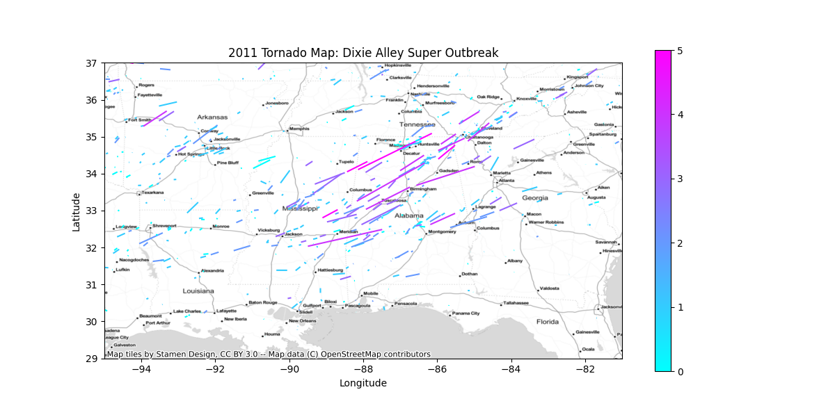
- Zoomed in map of the 27 April, 2011 Super Outbreak across Mississippi and Alabama, colored by strength
Python Libraries and Dependables
For this exercise, you’ll need to make sure you’ve installed several Python libraries. You can easily install the libraries with pip or anaconda.
- GeoPandas
- Pandas
- Matplotlib
- Contextily
Digging into the Raw Data
Before we begin, we need to figure out exactly which parameters are in the Shapefile. Because we don’t have a GIS program, we can use GeoPandas. To list all, columns, run the following Python code.
shp_path = "1950-2018-torn-aspath/1950-2018-torn-aspath.shp"
all_tornadoes = geopandas.read_file(shp_path)
print(all_tornadoes.columns)
This outputs a list of all column names in the shapefile. Because we are filtering by year, and coloring by strength, we are only interested in those columns.
yris the yearstdefines the 2-letter state abbreviationmagrepresents the tornado strength, using the Enhanced Fujita Scale
Read in the Data From the Shapefile
Before we dive into the Python code, let’s first import all of the libraries that we’ll need to make our geographic maps and graphs.
import geopandas
import pandas as pd
import matplotlib.pyplot as plt
import contextily as ctx
We’ll import the data the same way did last week.
shp_path = "1950-2018-torn-aspath/1950-2018-torn-aspath.shp"
all_tornadoes = geopandas.read_file(shp_path)
Filtering the Raw Data
Applying a filter to the raw data is incredibly simple. All you need to do is define the filtering criteria, and then apply it. You can do it in a single line of code. However, to make it easier to understand, we’ll do it in two.
Recall our filtering criteria. We’re using data from 2011.
filter_criteria = (all_tornadoes["yr"] == 2011)Applying the filter is as simple as parsing any other list.
filtered_data = all_tornadoes[filter_criteria]Finally, don’t forget to convert it to the WGS-84 projection. If you’ve forgotten it, the EPSG code for WGS-84 is 4326.
filtered_data = filtered_data.to_crs(epsg=4326)Plotting the Data on a Map
Using Python, we’re going to create three geographic maps of the 2011 tornado paths with GeoPandas.
- The eastern 2/3 of the United States
- Southern Great Plains (Oklahoma, Kansas, Missouri, and Arkansas)
- Dixie Alley (Mississippi, Alabama, Georgia, and Tennessee)
Because we’re generating three geographic maps, let’s put the map generation code into a Python function. We’ll call it plot_map, and we’ll pass it 4 arguments.
data: A list of the data we filtered from the shapefile in the previous sectionregion: One of the three regions defined above. We’ll define them as follows.- United States
- Tornado Alley
- Dixie Alley
xlim: An optional list or tuple defining the minimum and maximum longitudes to plot, in the format[min, max]. If omitted, the map will be scaled to fit the entire dataset.ylim: An optional list or tuple defining the minimum and maximum latitudes to plot, in the format[min, max]. If omitted, the map will be scaled to fit the entire dataset.
In Python, we’ll create our geographic maps with a function called plot_map().
def plot_map(data, region, xlim=None, ylim=None):
    # Put Your Code Here
Extra Arguments Needed to Generate the Plot
We’ll use the same methods we used last week to plot the data on a map. First, we’ll plot the data, passing it a few extra parameters compared to last time.
column: Tells Python which column in the shapefile to plot.- We’ll use the
magcolumn for tornado magnitude.
- We’ll use the
legend: A boolean argument that tells Python whether or not to display the legend on the map.- We will include the legend (
legend = True)
- We will include the legend (
cmap: The color map to use to shade the data on the map.- We’ll use the “cool” color map, which will shade the tornado paths from blue (weakest) to pink (strongest).
Put it all together into a single line of code.
ax = data.plot(figsize=(12,6), column="mag", legend=True, cmap="cool")Zoom In On Certain Areas
To zoom in on our three areas, we’ll need to set the bounding box. All a bounding box does in define the minimum and maximum latitudes and longitudes to include on the map. If the xlim and ylim arguments are passed to the function, let’s use them to set the bounding box.
if xlim:
    ax.set_xlim(*xlim)
if ylim:
    ax.set_ylim(*ylim)
Next, we’ll set the map’s title using the region variable we passed to the function.
title = "2011 Tornado Map: {}".format(region)
ax.set_title(title)
While we’re looking at the region, let’s also use the region to set the output filename for our map. We’ll replace spaces with dashes and make everything lowercase.
fname_region = region.replace(" ", "-").lower()The final piece of the map to add is the basemap, using the same arguments as the Hurricane Dorian cone of uncertainty. If you need to jiggle your memory bank, here are those parameters again.
ax: The plotted datacrs: The coordinate reference system, or projectionsource: The basemap style (we’ll use the Stamen TonerLite style again)
ctx.add_basemap(ax, crs=data.crs.to_string(), source=ctx.providers.Stamen.TonerLiteFinally, just save the map in png format. Incorporate the fname_region variable we defined above to give each file a unique name.
figname = "2011-tornadoes-{}.png".format(fname_region)
plt.savefig(figname)
Create Bar Charts
To further demonstrate the incredible power of Python and GeoPandas, let’s make a few bar graphs using data we’ve parsed from the shapefile. While top-line GIS programs such as ESRI ArcGIS include graphing capabilities, most do not. After this, you’ll be able to create publication-ready bar charts from shapefile data in less than 50 lines of code. And it didn’t cost you a dime.
Let’s create two bar charts.
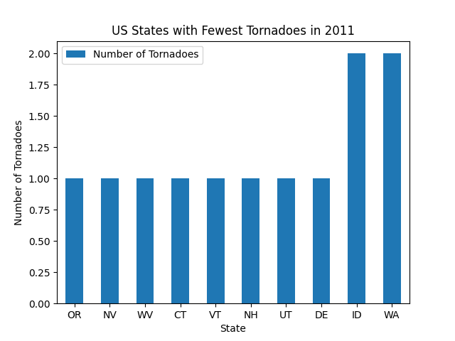
- One with the 10 states that recorded the most tornadoes in 2011
- The other with the 10 states that recorded the fewest tornadoes in 2011
Count the Number of Tornadoes that Struck Each State in 2011
Because we’re only looking for raw tornado counts, all we have to do is loop through the state (st) column in the shapefile and count how many times each state appears. First, let’s initialize a dictionary to store our state counts. The dictionary keys will be the 2-digit state abbreviations. For example, to get the number of tornadoes in Kansas, you would simply call state_counts["KS"].
states = filtered_data["st"]
state_counts = dict()
Next, all you have to do is count. Do note that the shapefile data contains data for Puerto Rico and the District of Columbia, so we will skip those because they are not states. Then, if a state is already in the state_counts dictionary, just add one to its count. If it’s not yet in the state_counts dictionary, initialize the count for that state, and set it to 1.
for state in states:
    # Filter Out DC and Puerto Rico
    if state in ["DC", "PR"]:
        continue

    # Count the Data
    if state in state_counts.keys():
        state_counts[state] += 1
    else:
        state_counts[state] = 1
Sort the Counts in Ascending and Descending Order
Sorting data is with Python is easy thanks to the sorted() function. You’ll need to pass the function several arguments.
- The raw data to sort. In our case, we’re using the
state_countsdictionary. - Which parameter to base the sorting on
- The sort function sorts from least to greatest by default, so if we’re sorting from least to greatest, we’ll need to tell Python to reverse the sort order.
fewest_counts = sorted(state_counts.items(), key=lambda x: x[1])[:10]
most_counts = sorted(state_counts.items(), key=lambda x: x[1], reverse=True)[:10]
I know this may look a little confusing, so let’s break down what everything means.
state_counts.items(): A list of key, value tuples of data in the dictionary to sort. For thestate_countsdictionary, the tuples would be(state_abbreviation, number_of_2011_tornadoes).key=lambda x: x[1]: Thekeyargument tells Python on which parameter to sort the data.lambda x: x[1]tells Python to sort based on the second element of each tuple instate_counts.items(), which is the number of tornadoes that occurred in each state in 2011.reverse=True: The graph of states with the most tornadoes in 2011 sorts the counts from greatest to smallest. Becausesorted()sorts from smallest to greatest by default,reverse=Truesimply tells Python to reverse the order of the sort.[:10]: Instructs Python to only take the first 10 items of each sorted dataset.
A Function to Generate the Bar Graphs
The most powerful aspect of the GeoPandas library is that it comes with all of the Pandas Data Analysis tools already built into it. As a result, you can perform your entire data analysis from within GeoPandas, regardless of whether or not each piece has a GIS component to it. We’ll use the Pandas library to create our bar graphs. Because we’re creating multiple plots, let’s create a function to generate each plot.
def plot_top10(sorted_list, title):
    # Code Goes Here
Our function requires two articles.
sorted_listis either thefewest_countsormost_countsvariable we defined in the previous sectiontitleis the title that goes at the top of the graph
Python’s Data Analysis Libraries Use Parallel Arrays to Plot (x, y) Pairs
Both pandas and matplotlib make heavy use of parallel arrays to define (x, y) coordinates to plot. Converting our (state_abbreviation, number_of_2011_tornadoes) tuples into parallel arrays is easy. We’ll loop through each tuple in the sorted data, put the states into one array, and put the tornado counts into the other.
states = []
num_tornadoes = []

for pair in sorted_list:
    state = pair[0]
    count = pair[2]

    states.append(state)
    num_tornadoes.append(count)
Pandas expects the data to be passed to it in a dictionary. The dictionary keys are the labels that go on each axis. Add key/value pairs to the dictionary for each parameter you’ll be analyzing.
data_frame = {
    "Number of Tornadoes": num_tornadoes,
    "States": states,
}
Next, read the data into Pandas. The index parameter tells Pandas which variable to plot on the independent (x) axis. We want to plot the states variable on the x-axis.
df = pandas.DataFrame(data_frame, index=states)Then, create the bar chart and label the title and axes. The rot parameter tells Pandas the rotation of each bar, so you can create a horizontal or vertical bar chart. We’re creating a vertical bar chart, so we’ll set it to zero.
ax = df.plot.bar(rot=0, title=title)
ax.set_xlabel("State")
ax.set_ylabel("Number of Tornadoes")
Finally, save the graph to your hard drive in png format.
figname = "{}.png".format(title)
plt.savefig(figname)
Generate the Maps and Bar Graphs
Now that we have defined our Python functions to generate the geographic maps and bar graphs, all we have to do is call them. Before we do that, let’s recall the parameters we have to pass to each function.
The plot_map() function to generate the map requires 4 arguments. If you can’t remember what each argument is, we defined them above.
plot_map(data, region, xlim, ylim)And for the plot_top10 function to create the bar graphs, we need 2 arguments.
plot_top10(sorted_list, title)Now, just call the functions. First we’ll do the maps.
# East-Central US
plot_map(filtered_data, "United States", (-110, -70))

# Oklahoma - Kansas - Missouri - Arkansas
plot_map(filtered_data, "Tornado Alley", (-100, -91), (33, 38))

# Dixie Alley
plot_map(filtered_data, "Dixie Alley Super Outbreak", (-95, -81), (29, 37))
And the bar charts…
# Highest Number of Tornadoes
plot_top10(most_counts, "US States with the Most Tornadoes in 2011")

# Fewest Number of Tornadoes
plot_top10(fewest_counts, "US States with the Fewest Tornadoes in 2011")
When you run the scripts, you should get the following output. First, the three maps. You can click on the image to view it full size.


And here are the two bar charts.

Try It Yourself: Download and Run the Python Scripts
As with all of our Python tutorials, feel free to download the scripts from our Bitbucket Repository and run them yourself.
Additional Exercises
If you’re up for an extra challenge, modify the script to plot any or all of the following, or create your own.
- 2011 Hail and Wind Reports
- Plot only significant (EF-3 and above) tornadoes
- Display the May, 2013 tornado outbreaks (Moore and El Reno) in Central Oklahoma
- Create a map of the 1974 Super Outbreak across the midwest and southern United States
- Re-create the same maps and graphs for Canada. You can download Canadian tornado track data from the Environment Canada archives.
Conclusion
If you only need to generate static geographic maps, Python GeoPandas is one of the most powerful tools you can use. It lets you plot nearly any type of geospatial data on a publication-ready map. Even better, it comes with one of the most complete and dynamic data analysis libraries that exists today.
While it’s certainly not a replacement for a full GIS suite like ESRI’s ArcGIS, I highly recommend GeoPandas if you want to avoid expensive licensing fees or have heavy data processing needs that some GIS applications can struggle with.
If you’d like to get started with GeoPandas (or any other GIS application), get in touch today to talk to our GIS experts about your geospatial data analysis. Once you get started with GeoPandas, you’ll be impressed with what you can do with it.
Top Photo: A Wedge Tornado Forms Over an Open Prairie
Chickasha, Oklahoma – May, 2013