Python is the world’s third most popular programming language. It’s also one of the most versatile languages available today. Not surprisingly, Python has incredible potential in the field of Geographic Information Systems (GIS). That potential has only barely begun to get tapped with libraries like GeoPandas.
In the past, we’ve looked at many different uses for Python, including how to make basic GIS maps. Unfortunately, the Basemap module is quite limiting on its own. My biggest complaint about it is actually how the maps look. It’s far too easy to make low-quality maps that look like they’re stuck in the 1980’s.
Enter Python’s GeoPandas Project
The Python Pandas library is an incredibly powerful data processing tool. Built on the popular numpy and matplotlib libraries, it’s a sleek combination of power, speed, and efficiency. You can easily perform complex data analysis in just a fraction of the time you could with Microsoft Excel or even raw Python.
GeoPandas is an add-on for Pandas that lets you plot geospatial data on a map. In addition to all of the benefits of Pandas, you can create high-quality maps that look incredible in any publication and on any medium. It supports nearly all GIS file formats, including ESRI Shapefiles. And do you know what the best part is? You don’t even need a GIS program to do it.
Today, we’re going to learn how to use GeoPandas to easily make simple, but stunning GIS maps. We’ll generate each map with less than 40 lines of code. The Python code is easy to read and understand, even for a beginner.
Getting Started with GeoPandas
Before getting started, you’ll need to install GeoPandas using either pip or anaconda. You can find the installation instructions from their website below. Please note their warning that pip may not install all of the required dependencies. In that case, you’ll have to install them manually.
All right, let’s dive in to the fun stuff. As always, you can download the full scripts from the Bitbucket repository.
Exercise #1: Display an ESRI Shapefile on a Map
Before we do any kind of number crunching and data analysis, we need to make sure we can load, read, and plot a shapefile using GeoPandas. In this example, we’ll use a shapefile of Mexican State borders, but you can use any shapefile you desire.
First, let’s import the libraries and modules we’ll be using. In addition to GeoPandas, we’ll be using matplotlib, as well as contextily. The contextily library allows us to set a modern, detailed basemap.
import geopandas
import matplotlib.pyplot as plt
import contextily as ctx
Diving into the code, we’ll first read the shapefile into pandas.
shp_path = "mexico-states/mexstates.shp"
mexico = geopandas.read_file(shp_path)
A Word on Projections
If we were to plot the map right now, we’d run into a major issue. Do you have any guesses as to what that issue might be? The boundaries in the shapefile will not align with the boundaries on the basemap because they use different coordinate reference systems (CRS’s), or projections. In that event, you’ll wind up with a map like this.
While the basemap is in the Pseudo-Mercator Projection, the shapefile is in the North American Datum, or NAD-83, projection. The European Petroleum Survey Group (EPSG) maintains a standardized database of all coordinate reference systems. Thankfully, you only need one line of code to convert the shapefile to the Pseudo-Mercator Projection. The EPSG code for the Pseudo-Mercator Projection is 3857.
mexico = mexico.to_crs(epsg=3857)Plot the State Borders and Basemap
With both the basemap and the shapefile in the same coordinate reference system, we can plot them on the map. First, we’ll do the shapefile. We’ll pass the plot() method three parameters.
- Figure Size is 1200×800 pixels
- 50% Transparency, or
alpha=0.5 - State borders should be black (
edgecolor="k"). Geopandas usesmatplotlibsyntax to define colors.
ax = mexico.plot(figsize=(12,8), alpha=0.5, edgecolor="k")Now, let’s use the contextily library to add the basemap. You can set the zoom level of the basemap, but I prefer to let Geopandas figure it out automatically. If you zoom in too much, you can easily crash your Python script.
ctx.add_basemap(ax)Finally, save the figure to your hard drive.
plt.savefig("mexico-state-borders.png")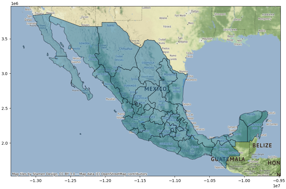
There’s still plenty of room for improvement, but our map is off to a great start!
Exercise #2: Use Layers to Map a Hurricane’s Cone of Uncertainty
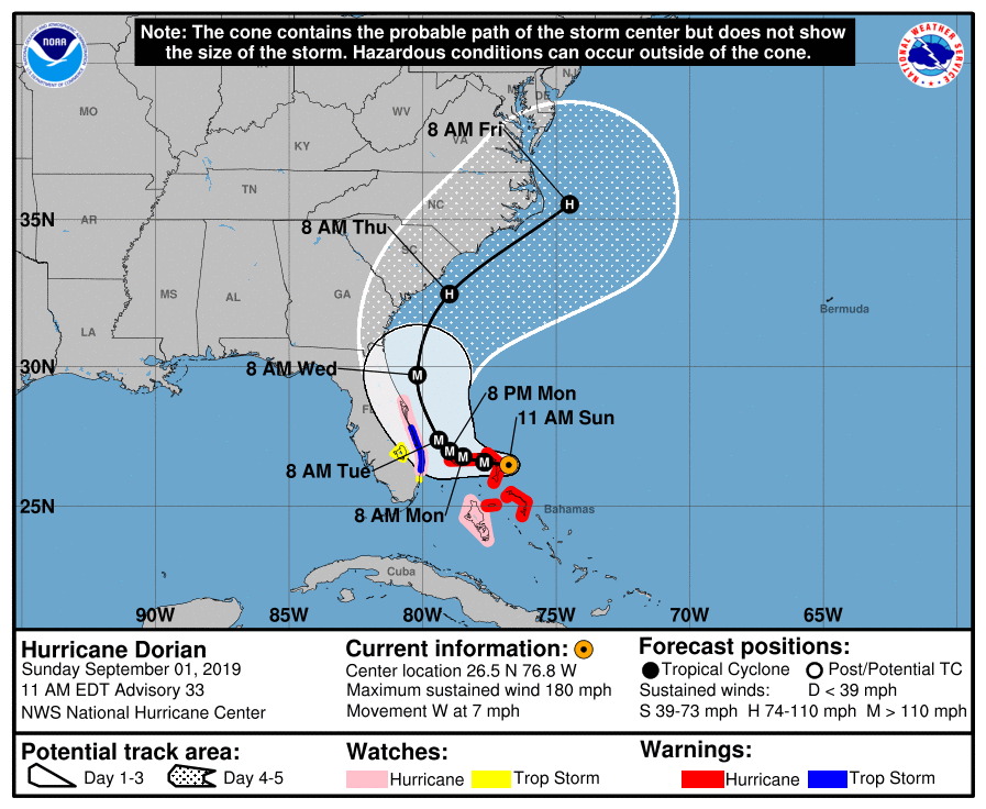
Layers make GIS, graphic design, and much more incredibly powerful. In this example, let’s stack three layers. We’ll generate a map of the cone of uncertainty of a hurricane. If we can generate the plot quickly, warnings and evacuation orders can be issued, and we can save lives. We’ll look at Hurricane Dorian as it bears down on Florida and the Bahamas in 2019.
The National Hurricane Center GIS Portal
The National Hurricane Center maintains a portal of both live GIS data as well as archives dating back to 2008. While I included the Hurricane Dorian shapefiles in the Bitbucket repository, I encourage you to browse the NHC archives and run our script for other hurricanes. Their file naming system can be a bit cryptic, so you can look up advisory numbers in their graphics archive.
Using the Hurricane Dorian shapefile as an example, here’s how the filename breaks down. The filename is al052019-033_5day_pgn.shp
al: Atlantic Hurricane05: The fifth storm of the season2019: The 2019 calendar year033: NHC Advisory #335day: 5-Day Forecastpgn: The polygon of the cone of uncertainty.
The NHC also provides shapefiles for the center line and points of where the center of the hurricane is forecast to be at each subsequent advisory. We’ll use all three in this example.
Python Code
Like the Mexico map, let’s start by importing the modules and libraries we’ll be using.
import geopandas
import matplotlib.pyplot as plt
import contextily as ctx
There are three components of the cone of uncertainty: the polygon, the center line, and the points where the center of the storm is forecast at each subsequent advisory. Each has its own shapefile. We’ll use a string substitution shortcut here so we don’t have to retype the filename three times. The .format() method substitutes the parameter passed to it into the curly brackets in the filepath.
SHP_PATH = "shp/hurricane-dorian/al052019-033_5day_{}.shp"
polygon_path = SHP_PATH.format("pgn")
line_path = SHP_PATH.format("lin")
point_path = SHP_PATH.format("pts")
Now, read the three shapefiles into GeoPandas.
polygons = geopandas.read_file(polygon_path)
lines = geopandas.read_file(line_path)
points = geopandas.read_file(point_path)
For the projections, we’re going change things up slightly from the Mexico map. Look at the x and y-axis labels of the Mexico map. They’re in the units of the projection instead of latitude and longitude. Instead of using the pseudo-mercator projection let’s use the WGS-84 projection, which uses EPSG code 4326. WGS-84 uses latitude and longitude as its coordinate system, so the axis labels will be latitude and longitude.
polygons = polygons.to_crs(epsg=4326)
lines = lines.to_crs(epsg=4326)
points = points.to_crs(epsg=4326)
Layering the Shapefiles on a Single Map
Before plotting the shapefiles, think about how you may want to color them. Because we’re dealing with a Category 5 hurricane that’s an imminent threat to population centers, let’s shade the cone red. While we’re at it, let’s make the center line and points black so they stand out.
The facecolor parameter defines the color a polygon is shaded. We’ll also make the cone more transparent so you can see the basemap underneath it better. That way, there’s no doubt as to where the storm is heading.
To stack the layers on a single map, define a figure (fig) variable with the initial layer. Then reference that variable to tell GeoPandas to plot each subsequent layer on the same map (ax=fig).
fig = polygons.plot(figsize=(10,12), alpha=0.3, facecolor="r", edgecolor="k")
lines.plot(ax=fig, edgecolor="k")
points.plot(ax=fig, facecolor="k")
Since this map would be published to the public in the real world, let’s spruce it up with a title and axis labels so there are no doubts about our warnings and messaging.
plot_title = "Hurricane Dorian Advisory #33\n11 AM EDT      1 September, 2019"
fig.set_title(plot_title)
fig.set_xlabel("Longitude")
fig.set_ylabel("Latitude")
Correctly Project the Basemap into WGS-84
The last map layer is the basemap. Because the basemap is not in the WGS-84 projection by default, we’ll need to pass that as well. To avoid type-o’s, we’ll reference it from one of the shapefiles that’s already in the WGS-84 projection. We’ll also manually set the zoom level to optimize the size and placement of state and city names on the basemap.
ctx.add_basemap(fig, crs=polygons.crs.to_string(), zoom=7)Finally, save the figure to your hard drive.
plt.savefig("hurricane-dorian-cone-33.png")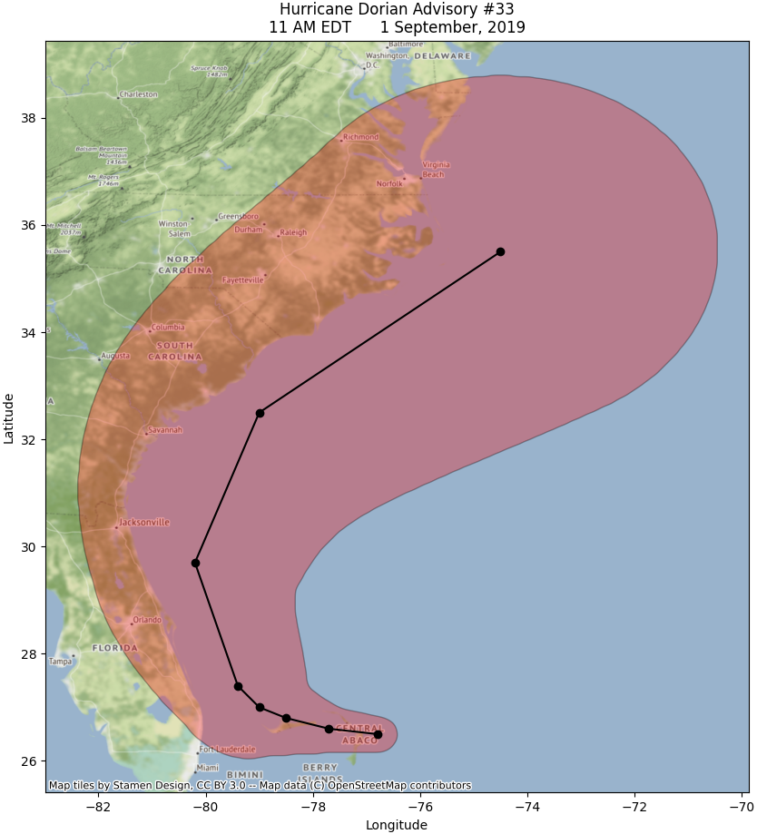
Plenty of Room for Improvement
That’s a perfectly fine map, but I believe we can do better. While the cone itself looks great, the basemap leaves a bit to be desired. City and state labels are hard to read, especially when they’re inside the cone. The basemap looks blurry, no matter the zoom level you set it too.
Additionally, the green terrain draws the eye away from the cone. In emergency situations like a major hurricane making landfall, you want to convey a bit of urgency. The red just doesn’t “pop” off the page.
So how do you fix the map to convey more urgency? Change the basemap. The terrain is too distracting. Ideally, when you look at the map, you should instantly be able to identify the map’s location using the basemap. After that, though, the basemap should “fade” into the background, allowing your reader to focus on the data. Using muted or greyscale colors on the basemap is the best way to accomplish that.
Thankfully, GeoPandas provides a good selection of basemaps. Have a look at the basemaps in that link (at the bottom of the page). Can you identify any basemaps that use muted or greyscale colors? The one that catches my eye is called “Stamen Toner Lite”.
Updating Our Python Code
Updating our script is easy. When you call the add_basemap() method, you can specify which basemap you use by passing it the source parameter.
ctx.add_basemap(fig, crs=polygons.crs.to_string(), source=ctx.providers.Stamen.TonerLite)After running the script, the difference is striking. It’s amazing the difference just changing a few colors makes.
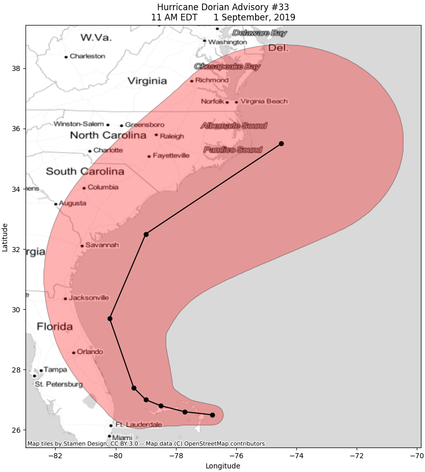
So how did we do? Instantly identify the location on the map? Check. Eye instantly drawn to the red? Check. The red pops off the page? You bet. For a final comparison, here’s the actual graphic from the National Hurricane Center. I’ll let you decide which map you like best.
The Hurricane Center actually provides all of the GIS data and layers to recreate their official advisory graphics. Unfortunately, that’s outside the scope of this tutorial, but we’ll create those maps in a future lesson.
Pro Tip: Use this Python script in real time this hurricane season. You just need to change the shapefile path to the live URL on the National Hurricane Center Website.
Conclusion
It wasn’t too long ago that you needed expensive GIS software to make high-quality, publication-ready figures. Thankfully, those days are forever behind us. With web-based and open-source GIS platforms coming online, geospatial data processing is not only becoming much more affordable. It’s also gotten exponentially more powerful.
This tutorial doesn’t even begin to scratch the surface of what you can do with Python GeoPandas. As a result, we’ll be exploring the GeoPandas tool much more as we go though this summer and into the fall.
In our next tutorial, we’ll be analyzing data from one of the busiest and deadly tornado season in US history. Make sure you come back later this month when that drops. In the meantime, please sign up for our email newsletter to stay on top of industry news. And if you have any questions, please get in touch or leave a comment below. See you next time.
Top Photo: A Secluded Stretch of Beach on the Intracoastal Waterway
St. Petersburg, Florida – March, 2011
Pingback:Python Tutorial: Create Geographic Maps and Graphs from a Shapefile