The hero image has been around for decades. However, it didn’t catch on in modern web design until only about 10 or so years ago. If you’re unfamiliar with the term, a hero image is the large banner image you see at the top of websites that takes up most, if not all, of the window when you first load the site. A heading, a very short description, and a call to action usually accompany them.

When used correctly, a hero image is a great way to make positive first impressions that instantly builds credibility and trust for your brand. Given the popularity of hero images, it’s no surprise that many businesses and organizations that use them often feel like they could be getting more from them. Unfortunately, when you’re dealing with graphics and images, all it takes is one minuscule misstep to send your audience running for the exits.
1. Your Hero Image is not Telling Your Story
They say a picture tells a thousand words. That’s especially true with hero images. In fact, the less text that accompanies them, the better. However, keep in mind that reducing the amount of text shifts even more of the burden to your hero image. As a result, it puts even more pressure on you to ensure everything is perfect.
Your hero image should tell your story. Without even reading the text, your audience should have a pretty good idea of as many of the following as possible.
- What you are selling or showcasing
- Personality of your brand
- Your brand’s mission and/or values
You can find some spectacularly terrible examples of web design from just a quick Google Image search. In this screenshot, can you figure out what this company does without reading any of the text?
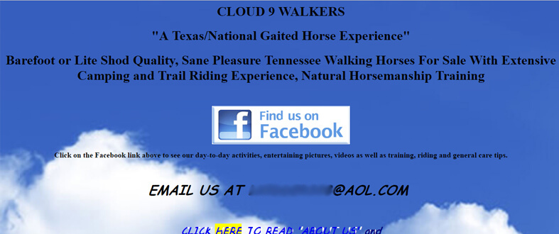
Put aside the font and color choices for a sec. A grainy image of a couple puffy clouds tells us nothing about the company! At first glance, you’d have no idea the website was about horses unless you read the text. What makes it even worse is that after reading the first two lines of text, you still have no idea what they do. It’s not until you get to the third line that they reveal that they sell horses.
So how do they make it better? First and foremost, the hero image should have an image of one of their horses. Then add a little personality. If they’re selling show horses, put a picture of one of their horses at a show. Selling to a summer camp? How about a picture of a kid on a horse actively engaging with an instructor? Anything is better than the clouds.
2. There’s No Clear Call to Action
I’ll be the first to admit, I have been guilty of this in the past. Without a call to action, your audience has reached the end of the road. And it’s often a dead end road. With no clear indication of where to go, a small fraction of your audience will poke around your navigation menu. A few more will turn around and back up. But the vast majority of visitors will simple hit the red “X” in the corner and leave. The lack of a clear call to action is the leading cause of prospects exiting your sales funnel.
A Minor Detail Makes a Huge Difference
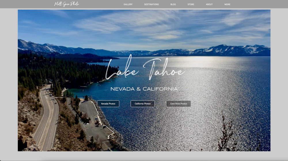
We can actually use on of my own websites to demonstrate the effect of the lack of a call to action. The Matt Gove Photo site uses a large hero image on the home page with links to my most recent adventures. Because the site is focused on travel and outdoor adventure, the heading and subheading reference the specific adventure and the state or country in which it’s located. Underneath, you’ll find the call to action: links where you can view photos, blog posts, videos, and more. Now, how would you react if you landed on the site and those calls to action had suddenly disappeared?
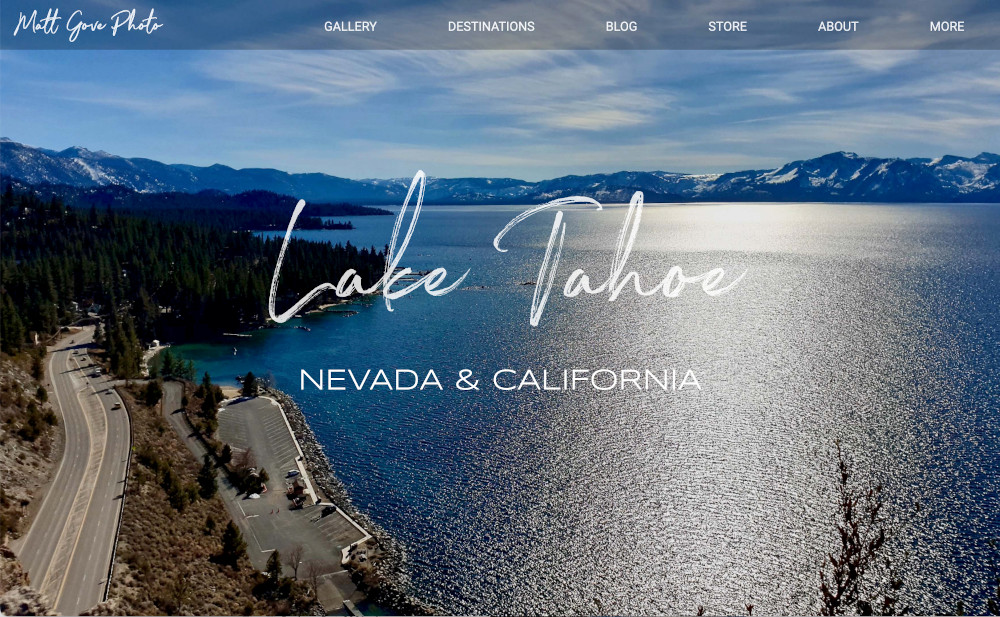
When you look at that hero image, you really want to see the rest of the photos. But without a call to action, you have nowhere to begin. You’d have to go searching through the whole photo gallery to find them. I don’t know about you, but I’m far too lazy for that. I’d have a quick scroll through the home page and then probably leave.
Thankfully, that example is purely hypothetical. If you visit the site, rest assured that the calls to action are all still there.
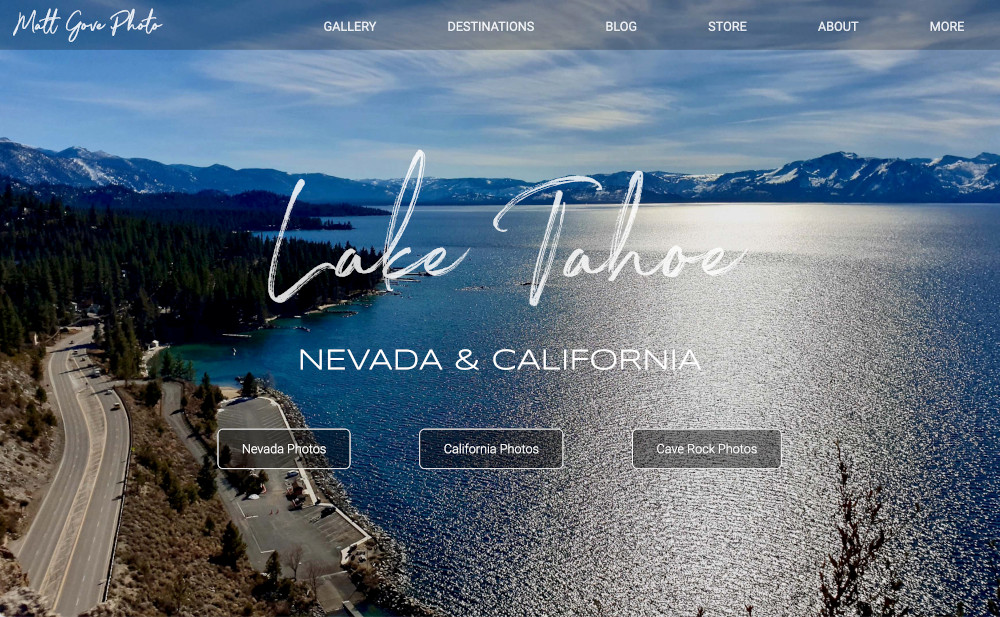
Amazing how such a small detail can make such a big difference, isn’t it?
Can’t Think of a Good Call to Action? Here’s What to Do.
So what should you do if you can’t think of a good call to action? Or maybe there actually is no logical path to your next step? When in doubt, give these a try. Your goal here is to keep your audience engaged, not make a sale.
- Signup form for your email list, with a free giveaway to encourage people to sign up
- An exclusive offer you won’t find anywhere else on the site
- List of references where they can learn more about you or the website’s topic
- A link to book an appointment, meeting, or phone call with you
- Links to follow you on social media
3. There are Too Many Calls to Action
On the flip side, it’s easy to get caught up and include too many calls to action. In an ideal world, the clearest call to action you can make is to only have one. Having two is okay, especially if one is a “Learn More” link. However, three is pushing it in many circumstances, unless there is a clear and logical reason for it. On the Matt Gove Photo home page, that’s the case. The photos are clearly divided into three parts.
- The turquoise waters and sandy beaches on the Nevada side of Lake Tahoe
- The rugged cliffs and deep waters on the California side
- My hike up to the top of a cliff to take aerial photos.
Under no circumstance should you have more than three calls to action associated with your hero image. Even with three, you risk overwhelming and confusing your audience with too many choices. Unfortunately, when you have too many choices, the one you make most often is simply to leave.
Let’s back up in time for a sec. We’ll go back to 2013. At the time, I had little experience when it came to web design and web development. Not surprisingly, I tried to cram way too much into the home page. To say it overwhelmed you with choices is an understatement. Not to mention I needed a few lessons in color theory.
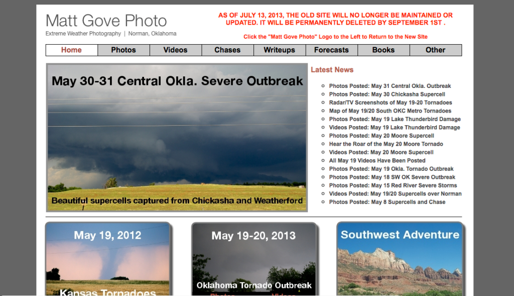
Back in the present day, I cringe big time looking at that. You should too. But we must learn from our mistakes and experiences. My how things have changed since then.
4. Too Much Text or Copy Muffles the Effectiveness of Your Hero Image
As we discussed at the beginning, your hero image should do most of the heavy lifting for getting your message across. Keep your text to a bare minimum. It should consist of no more than:
- Main Heading
- Subheading
- Short desciption – 1 or 2 sentences
- Call(s) to Action
There is once exception to this rule when it’s okay to write more than a couple short sentences: coming soon ore pre-launch pages. The reason why? You need to be able to describe both what is coming soon as well as the benefits your audience will get once it launches. If you can do it only one sentence, more power to you. But for most of us, it takes a short paragraph.
5. The Contrast of Your Hero Image is High, so You Can’t Read the Overlaid Text
If you’ve ever tried to overlay text over any photo of the outdoors, you’ve likely run into this issue. No matter which color you choose for the text, there’s part of the image where you can’t read it. Your first thought may be to make the text multiple colors, but that never looks professional.
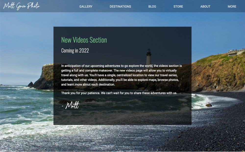
Let me let you in on an industry secret. Okay, it’s not really a secret, as just looking at the “Videos Coming Soon” page in the screenshot above gives it away. If you put a semi-transparent overlay on top of the image, the overlay mutes the effect of the high contrast and lets you easily read the text without having to change colors or squint at it from a weird angle. You want to find the perfect balance where the text is easy to read, but you can still clearly see what the image is behind the overlay.
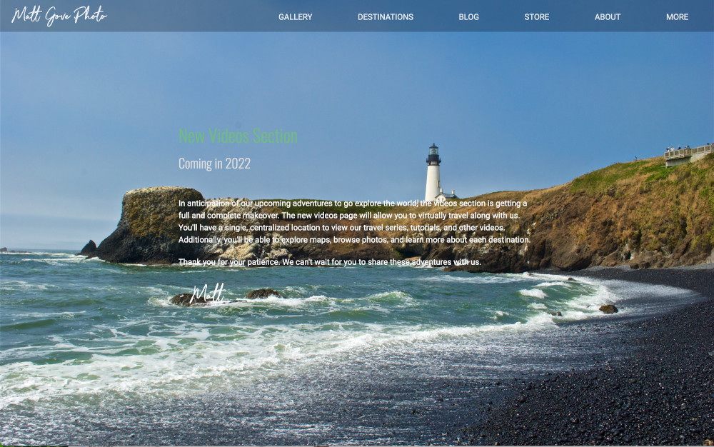
For comparison, here’s the same “Videos Coming Soon” page with the semi-transparent overlay removed. Quite a difference, isn’t it?
6. Your Hero Image is too Small
There are two ways you can go with regards to size. First, the resolution of your photo may be smaller than the resolution of your screen. For making a professional, trustworthy first impression, it’s a complete disaster if that happens. Not only does such a mistake make you look like an amateur, it also looks like you just don’t care.
Now, I intentionally shrunk the image in a development environment to generate that screenshot. However, if you are dealing with very high-resolution screens (larger than 4K), you may run into an issue where your large hero image starts to adversely affect your page performance. There are a couple ways around it, both of which I employ on the Matt Gove Photo home page.
- Use JavaScript to asynchronously load the image at the same time the rest of the page loads. In other words, you load the page without the image and the image simultaneously.
- Use the
background-size: coverCSS property to ensure that both dimensions of the hero image remain greater than or equal to the dimensions of the screen. Be aware that this can make your hero image grainy if its resolution is not optimized for larger screens.
Second, your hero image may not be taking up enough real estate on the page. In that case, you can easily argue that it’s no longer a hero image, but that’s a discussion for another day. Your hero image should take up the entire screen regardless of its size, orientation, and resolution. If your viewer’s eye is not immediately drawn to it, you’re doing it wrong.
You Can Shrink Your Hero Image to Tease What’s Below the Fold
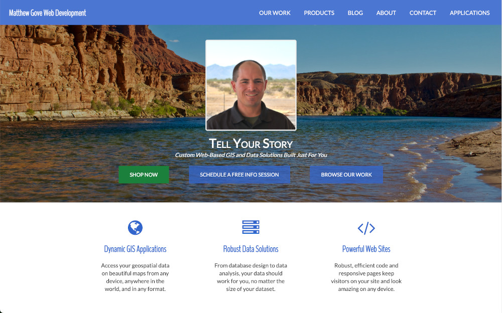
There is one scenario where it’s perfectly okay to shrink your hero image: to tease what’s below the fold (the content you have to scroll down to see). If you have a look the next time you buy something online, you’ll find many businesses and e-commerce sites apply this strategy. I use it on my business’ website, too.
7. Your Hero Image is a Low Quality, Under or Overexposed Photo
Your hero image should be one you would frame to hang up in your home or office. People should be oohing and aahing over it. Don’t use crappy images. Ever. If your photography skills aren’t up to snuff, you should either license a photo or hire a professional photographer to take and/or process your photos for you.
8. Your Unoptimized Hero Image is Suffocating Your Website’s Load Time
When your audience logs onto your website or application, they expect it to load. Fast. If your site takes more than a few seconds to load, you can kiss your audience goodbye. They won’t wait around for it to load. And losing your audience isn’t your only worry. Search engines will punish your website if they detect it’s unnecessarily slow.
Unfortunately, we’re barreling right towards a Catch 22. Large, and often bloated, images are the #1 cause of slow websites. So how do you maintain that lightning fast load time while at the same time being able to use beautiful, high-quality hero images?
- As we discussed a few sections ago, use JavaScript to asynchronously load the image. That way, the rest of the page loads without the extra weight of the image. At the same time, JavaScript loads the image and inserts it into the page at the same time the page is loading.
- Save your hero image in jpeg format. Other formats, such as png, are much larger and are not optimized to be used as hero images.
- Your hero image should not be larger than 4K resolution (3840 x 2160). This recommendation will likely change in the future, but screens larger than 4K are so rare these days, it’s not worth it yet. Consult your analytics to find out what screen sizes your audience uses. Then optimize your hero image for those screen sizes.
- Use a separate hero image that’s optimized for mobile devices to speed up mobile users’ performance significantly.
9. You’re Using Multiple Hero Images
Hero images were designed to be used one at a time, and one per page. If one hero image is bogging down your website, imagine what several will do. In addition to the performance issues, you risk overwhelming your audience with choices if you use multiple hero images on the same page. And we all know what happens when you do that.
In addition, sliders and carousels stopped being popular in 2010. Don’t use them. Search engines have a brutally difficult time crawling them, which can have a profoundly negative effect on your search engine optimization. Most SEO and conversion experts agree that they have little use 99% of the time. In addition to bogging down your site, the statistics just don’t justify their use anymore.
| Slide | Amount of Clicks |
|---|---|
| First Slide | 90% |
| Second Slide | 8.8% |
| Third Slide and Above | 1.7 to 2.3% |
10. A Hero Image May Not Be Right For You
If you feel you’ve done everything right with your hero image and still aren’t getting conversions, it may mean that hero images aren’t for you. There’s nothing wrong with that. Maybe you have home page content that is constantly being updated. Have a look at any news site out there. None of them use hero images. The same goes for certain e-commerce businesses. Amazon, Walmart, Home Depot, and Best Buy don’t use them, either.
If you don’t feel hero images right for you, don’t use them. Yes, they’re all the hype right now. And yes, they can be absolutely gorgeous. But they’re not for everyone. You’re the only one who can make the decision as to what’s best for you.
Conclusion
Well, that’s about enough butchering of my own websites as I can take. When used correctly, hero images can convert at an incredible rate and boost your credibility to levels you didn’t think possible. Unfortunately, that’s an incredibly difficult needle to thread. Hero images are astonishingly easy to screw up. I’ve been building websites since 2008 and I still find new ways to make mistakes.
However, we must continue to learn from our mistakes. Use analytics to your advantage. They’ll tell you why your hero image is not converting. Please reach out to us if you need any help. With our expertise in data science, web development, and graphic design, we’ll help you process your analytics and make sure that your hero image becomes a magnet for leads. The worst thing you can do is let it frustrate you.
Top Photo: A Desolate Road to Nowhere
Death Valley National Park, California – February, 2020