Interactive maps are one of the most powerful tools available to travel bloggers today. Unfortunately, far too many travel bloggers today are either using interactive maps incorrectly or not using them to their full potential. As a GIS expert, data scientist, and travel blogger myself, it pains me greatly when I see so many crappy maps on travel blogs. There is so much potential going to waste. As a result, I want to help you, the travel blogger, realize the full potential of your interactive maps. At the very minimum, you’ll see more traffic, retain more visitors, and make your website easier to navigate.
What Makes a Good Interactive Map?
Regardless of what industry you’re in, a good interactive map is easy to understand, offers an intuitive user experience, and draws the user’s focus to the data on the map. One of the best examples of an interactive map is the RadarScope application, which we covered in detail last month in 6 Powerful Weather Applications for Stunning Landscape Photography. If you’re not familiar with it, RadarScope is an application that plots weather radar data, severe weather warnings, and much more on a map.


So how exactly does RadarScope do it so well? When I look at the maps in the screenshots above, I make a few key observations about what makes it such a powerful interactive map, even without having access to its interactivity.
- Your eye is immediately drawn to the radar data on the screen.
- The basemap is simple enough that you instantly know where the storms are, while at the same time fading into the background and not distracting you from the data on the map.
- RadarScope’s chosen color scheme is easy to understand because it’s the industry standard for the weather and meteorology field.
- The design of RadarScope’s user interface is timeless. The last two screenshots in the above gallery are from the El Reno (31 May) and Moore, Oklahoma (20 May) tornadoes in 2013. The remaining screenshots were taken between 2017 and 2021.
You Can Bring That Same User Experience to Your Travel Blog Without Breaking the Bank
Thankfully, there are plenty of tools and applications available today to bring a similar mapping experience to your travel blog. Best of all, many are free and open source, so you don’t have to spend your hard-earned cash on expensive licensing fees. However, before we look at solutions, let’s have a look at the problem.
Too Many Travel Bloggers’ Interactive Maps are Not Actually Fully Interactive
In order to fully understand the problem so many travel bloggers run into, let’s first look at the definition of interactive.
Interactive: allowing a two-way flow of information between a computer and a computer-user; responding to a user’s input.
Oxford Dictionary
Armed with that definition, have a look at what you’ll find on far too many travel blogs. From the home page, you click on a link or button to the interactive map. You see a simple map that looks something like this screenshot. Some of the countries may be shaded to indicate that the blogger has traveled there.
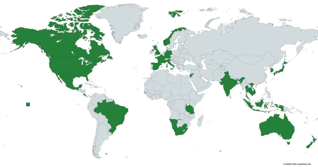
If you hover over a country, it’ll often show the country’s name and maybe a count of the number of blog posts, photos, or videos the travel blogger has created. However, if you click on a country, you’ll just be brought to another page with a list of post titles. In the best case scenario, you’ll also see a featured image and the first 20-40 words of the post, much like our All Posts page.
However, this still leaves me asking one question. If you have a map whose only purpose is to redirect visitors off of said map, why even have the map at all?
How Can Travel Bloggers Make Their Maps Interactive?
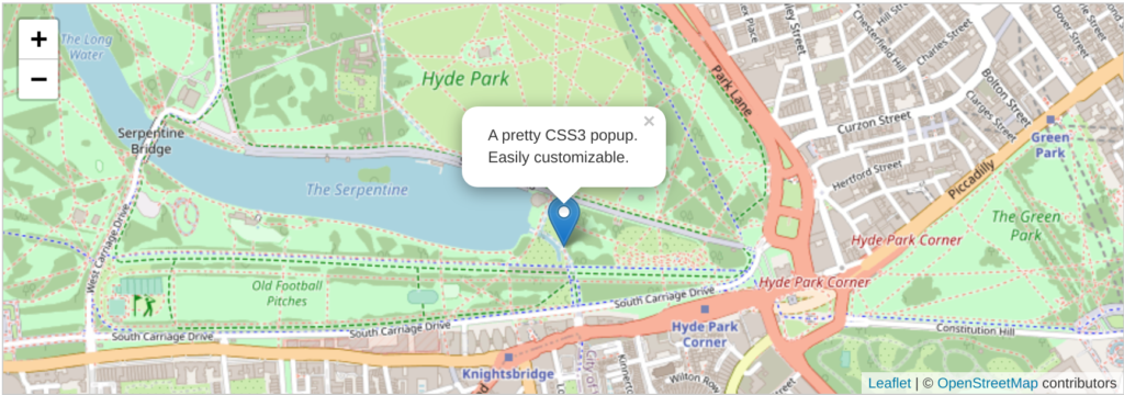
First and foremost, if you’re going to add a feature to your blog or website, it should serve more of a purpose than just redirecting visitors off of it. Your visitors should be able to gather all of the information they need without leaving the map. There is one exception, however. If you’re trying to display lengthy content, such as an entire blog post, don’t try to put the entire post in a pop-up window on the map. Nobody in their right mind is going to scroll through all of that.
Instead, you want to include key details and a link to the full blog post to make a fully interactive map. For a blog post, you’ll want to include at least four things.
- Title of the post
- A summary of the post or the first 20-25 words of it
- The post’s feature image
- A link to the full post
- Anything else that’s relevant and important, such as the date, author, or location
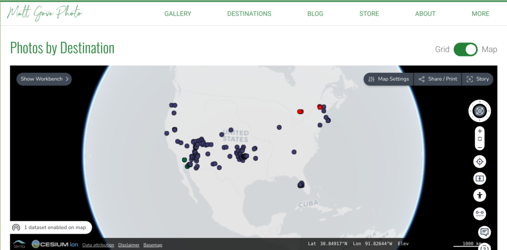
Example: The Matt Gove Photo Visual Media Map
To best demonstrate a fully interactive map, let’s have a look at the Matt Gove Photo Visual Media Map. Instead of blog posts, the map includes datasets to display all of our photos and videos on a map. Notice how it includes all five requirements for full interactivity. As a user, you can easily explore our photos and videos on a map without having to leave the map. In addition, you can click on the link in the pop-up window to view the full album or video.
Best GIS Solutions for Travel Bloggers to Create Interactive Maps
As recently as 10 years ago, getting professional-quality interactive maps meant shelling out hundreds, if not thousands of dollars every year in GIS software licensing fees. Even worse, there were very few online GIS programs to choose from back then.
Thankfully, that has all changed. Today, you there are an plenty of free online mapping programs available. Many of these programs are both incredibly powerful and easy to set up. While it’s certainly not a requirement, I highly recommend investing in a developer to install, connect, and integrate the maps on your website. They’ll be able to connect your maps directly to your database. As a result, new content will automatically be added to your maps, allowing them to effortlessly scale with your business. It’ll cost more up front, but with a good developer, you’ll save money in the long run.
We’d love to help you get set up with your maps. If you want to discuss your project further or get a free quote to add maps to your travel blog, please get in touch with us today. Or if you’re still just kicking tires, please feel free to browse our catalog of GIS products and services.
Google Maps or Bing Maps
If you’re just starting out or are looking for a simple solution, Google or Bing Maps are great options! Both platforms allow you to create high-quality maps and embed them on your website free of charge. And best of all, you don’t need a developer. Instead, you’ll just copy and paste a short block of code into your website or blog.
Unfortunately, the simplicity of both Google and Bing Maps leave them with some downsides. Most notably, if you have a dynamic dataset or high traffic volumes, you’ll run into issues. Neither platform is built to display large datasets. As a result, you’ll struggle to scale your application and will run into high API fees to generate the basemaps as your organization grows.
Mapbox
Mapbox is a direct competitor of both Google and Bing Maps, but it offers so much more. As a result, I typically recommend that my clients use Mapbox over Google or Bing. Mapbox gives you much finer control over your mapping application, allowing you to scale it both up and down as your business evolves. And best of all, it’s completely free to use, unless you have more than 50,000 map loads per month.
However, my favorite Mapbox feature is its use of vector tiles, which allows you to display huge amounts (read: gigabytes) of data that load and respond extremely fast.
- Fully customizable maps
- Much friendlier pricing than Google or Bing
- Supports both proprietary and open source data formats
- Offers a software development kit to add your own functionalities and customizations
- Developer optional to use maps or embed them on your website
Leaflet
Leaflet is a simple, yet powerful open source JavaScript library that displays two-dimensional maps on your website or blog. Because it’s hosted on your server, you don’t need to worry about API fees, regardless of how much or how little traffic you get. It’s lightweight, fast, powerful, and completely customizable. Furthermore, it has an extensive library of plugins and extensions if you need additional functionality. If you don’t know JavaScript, you’ll need a developer for the initial set up of your maps. You can easily connect Leaflet to nearly any type of database or data repository. As a result, Leaflet maps will easily scale with your business once it’s set up.
Thankfully, Leaflet requires very little maintenance once you get it up and running. In fact, I tell my clients that it’s often more cost-effective to pay for Leaflet maintenance as you need it instead of paying a recurring monthly maintenance fee. Yes, there are obviously exceptions to that rule. However, for the vast majority of people, Leaflet is an extremely cost-effective way to add high-quality maps to your website or blog.
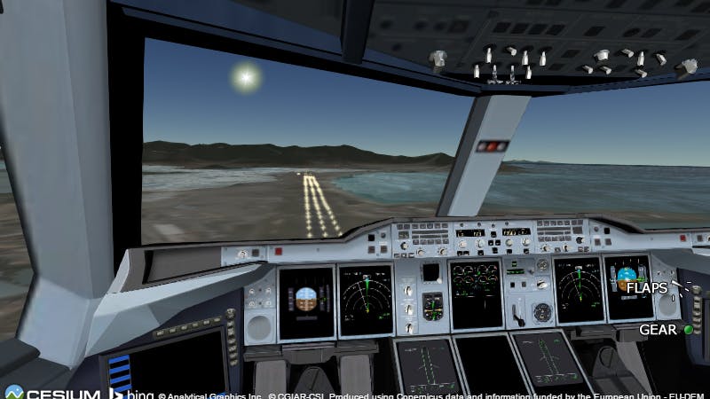
Cesium
Like Leaflet, Cesium is an open source JavaScript library that creates powerful 3D maps to “unleash the power of 3D data”. Their maps are engineered to maximize performance, precision, and experience. With Cesium, it often feels like there is no limit when it comes to what you can do with a map. In fact, Cesium also includes a timeline, so you could make the argument that its maps are four dimensional instead of three.
Furthermore, they’ve even created their own 3D vector tile format that lets you load enormous datasets in seconds. For example, check out Cesium’s demo that loads 3D models of nearly every building in New York City. It’s fast, fluid, and responsive. For additional demos, have a look at Cesium’s Use Cases. You’ll find examples from many different industries, applications, and regions.
You can get an incredible amount of power and functionality out of Cesium’s free base functionality. For the average travel blog, the free functionality is probably more than you need. However, if you want to harness its full potential, you should at least look into some of the paid add-ons for Cesium. Those paid add-ons will streamline your workflow and optimize your data. As a result, your users will ultimately have a better experience.
Terria
If you’re trying to decide between Leaflet or Cesium, why not use both? Originally developed as an open source platform for the Australian Government, Terria lets your users choose whether they want to view a two or three dimensional map. And you can probably see where this is going. Leaflet powers Terria’s two dimensional maps, which Cesium is behind its three dimensional maps.
The best feature of Terria, however, is its user interface. Easily organize and browse through a huge number of datasets. It uses Cesium’s 3D data optimization to ensure your map remains fast and responsive, even if your datasets are massive. Use Terria’s slider to compare datasets side-by-side. It even includes a feature for you to build stories with your data and share them with your audience.

COVID-19 Dashboard 
Scenic Drives Repository and Guide
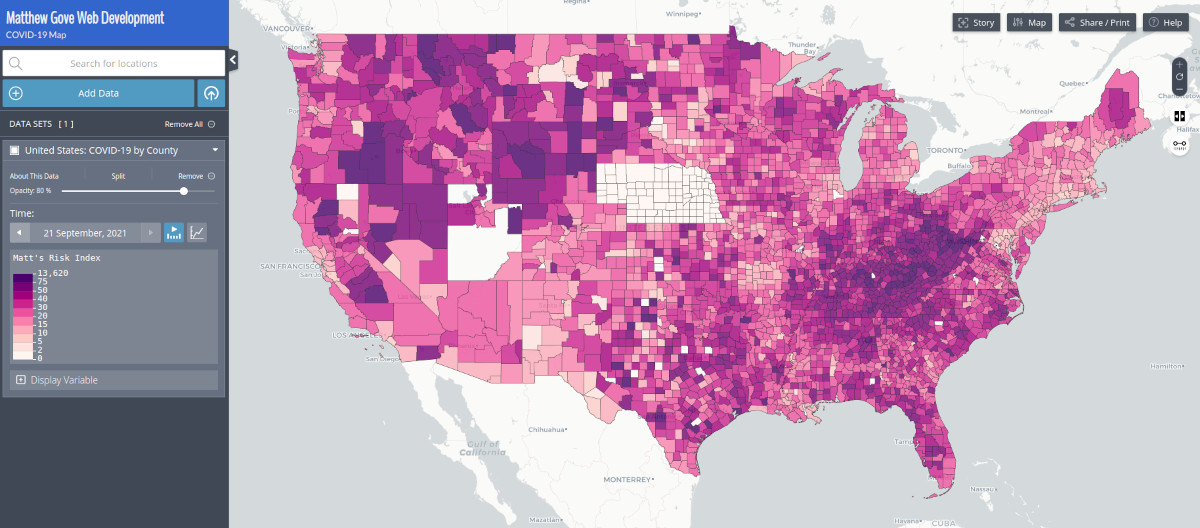
I use Terria for all of my mapping needs, and also recommend it for most of my clients. Its power and responsiveness across all devices, including mobile phones, coupled with its flexibility and minimal programming required to set it up make it the optimal platform for me. My users and clients have never complained about being confused using Terria, and are often impressed at how easy it is to analyze huge amounts of data. And best of all, I can set it up so it scales up and down as I need without needing hardly any maintenance.
If you want your travel blog to stand out from the rest, adding fully interactive maps with Terria is one of the easiest and most cost-effective way to do so. To learn more or get started, please get in touch with us or browse our online resources.
- Our Catalog: GIS Products and Services
- Our Maps Made with Terria
- Blog Posts About Terria
- Book a Free Info Session
- Request a Quote
- Join Our Email List
ESRI ArcGIS Online
If you have a complex dataset, but would prefer not to hire a developer, ESRI’s ArcGIS Online may be the best solution for you. Yes, it does have licensing fees, but you’ll get much of the functionality of the other applications we’ve discussed without needing a developer to set them up for you. Like the other platforms, ArcGIS online can easily handle large numbers of complex datasets, and plot those data on maps that need just a copy and paste to embed in your website. Plus ESRI is widely considered to be the industry standard for anything related to GIS and maps. If anything goes wrong for you, they have excellent documentation and support.
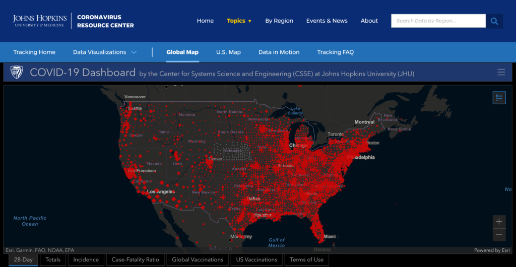
If you’re looking for a real-world example of ArcGIS Online in action, you’ve probably seen them already. Since the COVID-19 pandemic began, most dashboards that display maps of COVID-19 data use ArcGIS online.
Summary
| Platform | Free | API Fees | Dimensions | Developer | Dynamic Data |
|---|---|---|---|---|---|
| Google/Bing Maps | Yes | Optional | 2D Only | Not Required | No |
| Mapbox | Yes | > 50K loads/mo | 2D Only | Optional | Yes |
| Leaflet | Yes | Not Required | 2D Only | Required | Yes |
| Cesium | Yes | Not Required | 3D Only | Required | Yes |
| Terria | Yes | Not Required | 2D & 3D | Required | Yes |
| ArcGIS Online | No | N/A | 2D Only | Not Required | Yes |
Travel Bloggers, Take Your Interactive Maps to the Next Level
Once you have your new interactive map set up on your website or blog, simply adding a link to it is not enough. In addition, you should strategically embed them on different pages of your website to give your users the most immersive experience. For example, you’ll find the Matt Gove Photo Visual Media map embedded both on the home page of this blog and the main photo gallery page on the Matt Gove Photo website, in addition to being embedded above. I’ll continue to add maps as we go forward, too.
To figure out where to embed your interactive maps, have a look at your website’s analytics. Are there pages that have a lot of page views? Is there a specific page people are navigating to that the map could benefit? Are your visitors getting confused and leaving your website instead of navigating somewhere the map could help? Is there a logical place for your maps in your navigation or sales funnel?
Finally, as a travel blogger, you shouldn’t plot just your blog posts on the interactive map. Geotag photo albums, videos, social media posts, guides, fun activities, scenic drives, and much more. Don’t be afraid to make multiple maps, either. Try to use a platform like Terria or ArcGIS Online that organizes your datasets in a logical manner and makes it easy to both add and remove data from the map. If that’s not an option, don’t overwhelm your users with too much data on a single map. That’s one of the best ways to drive visitors off of your website and directly into the arms of your competitors.
Conclusion
Fast, professional quality interactive maps are one of the best ways travel bloggers can stand out from the crowd. Interactive maps are easy and cost-effective to implement and maintain. They’re also incredibly effective at retaining your visitors’ engagement and keeping them on your website. It boggles my mind why so many travel bloggers haven’t taken full advantage of the incredible potential interactive maps present to both grow your audience and keep your existing followers coming back for more.
Are you ready to take the next steps with interactive maps and bring your website or travel blog to the next level? As avid travelers and data science experts who specialize in online GIS and mapping applications, we’d love to help you take that next step in your journey. I invite you to please browse our catalog of GIS and mapping services. Then, get in touch or book a free info session with us to discuss your specific project. We can’t wait to hear from you.
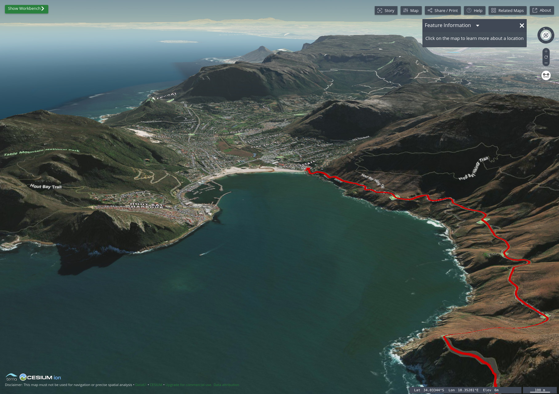
Top Photo: Chapman’s Peak Drive on the Matt Gove Photo Scenic Drives Map
Cape Town, Western Cape, South Africa