When COVID-19 first broke out in China in December, 2019, numerous institutions, including universities, governments, and private companies build applications to track the disease as it rapidly spread around the world. Most of these applications features a map that used circles or dots to track the disease from outbreak to epidemic to pandemic. Many also overloaded you with information to the point you didn’t know where to start.
We Identified a Common Problem with Other COVID-19 Dashboards
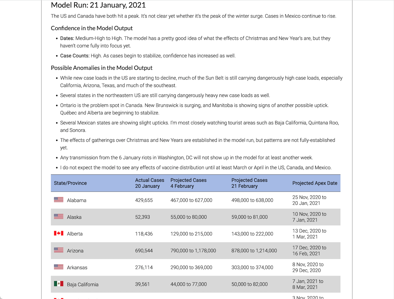
We quickly grew frustrated while using these applications. As the outbreak rapidly spread through Europe in late February, 2020, the circles on the maps got so big you couldn’t tell which circle was from which country. Once the pandemic started to accelerate out of control in the United States, many of our family, friends, and loved ones wanted to compare the outbreak in the United States to the outbreaks in Iran, Italy, and Spain. You couldn’t do that easily with tools that existed at the time. Nor could you compare time-series data on the state and provincial level on either a graph or map. We soon started getting the same requests from our friends, family, and colleagues in Canada. We knew we had to do something. So we built our own COVID-19 dashboard, model, and map.
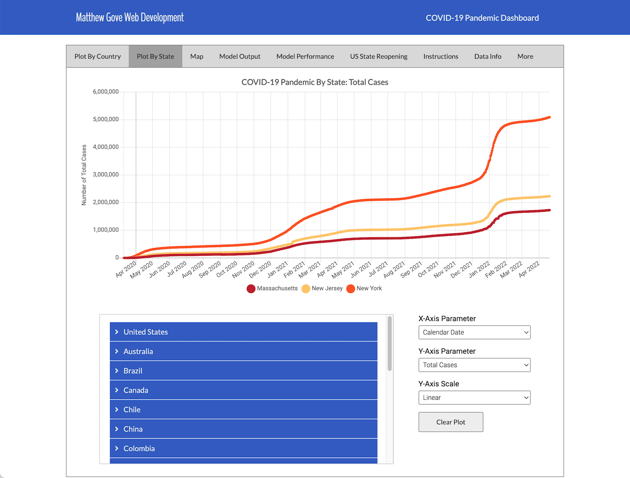
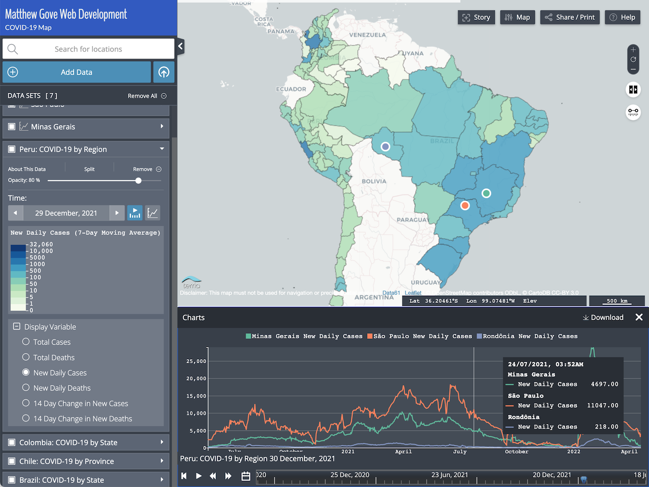
In addition to the COVID-19 data at the country level, our dashboard also features state and province data for over 20 countries. The detailed and easy-to-read map also contains a timeline so you can view data on a map for any day since the pandemic started.

Our COVID-19 Model
As a mathematical modeler, the start of the outbreak in the United States and Canada, combined with how little was known about the disease at the time, really piqued my curiosity and interest. Can we accurately model the pandemic using the little bit we know about COVID-19? We started playing around with the Susceptible – Infected – Removed, or SIR, model. Each tweak we made to the model only increased our curiosity. Before we knew it, we had built our own COVID-19 model. It forecasts both new and cumulative cases and deaths for any country in the world. Additionally, it works for states and provinces in 20-plus countries, territories, continents, and more.
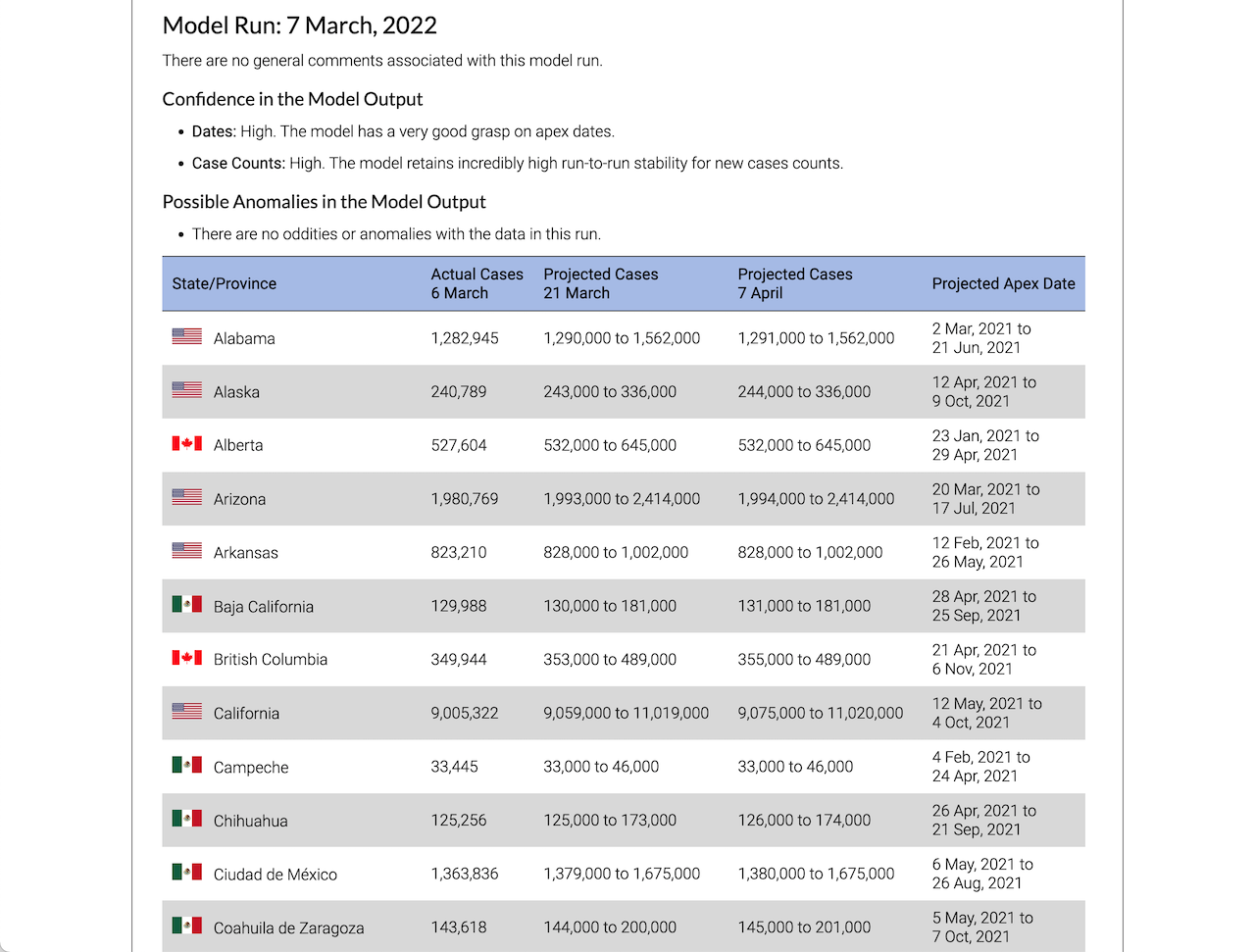
We set the following goals for the model’s total case predictions.
- 2-Week Projections: 65% correct, with 80% of incorrect projections missing by 5,000 cases or less
- 1-Month Projections: 50% correct, with 50% of incorrect projections missing by 5,000 cases or less
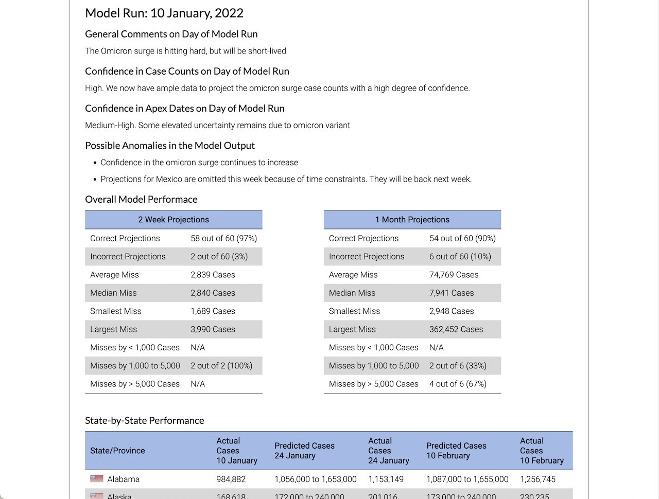
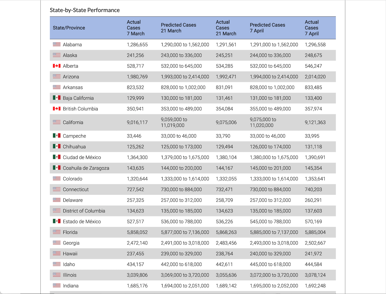
The Model Has Performed Disturbingly Well
Between May, 2020 and February, 2022, the model outperformed all expectations. Each run averaged getting 75 to 90% of its two-week projections correct. At the same time, one-month projections ran a 60 to 70% correct rate. On its hottest streak, it went 6 weeks without getting a single two-week prediction wrong, despite being run twice per week.
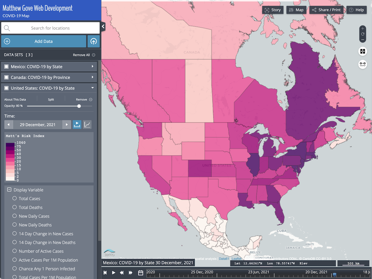
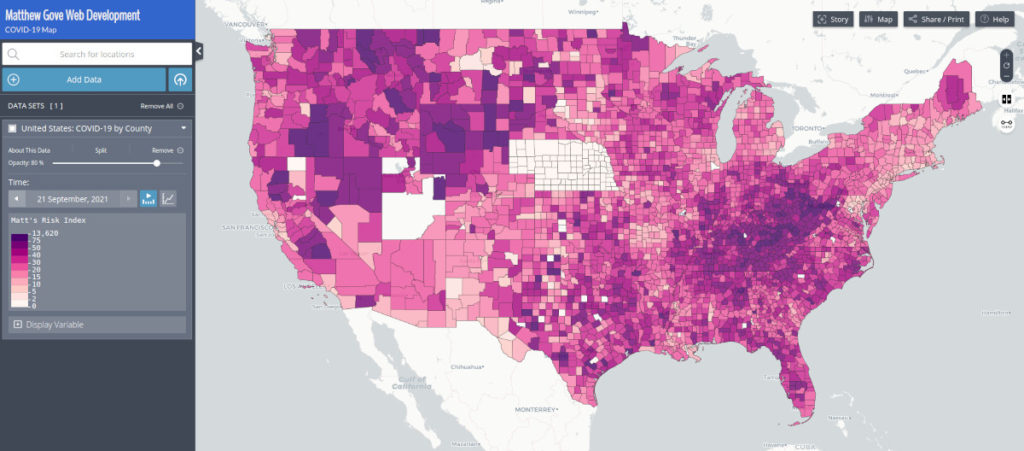
Matt’s Risk Index Combines All COVID-19 Risk Parameters into a Single Index…That You Can Model
If creating our own model wasn’t enough innovation, we took it a step further. Back in my storm chasing days, the strategy was to look for where the severe weather parameters best came together. You’d then target that area for the day’s chase. With COVID-19, it was the exact opposite. You once again wanted to look for where the COVID-19 numbers were all the highest, but avoid those areas instead.
Because there were so many different COVID-19 parameters to consider, I asked myself whether it was possible to combine them all into a single index. That index could immediately identify COVID-19 hotspots when you looked at them on a map. As a result, Matt’s Risk Index was born.
Matt’s Risk Index is essentially a weighted average of all those COVID-19 parameters. It makes hot spots stand out on a map like a sore thumb. Because it’s normalized for population, it will work on any geographic scale. And best of all, you can model it with our COVID-19 model.
Matt’s Risk Index Keeps You Safe
Having Matt’s Risk Index proved invaluable when I drove across the United States at the peak of the winter wave in February, 2021, before vaccines were available to the general public. In fact, I developed the risk index specifically for that trip. Being able to evaluate the risk at the county level and adjust your route to avoid hotspots was incredibly powerful.
Fast forward a year. The risk index kept me safe during my three-month trip through the western United States during the winter of 2021 – 2022. Despite the omicron variant exploding to more than 800,000 cases per day and my 10,000 mile trip taking me through 20 states, I did not get catch Covid (or anything else). In fact, nobody that I know who has used Matt’s Risk Index on our COVID-19 Dashboard has come down with Covid.