Geographic Information Systems (GIS) and mapping applications are one of the most underrated uses of the Python programming language. Python integrates easily with many desktop and web-based GIS programs, and can even create simple maps on its own. You can supercharge your GIS productivity in as little as 10 minutes with simple Python scripts. Let’s get started.
1. Copy large amounts of data between geographic files and databases
It’s no secret that the future of big data is here. As your datasets get larger, it’s much more efficient to keep the data in a databases instead of embedded in your geography files. Instead of manually copying the data between your GIS files and the database, why not let Python do the heavy lifting for you?
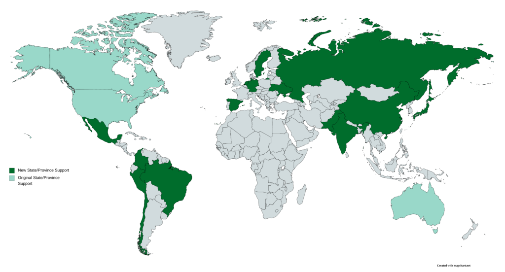
I am in the process of expanding my COVID-19 dashboard to be able to plot data by state for many more countries than just Australia, Canada, and the United States.
I am also expanding the US dataset to break it down as far as the county level. In order to do so, I had to add all 3,200-plus counties to my geodatabase. Manually entering datasets of this scale in the past have taken months. With Python, I completed the data entry of all 3,200-plus counties in less than 20 minutes. Using QGIS, the Python script completed the following steps.
- Open the shapefile containing data about each county.
- In each row of the shapefile’s attribute table, identify the county name, the state in which it’s located, and the population.
- Assign a unique identifier to each county. I opted to use my own unique identifier instead of the FIPS codes in case I wanted to add counties in additional countries. FIPS codes are only valid in the US.
- Write the parsed data to a CSV file. That CSV file was imported into a new table in the geodatabase.
#!/usr/bin/env python3
from qgis.core import QgsProject
import csv

# Step 1: Open the shapefile
qgis_instance = QgsProject.instance()
shp_counties = qgis_instance.mapLayersByName("US Counties")[0]
county_features = shp_counties.getFeatures()

# Initialize a list to store data that will be written to CSV
csv_output = [
    ["CountyID", "County Name", "State Name", "Population"
]

# Initialize our unique ID that is used in Step 3
county_id = 1

# Step 2: In each row, identify the county, state, and population
for county in county_features:
    fips_code = county.attribute(0)
    county_name = county.attribute(1)
    state_name = county.attribute(2)
    population = county.attribute(3)

    # Define output CSV row
    csv_row = [county_id, county_name, state_name, population]

    # Add the row to the output CSV data
    csv_output.append(csv_row)

    # Increment the county_id unique identifier
    county_id += 1

# Step 4: Write the data to CSV
with open("county-data.csv", "w") as ofile:
    writer = csv.writer(ofile)
    writer.writerows(csv_output)
2. Generate publication-ready graphs with Python from within your GIS program
Have you ever been deep in a geospatial analysis and discovered that you needed to create a graph of the data. Whether you need to plot a time series, a bar chart, or any other kind of graph, Python comes to the rescue again.
Python’s matplotlib library is the gold standard for data analysis and figure creation. With matplotlib, you can generate publication-quality figures right from the Python console in your GIS program. Pretty slick, huh?
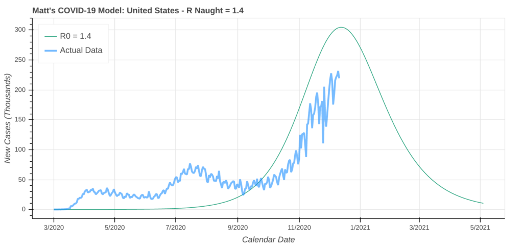
My COVID-19 model uses matplotlib to generate time series plots for each geographic entity being modeled. While I run the model out of a Jupyter Notebook, you could easily generate these plots from within a GIS program.

matplotlib time series chart that my COVID-19 model generatesThe model is over 2,000 lines of Python code, so if you want see it, please download it here.
3. Supercharge Your GIS Statistical Analysis with Python
In addition to matplotlib, the Python pandas library is another great library for both data science and GIS. Both libraries come with a broad and powerful toolbox for performing a statistical analysis on your dataset.
Since we’re still in the middle of the raging COVID-19 pandemic, let’s do a basic statistical analysis on some recent COVID-19 data. We’ll do a basic statstical analysis on some confirmed cases and deaths data in the United States. Let’s have a look at new daily cases by state.
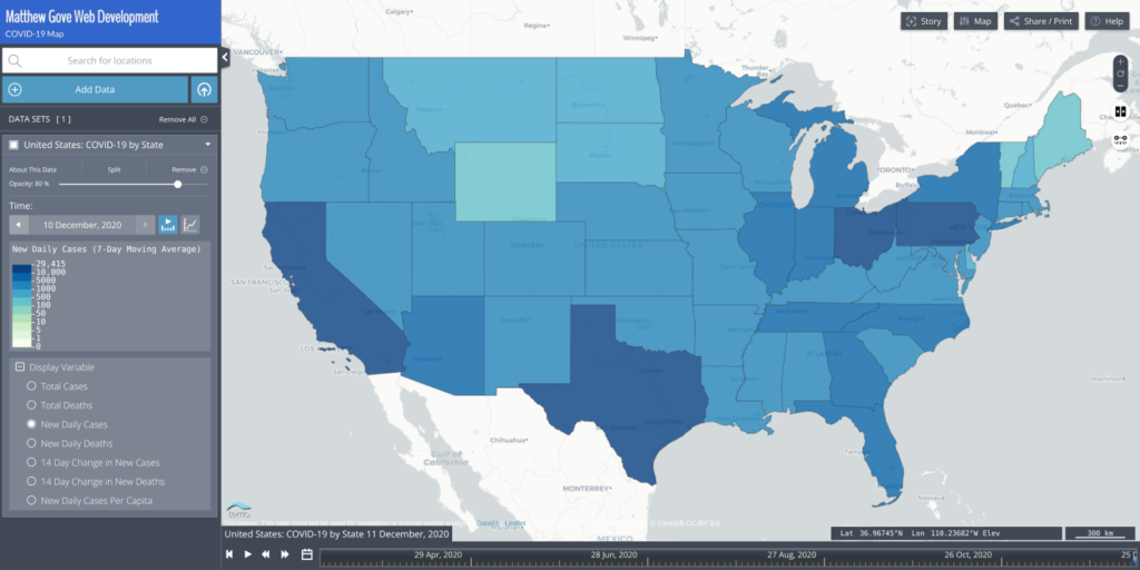
As a simple statistical analysis, let’s identify the following values and the corresponding states.
- Most New Daily Cases
- Fewest New Daily Cases
- Mean New Daily Cases for all 50 states
- Median New Daily Cases for all 50 states
- How many states are seeing more than 10,000, 5,000, and 3,000 new daily cases.
Even though I store these data in a database, and these values can easily be extracted with database queries, let’s assume that the data are embedded in a shapefile or CSV file that looks like this.
| State | New Daily COVID-19 Cases |
|---|---|
| Pennsylvania | 10,247 |
| Arkansas | 2,070 |
| Wyoming | 435 |
| Georgia | 5,320 |
| California | 29,415 |
Is There a Strategy to Tackle the Statistical Analysis with Python?
First, regardless of the order that the data in the table are in, we want to break the columns down into 2 parallel arrays. There are more advanced ways to sort the data, but those are beyond the scope of this tutorial.
import csv

# Initialize parallel arrays
states = []
new_cases = []

# Read in data from the CSV file
with open("covid19-new-cases-20201210.csv", "r") as covid_data:
    reader = csv.reader(covid_data)
    for row in reader:
        # Extract State Name and Case Count
        state = row[0]
        new_case_count = row[1]

        # Add state name and new cases to parallel arrays.
        states.append(state)
        new_cases.append(new_case_count)
Now, let’s jump into the statistical analysis. The primary advantage of using parallel arrays is we can use the location of the case count data in the array to identify which state it comes from. As long as the state name and its corresponding case count are in the same location within the parallel arrays, it does not matter what order the CSV file presents the data.
Identify States with Fewest and Most New Daily Cases
First up in our statistical analysis is to identify the states with the most and fewest new daily COVID-19 cases. We’ll take advantage of Python’s build-in statistical functions. Variable names are consistent with the above block of code.
most_cases = max(new_cases)
fewest_cases = min(new_cases)
When you run this, you’ll find that most_cases = 29,415 and fewest_cases = 101. Now we need to determine which states those values correspond to. This is where the parallel arrays come in. Python’s index() method tells us where in the new_case_count array the value is located. We’ll then reference the same location in the states array, which will give us the state name.
most_cases_index = new_cases.index(most_cases)
most_cases_state = states[most_cases_index]

fewest_cases_index = new_cases.index(fewest_cases)
fewest_cases_state = states[fewest_cases_index]
When you run this block of code, you’ll discover that California has the most new daily cases, while Hawaii has the fewest.
Mean New Daily Cases
While Python does not have a built-in averaging or mean function, it’s an easy calculation to make. Simply add up the values you want to average and divide them by the number of values. Because the data is stored in arrays, we can simple sum the array and divide it by the length of the array. In this instance, the length of the array is 51: the 50 states, plus the District of Columbia. It’s a very tidy one line of code.
mean_new_daily_cases = sum(new_cases) / len(new_cases)Rounding to the nearest whole number, the United States experienced an average of 4,390 new COVID-19 cases per state on 10 December.
Median New Daily Cases
Python does not have a built-in function to generate the median of a list of numbers, but thankfully, like the mean, it’s easy to calculate. First, we need to sort the array of new daily cases from smallest to largest. We’ll save this into a new array because we need to preserve the order of the original array and maintain the integrity of the parallel arrays.
sorted_new_cases = sorted(new_cases)Once the values are sorted, the median is simply the value of the middle-most point in the array. Because we included the District of Columbia, there are 51 values in our array, so we can select the middle value (the 25th item in the array). If we only used the 50 states, we would need to average the two middle-most values. In Python, it looks like this. The double slash means that you round the division down to the nearest whole number.
middle_index = len(sorted_new_cases) // 2
median_new_cases = sorted_new_cases[middle_index]
The median value returned is 2,431 new cases. Now we need to figure out which state that value belongs to. To that, just do the same thing we did when calculating the max and min values. Look in the original new_cases array for the value and look in that same location in the states array.
median_cases_index = new_cases.index(median_new_cases)
median_state = states[median_cases_index]
On 10 December, the state with the median new daily cases was Connecticut.
Determine How Many States are Seeing More than 10,000, 5,000, and 3,000 New Daily Cases
To determine how many states are seeing more than 10K, 5K, and 3K new daily cases, we simply need to count how many values in the new_cases array are greater than those three values. Using 3,000 as an example, it can be coded as follows (the “gt” stands for “greater than”).
values_gt_3000 = []

for n in new_cases:
    if n > 3000:
        values_gt_3000.append(n)
Thankfully, Python gives us a shorthand way to code this so we don’t wind up with lots of nested layers in the code. The block of code above can be compressed into just a single line.
values_gt_3000 = [n for n in new_cases if n > 3000]To get the number of states with more than 3,000 new daily cases, recall that the len() function tells us how many values are in an array. All you need to do is apply the len() function to the above array and you have your answer.
num_values_gt_3000 = len([n for n in new_cases if n > 3000])
num_values_gt_5000 = len([n for n in new_cases if n > 5000])
num_values_gt_10000 = len([n for n in new_cases if n > 10000])
When you run that code, here are the values for the 10 December dataset. You can determine which states these are by either looking at the map above or using the same techniques we used to extract the state in the max, min, and median calculations.
| New Daily Case Cutoff | Number of States |
|---|---|
| > 10,000 | 4 |
| > 5,000 | 13 |
| > 3,000 | 24 |
4. Look into the Future with Mathematical Modeling
As many of you know, I built my own COVID-19 model last spring. The model is written in Python and extensively uses the matplotlib library. The model predicts the number of cases both two weeks and one month out as well as the apex date of the pandemic. While I primarily focus on the 50 US states and 6 Canadian provinces, you can run the model for any country in the world, and every state in 17 countries.
While many models, whether it be weather models, COVID-19 models, and more make heavy use of maps, there’s more to modeling than just maps. Remember above when we generated publication-quality graphs and figures right from within your GIS application using matplolib? You can do the same thing for you non-geospatial model outputs.
bokeh, a Python library that creates interactive plots for use in a web browser.5. Merge, Split, and Edit Geographical Features
Have a shapefile or other geographic file that you need to make bulk edits on? Why not let Python do the heavy lifting for you. Let’s say you have a shapefile of every county in the United States. There are over 3,200 counties in the US, and I don’t know about you, but I have little to no interest in entering that much data manually.
In the attribute table of that shapefile, you have nothing but the Federal Information Processing Standards (FIPS) code for each county. FIPS codes are standardized unique indentifiers the US Federal Government assigns to entities such as states and counties. You want to add the county names and the county’s state to the shapefile.
In addition, you also have a spreadsheet, in CSV format of all the FIPS codes, county names, and which state each county is located in. That table looks something like this.
| FIPS Code | County Name | State Name |
|---|---|---|
| 04013 | Maricopa | Arizona |
| 06037 | Los Angeles | California |
| 26163 | Wayne | Michigan |
| 12086 | Miami-Dade | Florida |
| 48201 | Harris | Texas |
| 13135 | Gwinnett | Georgia |
To add the data from this table into the shapefile, all you need is a few lines of Python code. In this example, the code must be run in the Python console in QGIS.
#!/usr/bin/env python3
from qgis.core import QgsProject
import csv

# Define QGIS Project Instance and Shapefile Layer
instance = QgsProject.instance()
counties_shp = instance.mapLayersByName("US Counties")[0]

# Load features (county polygons) in the shapefile
county_features = counties_shp.getFeatures()

# Define the columns in the shapefile that we will be referencing.
shp_fips_column = counties_shp.dataProvider().fieldNameIndex("FIPS")
shp_state_column = counties_shp.dataProvider().fieldNameIndex("State")
shp_county_column = counties_shp.dataProvider().fieldNameIndex("County")

# Start Editing the Shapefile
counties_shp.startEditing()

# Read in state and county name data from the CSV File
with open("fips-county.csv", "r") as fips_csv:
    csv_data = list(csv.reader(fips_csv))

# Loop through the rows in the shapefile
for county in county_features:
    shp_fips = county.attribute(0)

    # The Feature ID is internal to QGIS and is used to identify which row to add the data to.
    feature_id = county.id()

    # Loop through CSV to Find Match
    for row in csv_data:
        csv_fips = row[0]
        county_name = row[1]
        state_name = row[2]

        # If CSV FIPS matches the FIPS in the Shapefile, assign state and county name to the shapefile row.
        if csv_fips == shp_fips:
            county.changeAttributeValue(feature_id, shp_county_column, county_name)
            county.changeAttributeValue(feature_id, shp_state_column, state_name)

# Commit, Save Your Changes to the Shapefile, and Exit Edit Mode
counties_shp.commitChanges()
iface.VectorLayerTools().stopEditing(counties_shp)
6. Generate Metadata, Region Mapping Files, and More
We all hate doing monotonous busy work. Who doesn’t, right. Most metadata entry falls into that category. There is a surprising amount of metadata associated with GIS datasets.
In the above section, we edited the data inside of shapefiles and geodatabases with Python. It turns out that data is not the only thing you can edit with Python. Automating metadata entry and updates with Python is one of the easiest and most efficient ways to boost your GIS productivity and focus on the tasks you need to get done.
A Brief Intro to Region Mapping Files
In today’s era of big data, the future of GIS is in vector tiles. You’ve probably heard of vector images, which are comprised of points, lines, and polygons that are based on mathematical equations instead of pixels. Vector images are smaller and much more lightweight than traditional images. In the world of web development, vector images can drastically increase a website’s speed and decrease its load times.
Vector images can also be applied to both basemaps and layer geometries, such as state or country outlines. In the context of GIS, they’re called vector tiles, and are primarily used in online maps. Vector tiles are how Google Maps, Mapbox, and many other household mapping applications load so quickly.
What is a Region Mapping File?
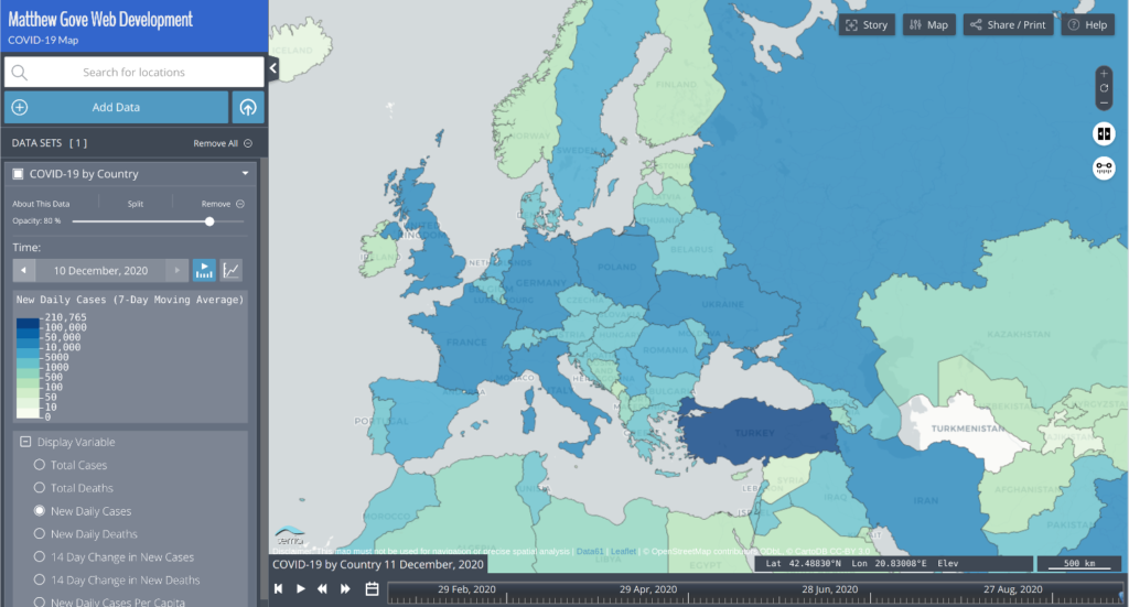
Region mapping files simply use a unique identifier to map a feature in a vector tile to a row in a data table. The data in the table is then displayed on the map. Let’s look at an example using my COVID-19 Dashboard’s map. While I use my own unique identifiers to do the actual mapping, in this example, we’ll use the ISO country codes to map COVID-19 data in Europe. The data table is simply a CSV file that looks like this. For time series data, there would also be a column for the timestamp.
| Country Code | Total Cases | Total Deaths | New Cases | New Deaths |
|---|---|---|---|---|
| de | 1,314,309 | 21,567 | 22,399 | 427 |
| es | 1,730,575 | 47,624 | 6,561 | 196 |
| fr | 2,405,210 | 57,671 | 11,930 | 402 |
| gb | 1,814,395 | 63,603 | 17,085 | 413 |
| it | 1,805,873 | 63,387 | 16,705 | 648 |
| nl | 604,452 | 10,051 | 7,345 | 50 |
| pt | 340,287 | 5,373 | 3,962 | 81 |
The region mapping file is a JSON (JavaScript Object Notation) file that identifies the valid entity ID’s in each vector tiles file. In this example, the entity ID is the Country Code. We can use Python to generate that file for all country codes in the world. I keep all of the entity ID’s in a database. Databases are beyond the scope of this tutorial, but for this example, I queried the country codes from the database and saved them in an array called country_codes.
# Initialize an array to store the country codes
region_mapping_ids = []

# Add all country codes to the region mapping ID's
for country_code in country_codes:
    region_mapping_ids.append(country_code)

# Define the Region Mapping JSON
region_mapping_json = {
    "layer": "WorldCountries",
    "property": "CountryCode",
    "values": region_mapping_ids
}

# Write the Region Mapping JSON to a file.
with open("region_map-WorldCountries.json", "w") as ofile:
    json.dump(region_mapping_json, ofile)
The Region Mapping JSON
In the Region Mapping JSON, the layer property identifies which vector tiles file to use. The property property identifies which attribute in the vector tiles is the unique identifier (in this case, the country code). Finally, the values property identifies all valid unique ID’s that can be mapped using that set of vector tiles.
When you put it all together, you get a lightweight map that loads very fast, as the map layers are in vector image format, and the data is in CSV format. Region mapping region shines when you have time series data, such as COVID-19. Here is the final result.
Conclusion
Python is an incredibly powerful tool to have in your GIS arsenal. It can boost your productivity, aid your analysis, and much more. Even though this tutorial barely scratches the surface of the incredible potential these two technologies have together, I hope this gives you some ideas to improve your own projects. Stay tuned for more.
Top Photo: Beautiful Sierra Nevada Geology at the Alabama Hills
Lone Pine, California – Feburary, 2020