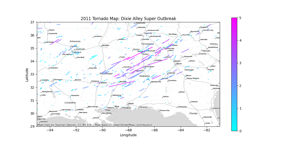
Several weeks ago, you learned how to create stunning maps without a GIS program. You created a map of a hurricane’s cone of uncertainty using Python’s GeoPandas library and an ESRI Shapefile. Then you created a map of major tornadoes to strike various parts of the United States during the 2011 tornado season. You also generated two bar charts directly from the shapefile to analyze the number of tornadoes that occurred in each state that year. However, we did not cover one popular type of map: the choropleth map.
Today, we’re going to take our analysis to the next level. You’ll be given a table of COVID-19 data for each US State in CSV format for a single day during the COVID-19 pandemic. The CSV file has the state abbreviations, but does not include any geometry. Instead, you’ll be given a GeoJSON file that contains the state boundaries. You’ll link the data to the state boundaries through a process called region mapping and create a choropleth map of the data.
Why Do We Use Region Mapping to Create Choropleth Maps?
The main reason we use region mapping is for performance. When you use region mapping, you only need to load your geometry once, regardless of how many data points use that geometry. Each data point uses a unique identifier to “map” it to the geometry. You can use the ISO state or country codes, or you can make your own ID’s. Without region mapping, you need to load the geometry for each data point that uses it.
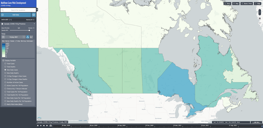
To show you the performance gains, let’s use COVID-19 data as an example. In our COVID-19 Dashboard’s Map, you can plot data by state for several countries. For Canada, the GeoJSON file that contains the provincial boundaries is 150 MB. We’re roughly 500 days into the COVID-19 pandemic. A quick back-of-the-envelope calculation shows just how much data you’d need to load without region mapping.
data_load_size = size_of_geojson * number_of_days
data_load_size = (150 MB) * (500 days)
data_load_size = 75,000 MB = 75 GB
Keep in mind, that 75 GB is just for the provincial boundaries. It does not include any of the COVID-19 data. And it only grows bigger and bigger every day.
Using region mapping, you only need to load the provincial boundaries once. With the GeoJSON file, that’s only 150 MB. In our COVID-19 map, we actually take it a step further. Instead of GeoJSON format, we use Mapbox Vector Tiles (MVT), which is much more efficient for online maps. The MVT geometry for the Canadian provincial boundaries is only 2 MB. Compared to possibly 75 GB of geometry data, 2 MB wins hands down.
What is a Choropleth Map?
A choropleth map displays statistical data on a map using shading patterns on predetermined geographical areas. Those geographic areas are almost always political boundaries, such country, state, or county borders. They work great for representing variability of a given measurement across a region.
An Overview of Creating a Choropleth Map in Python GeoPandas
The process we’ll be programming in our Python script is breathtakingly simple using GeoPandas.
- Read in the US State Boundaries from the GeoJSON file.
- Import the COVID-19 data from the CSV file.
- Link the data to the state boundaries using the ISO 3166-2 code (state abbreviations)
- Plot the data on a choropleth map.
Required Python Dependencies
Before we get started, you’ll need to install four Python modules. You can easily install them using either anaconda or pip. If you have already installed them, you can skip this step.
- geopandas
- pandas
- matplotlib
- contextily
The first item in our Python script is to import those four dependencies.
import geopandas
import pandas
import matplotlib.pyplot as plt
import contextily as ctx
Define A Few Constants That We’ll Use Throughout Our Python Script
There are a few values we’ll use throughout the script. Let’s define a few constants so we can easily reference them.
GEOJSON_FILE = "USStates.geojson"
CSV_FILE = "usa-covid-20210102.csv"

# 3857 - Mercator Projection
XBOUNDS = (-1.42e7, -0.72e7)
YBOUNDS = (0.26e7, 0.66e7)
The XBOUNDS and YBOUNDS constants define the bounding box for the map, in the x and y coordinates of the Mercator projections, which we’ll be using in this tutorial. They are not in latitude and longitude. We’ve set them so the left edge of the map is just off the west coast (~127°W) and the right edge is just off the east coast (~65°W). Likewise, the top of the map is just above the US-Canada border (~51°N), and the bottom edge is far enough south (~23°N) to include Florida peninsula and the Keys.
Read in the US State Boundaries Using GeoPandas
GeoPandas is smart enough to be able to automatically figure out the file format of most geometry files, including ESRI Shapefiles and GeoJSON files. As a result, we can load the GeoJSON the exact same way as we loaded the ESRI Shapefiles in previous tutorials.
geojson = geopandas.read_file(GEOJSON_FILE)Read in Data From the CSV File
You may have noticed that we did not import Python’s built in csv module. That was done intentionally. Instead, we’ll use Pandas to read the CSV.
On the surface, it may look like the main benefit is that you only need a single line of code to read in the CSV data with Pandas. After all, it takes a block of code to do the same with Python’s standard csv library. However, you’ll really reap the benefits in the next step when we go to map the data to the state boundaries.
data = pandas.read_csv(CSV_FILE)Map the CSV Data to the State Boundaries in the GeoJSON File
When you read the GeoJSON file in with the geopandas.read_file() method, Python stores it as a Pandas DataFrame object. If you were to read in the CSV data using Python’s built-in csv library, Python would store the data as a csv.reader object.
Here’s where the magic happens. By reading in the CSV data with Pandas instead of the built-in csv library, Python also stores the CSV data as a Pandas DataFrame object. If we has used Python’s built-in csv library, mapping the CSV data to the state boundaries would be like trying to combine two recipes, where one was in imperial units, and the other was in metric units.
The Pandas developers built the DataFrame objects to be easily split, merged, and manipulated, which means that once again, we can do it with just a single line of code.
full_dataset = geojson.merge(data, left_on="STATE_ID", right_on="iso3166_2")Let’s go over what that line of code means.
geojson.merge(data, ... ): Merge the CSV data store in thedatavariable into the US State boundaries stored in thegeojsonvariable.left_on="STATE_ID": The property that contains the common unique identifier in the GeoJSON file is calledSTATE_ID.right_on="iso3166_2": The property (column) that contains the corresponding unique identifier in the CSV data is callediso3166_2.
The ISO 3166-2 Code: What’s in the Mapping Identifier?
In this tutorial, we’re using each state’s unique ISO 3166-2 code to map the CSV data to the state boundaries in the GeoJSON. So what exactly is an ISO 3166-2 code? It’s a unique code that contains the country code and a unique ID for each state. The International Organization for Standardization, or ISO, maintains a standardized set of codes that every country in the world uses.
In many countries, including the United States and Canada, the ISO 3166-2 codes use the same state and province abbreviations that their respective postal services use. As you’ll see in the table, though, not all countries do.
| ISO 3166-2 Code | State/Province | Country |
|---|---|---|
| US-CA | California | United States |
| US-FL | Florida | United States |
| US-NY | New York | United States |
| US-TX | Texas | United States |
| CA-BC | British Columbia | Canada |
| CA-ON | Ontario | Canada |
| AU-NSW | New South Wales | Australia |
| AU-WA | Western Australia | Australia |
| ZA-MP | Mpumalanga | South Africa |
| IT-BO | Bologna | Italy |
| RU-CHE | Chelyabinskaya Oblast | Russia |
| IN-MH | Maharashtra | India |
| TH-50 | Chaing Mai | Thailand |
| JP-34 | Hiroshima | Japan |
| FR-13 | Bouches-du-Rhône | France |
| AR-X | Córdoba | Argentina |
| KG-C | Chuy | Kyrgyzstan |
Write a Function to Generate a Choropleth Map
Once the CSV data has been successfully linked to the state boundaries in the GeoJSON, everything is stored in a single Pandas DataFrame object. As a result, the code to plot the data will be nearly identical to the maps we created in previous GeoPandas tutorials.
Like the tornado track tutorial, you’ll be creating several different maps. To avoid running afoul of the DRY (Don’t Repeat Yourself) principle, let’s put the plotting code into a function that we can call.
First, let’s define the function. We’ll pass it X parameters.
def choropleth_map(mapped_dataset, column, plot_type):Initialize the Figure
Inside that function, let’s first initialize the figure that will hold our choropleth map.
ax = mapped_dataset.plot(figsize=(12,6), column=column, alpha=0.75, legend=True, cmap="YlGnBu", edgecolor="k"There’s a lot in this step, so let’s unpack it.
figsize=(12,6): Plot should be 12 inches wide by 6 inches tallcolumn=column: Plot the column name that was passed to thechoropleth_map()function.alpha=0.75: Make the map 75% opaque (25% transparent) so you can see through it slightly.legend=True: Include the color bar legend on the figurecmap="YlGnBu": Use a Yellow-Green-Blue color mapedgecolor="k": Color the state outlines/borders black
Remove Axis Ticks and Labels From Your Choropleth Map
If we use the standard WGS-84 (EPSG:4326) projection to plot the continental US, the map comes out short and wide. For a better aspect ratio, we’ll convert the data into the Mercator Projection (EPSG:3857). Unfortunately, that means the x and y axes will no longer be in latitude and longitude, and will instead be in the coordinates of the Mercator Projection. To avoid any confusion, let’s just hide the labels on the x and y axes.
ax.set_xticks([])
ax.set_yticks([])
Set the Title of Your Choropleth Map
Next, we’ll set the title, exactly like we’ve done in previous tutorials.
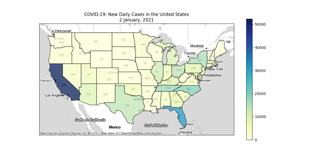
title = "COVID-19: {} in the United States\n2 January, 2021".format(title)
ax.set_title(plot_type)
Because we’re only working with a specific date, we’ve hard-coded the date into the function. However, if you’re working with multiple dates, you can easily update the code so that the correct dates display on the maps.
Zoom the Map to Show the Continental United States
Now, let’s set the bounding box to show only the Lower 48.
ax.set_xlim(*XBOUNDS)
ax.set_ylim(*YBOUNDS)
Add the Basemap For Your Choropleth Map
Penultimately, add the basemap for the choropleth map. We’ll use the same Stamen TonerLite basemap that we used in both the Hurricane Dorian Cone of Uncertainty and the maps of the 2011 tornado tracks. We’ll get the projection from the dataset so we don’t have to worry about the basemap and the data being in different projections.
ctx.add_basemap(ax, crs=full_dataset.crs.to_string(), source=ctx.provicers.Stamen.TonerLite, zoom=4)Save Your Choropleth Map to a png File
Finally, save the plots to a png image file.
output_path = "covid19_{}_usa.png"
plt.savefig(output_path)
Let’s Generate 4 Choropleth Maps
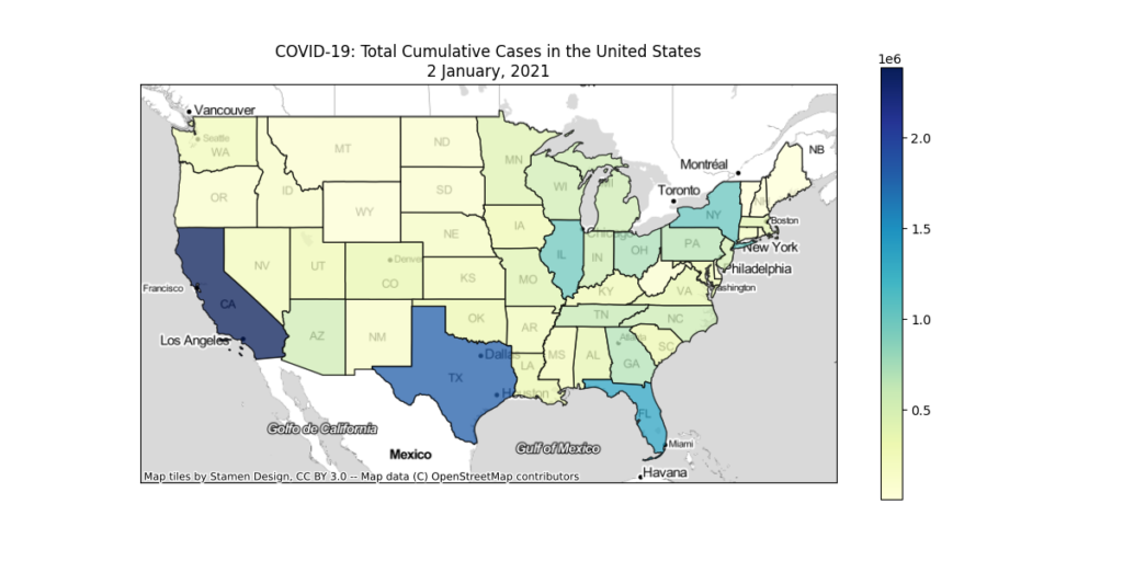
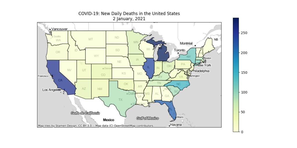
Now that we have our function to generate the choropleth maps, let’s make 4 maps of COVID-19 data on 2 January, 2021, which was the peak of the winter wave in the United States.
- New Daily Cases
- Total Cumulative Cases
- New Daily Deaths
- Total Cumulative Deaths
columns_to_plot = [
    "new_cases",
    "confirmed",
    "new_deaths",
    "dead"
]

plot_types = [
    "New Daily Cases",
    "Total Cumulative Cases",
    "New Daily Deaths",
    "Total Cumulative Deaths",
]

for column, plot_type in zip(columns, plot_types):
    choropleth_map(full_dataset, columns, plot_type)
    print("Successfully Generated Choropleth Map for {}...".format(plot_type))
Let There Be Maps
After running the script, you’ll find 4 choropleth maps in the script directory.

Download the Script and Run It Yourself
We encourage you to download the script from our Bitbucket Repository and run it yourself. Play around with it and see what other kinds of choropleth maps you can come up with.
Conclusion
Region mapping is an incredibly powerful way to efficiently display massive amounts of data on a map. For example, when we load the Canadian provincial data in our COVID-19 map, the combination of region mapping plus the Mapbox Vector tiles has resulted in a 99.997% reduction in the size of the provincial boundary being loaded. These savings are critical to the success of online GIS projects. Nobody in their right mind is going to sit around and wait for 75 GB of state boundaries to download every time the map loads.
Many people think that high-level tasks such as region mapping are confined to tools like ESRI ArcGIS. While Python GeoPandas is certainly not a replacement for a tool like ArcGIS, it’s a perfect solution for organizations that don’t have the budget for expensive software licenses or don’t do enough GIS work to require those licenses. If you’re ready, we can help you get started building maps with GeoPandas today.
If you’re ready to try a few exercises yourself, we’ve got a couple challenges for you.
Next Steps, Challenge 1:
Revisit our tutorial plotting 2011 tornado data. Revise that script so that instead of generating a map of the tornado tracks, you create a choropleth map of the number of tornadoes to strike each state in 2011. I’ll give you a hint to get started. You don’t need to use region mapping for this because the data is already embedded in the shapefile.
Next Steps, Challenge 2:
In the Bitbucket Repository, you’ll find a CSV File of COVID-19 data for each country for 2 January, 2021. Go online and find a GeoJSON or ESRI Shapefile of world country borders. Then use region mapping to create the same 4 choropleth maps we generated in this tutorial, except you should output a map of the world countries, not a map of US States. I’ve included all of the ISO Country Codes in the CSV file so you can use the Alpha 2, Alpha 3, or Numeric codes.
Top Photo: Beautiful Geology in Red Rock Country
Sedona, Arizona – August, 2016