The spread of disinformation and fake news seems like it’s about as American as apple pie these days. As a data scientist, it’s beyond horrifying watching so much disinformation rip through every facet of our society like wildfire. Sure, you grow to expect it from the idiots on the internet. But the fact that it now dominates everything from the news media to our education system to our jobs? That’s much more concerning.
Before we get too far, I want to say that the content of this post is designed for educational purposes only. I do not endorse the spread of disinformation or any conspiracy theories in any way. You should always back up your arguments with strong logic and easily-verifiable facts.
Recent statistics about disinformation over the past year or two are eye opening.
- 67% of Americans have interacted with disinformation or face news on social media.
- 56% of Facebook users cannot identify fake news that aligns with their own beliefs.
- Less than 30% of American adults trust the news media.
- In the third quarter of 2020 alone, Facebook saw over 1.8 billion engagements with fake news.
And that’s not even the tip of the iceberg.
How Do We Create and Spread Disinformation?
Sadly, it’s far too easy to create, publish, and spread disinformation these days. There is an endless list of different methods to create disinformation, but here are a few of the more popular ones.
- Manipulating Data or Statistics
- Using Logical Fallacies
- Making an argument that uses flawless logic, but the statements that are input into the argument are false
- Example: Rocks are vegetables. I like to eat vegetables. Therefore, I like to eat rocks.
- Injecting technical jargon and fancy words into a statement that is otherwise complete BS
- Just making something up off the top of your head.
One of My First Memorable Encounters with Real World Disinformation
One my first encounters with disinformation in the “real world” came after graduating into the teeth of the Great Recession in 2009. Like so many people at the time, I struggled mightily to find work. As the election season began heating up, it was quite clear that Republicans were going to do very well in the 2010 midterms. At the time, Democrats controlled the House, the Senate, and the White House. The economic recovery was moving painfully slowly, and unemployment remained stubbornly high.
Then, all of a sudden, shortly before the 2010 midterms, the unemployment rate mysteriously dropped, and it dropped a lot. What happened? Was the recovery finally kicking into high gear? Not really. Turns out, the number of unemployed people hadn’t really changed at all.
Instead, the Obama administration had decided that they didn’t like the optics of high unemployment levels, so they changed how the unemployment rate was calculated so it looked lower than it actually was. Long term unemployment was a particular problem coming out of the Great Recession, so they simply stopped including the long-term unemployed when they calculated the unemployment rate. Thankfully, the media called them out on it. As a result, the different methods of calculating the unemployment rate became much more transparent.
The Most Insidious Way to Spread Disinformation: A Look at the 2020 Election and the COVID-19 Pandemic
Today, we’re going to look at one of the most subtle, insidious, and incredibly effective ways to spread disinformation. You don’t need to manipulate any data or statistics. Nor do you need to tie yourself in knots using pretzel logic to make your argument.
Indeed, all you need to use is a little equivocation. When you equivocate, you tell part of the truth, but not the whole truth. The part of the truth you don’t want revealed is usually obfuscated in vague language. When done effectively, you’re not telling the whole truth, but you’re not telling a bold-faced lie, either.
Disinformation Spread in the 2020 Election: It All Starts with a Simple Map
Take yourself back to election night. You’ve cast your vote, and it’s time to sit down and watch the election returns. Regardless of which TV network or website you’re watching, they’re filling in this map.

On the surface, this map looks completely harmless. More importantly for the TV networks, their audience understands this map without needing any explanation.
In reality, this map is one of the most misleading ways to present election returns that exists. It infuriates me to no end that people still use it. One of the most common arguments I hear from people who look at this map is that there is so much more red than blue on the map, there is no possible way Trump lost the election.
There’s A Lot This Map Does Not Show
It’s true, there is far more red than blue on the map. And that’s exactly why the map is so misleading. To pop holes in that argument, let’s look at what the map shows and what it doesn’t show.
What the Map Shows
- The winner of each county
What the Map Doesn’t Show
- How many votes were cast
- The population of each county
- The margin of victory
- The percentage of the vote each candidate received
To further show how useless that map is, let’s compare it to the results of the 2016 election. Recall that in the 2020 election, Biden won 306-232 in the Electoral College. In 2016, Trump won by that exact same margin. Now compare the two maps using the slider. Can you easily tell which candidate won?
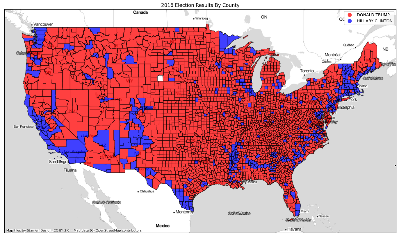

Not only can you not easily tell which candidate won, the 2016 and 2020 maps are practically identical. The only county with any significant population that changed colors between the two elections was Maricopa County in Arizona. This map has played a significant role in Maricopa County being the target of so many election-related conspiracy theories.
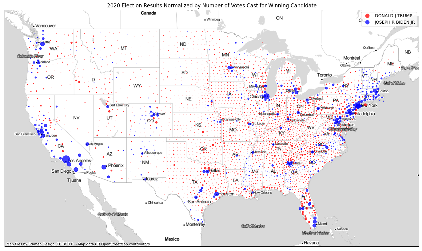
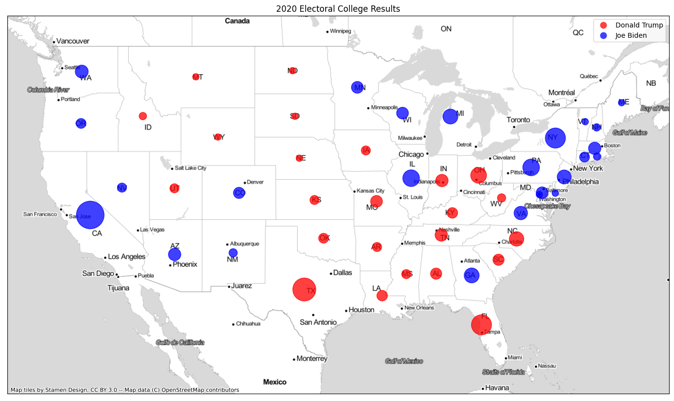
Introduce Population and Vote Tallies into the Map to Improve It
In order to better present the election results, you’ll need to incorporate at least one of either population or number of votes cast. Ideally you can incorporate both. First, let’s look at map of population by county.
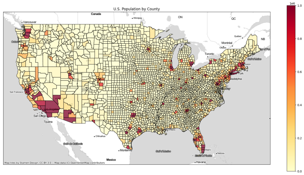
If you overlay the population map on either map of election results above, you should notice a very distinct correlation. The Democrat candidate won the more populous counties almost exclusively. When you have such a perfect correlation, it means that you have figured out which statistic is skewing the data on your maps and leading to the spread of disinformation.
So exactly how do we show population on our map? The easiest way is to put a colored dot inside each county instead of shading the entire county. Then scale the diameter of the dot based not on population, but instead on the number of votes cast for the winning candidate. Like our choropleth map, the dots be shaded blue or red to indicate which candidate won.
It’s not perfect, but it gives a much more accurate picture of the 2020 election results.
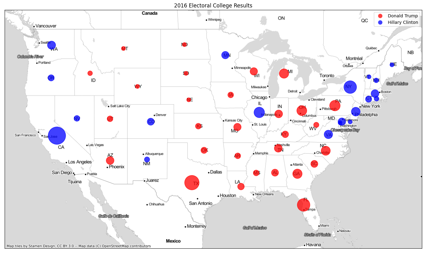
For comparison, here’s the same map for the 2016 election.
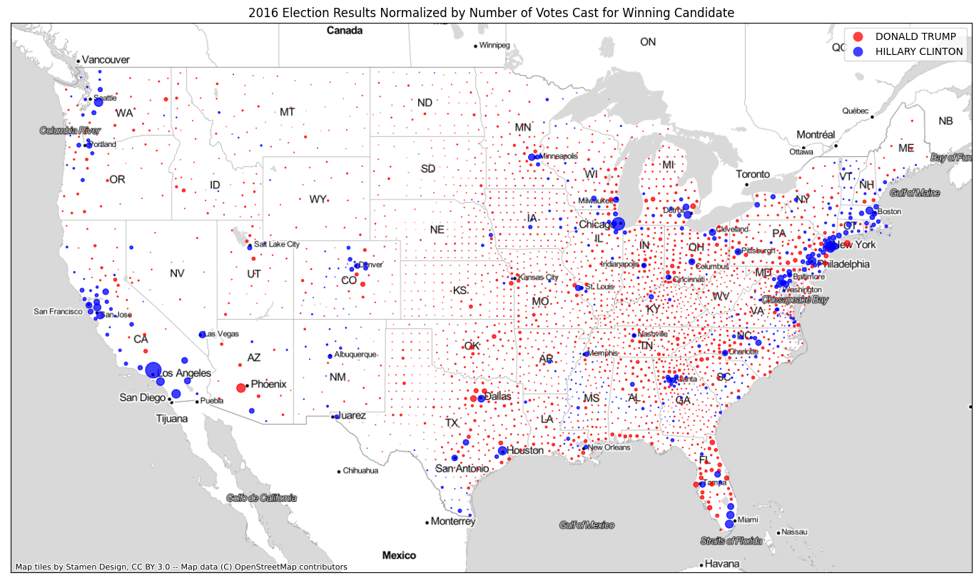
But Wait, Trump Won the 2016 Election 306-232. This Map Doesn’t Reflect That!
Good catch! You’re partially correct. Trump did win the 2016 election 306-232. And the 2016 map does show a lot more blue on it. So what gives? Trump won the Electoral College vote in 2016, but Hillary Clinton won the popular vote. The election maps with the scaled dots on them reflect the popular vote, not the Electoral College vote.
| Vote | Donald Trump | Hillary Clinton |
|---|---|---|
| Electoral College | 306 | 232 |
| States Won | 30 | 20, plus DC |
| Total Votes Cast | 62.9 million | 65.8 million |
| Percentage of Vote | 46.1% | 48.2% |
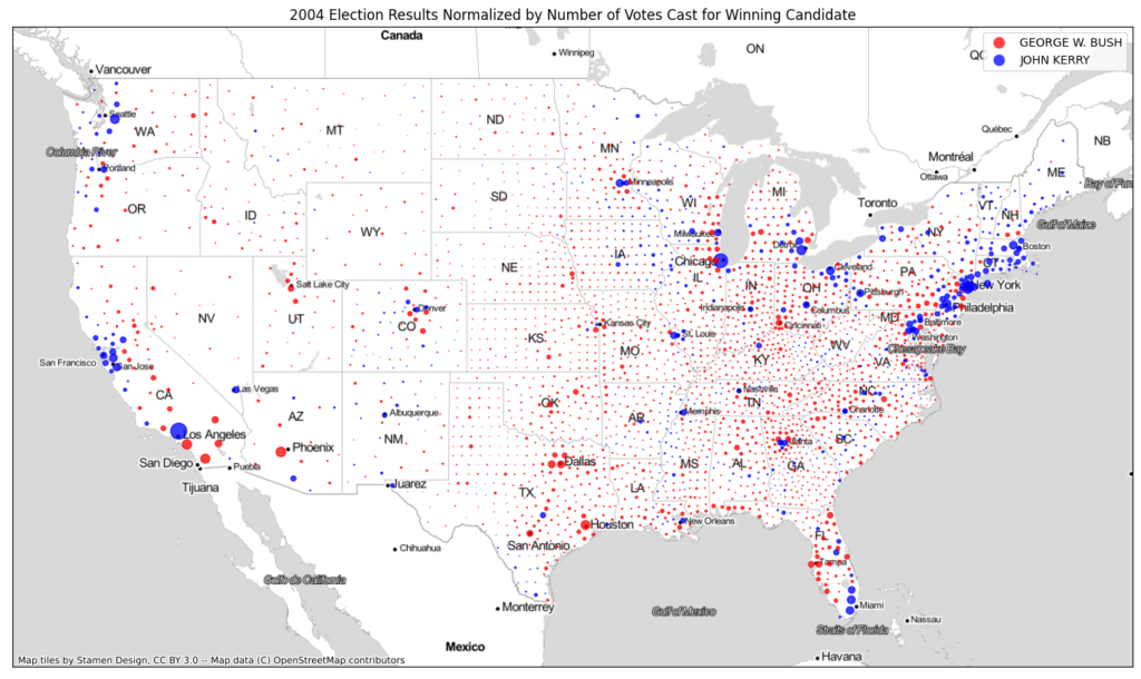
A Look at 2004: The Most Recent Election the Republican Candidate Won the Popular Vote
The 2004 presidential election marks the only time in recent history that the Republican Candidate won the popular vote. In 2004, President George W. Bush won both the Electoral College (286-251) and 50.7% of the popular vote (62 million to 59 million). Our map does correctly indicate that Bush won the popular vote that year.
So Can We Create an Electoral College Map That Does Not Spread Disinformation?
Because the Electoral College is a state-level process, it’s impossible to do so at the county level. However, we can recreate the map using scaled dots to represent the Electoral College. Like the county-level choropleth maps, population skews the Electoral College choropleth maps, leaving the ripe for the spread of disinformation as well.
Can Any Maps Debunk the Spread of Election Disinformation and Conspiracy Theories?
Maps can certainly explain what happened in Trump’s rise to power in 2016 and Biden’s triumph in 2020. Unfortunately, people that believe in conspiracy theories are often so irrational, it’s unlikely to convince them.
To show what led to Trump’s rise as well as his demise, let’s brainstorm a few changes we may want to look at when comparing the 2020 election to 2016.
- Demographics
- Voter behavior
- Candidate popularity
- Voter turnout
To save you the hassle, we’re going to look at the total voter turnout between the two elections, as well as who those voters were voting for. We’ll do this for each county. The math is simple, just addition and subtraction.
total_vote_difference = total_votes_2020 - total_votes_2016
dem_vote_difference = dem_votes_2020 - dem_votes_2016
rep_vote_difference = rep_votes_2020 - rep_votes_2016
To determine which candidate gained the most ground, simple compare the Democrat vote differences to the Republican vote differences.
vote_difference = dem_vote_difference - rep_vote_differenceIf vote_difference is a positive number, it means the Democrats gained votes. If it’s negative, the Republicans gained votes. The larger the magnitude of vote_difference, the bigger those gains were.
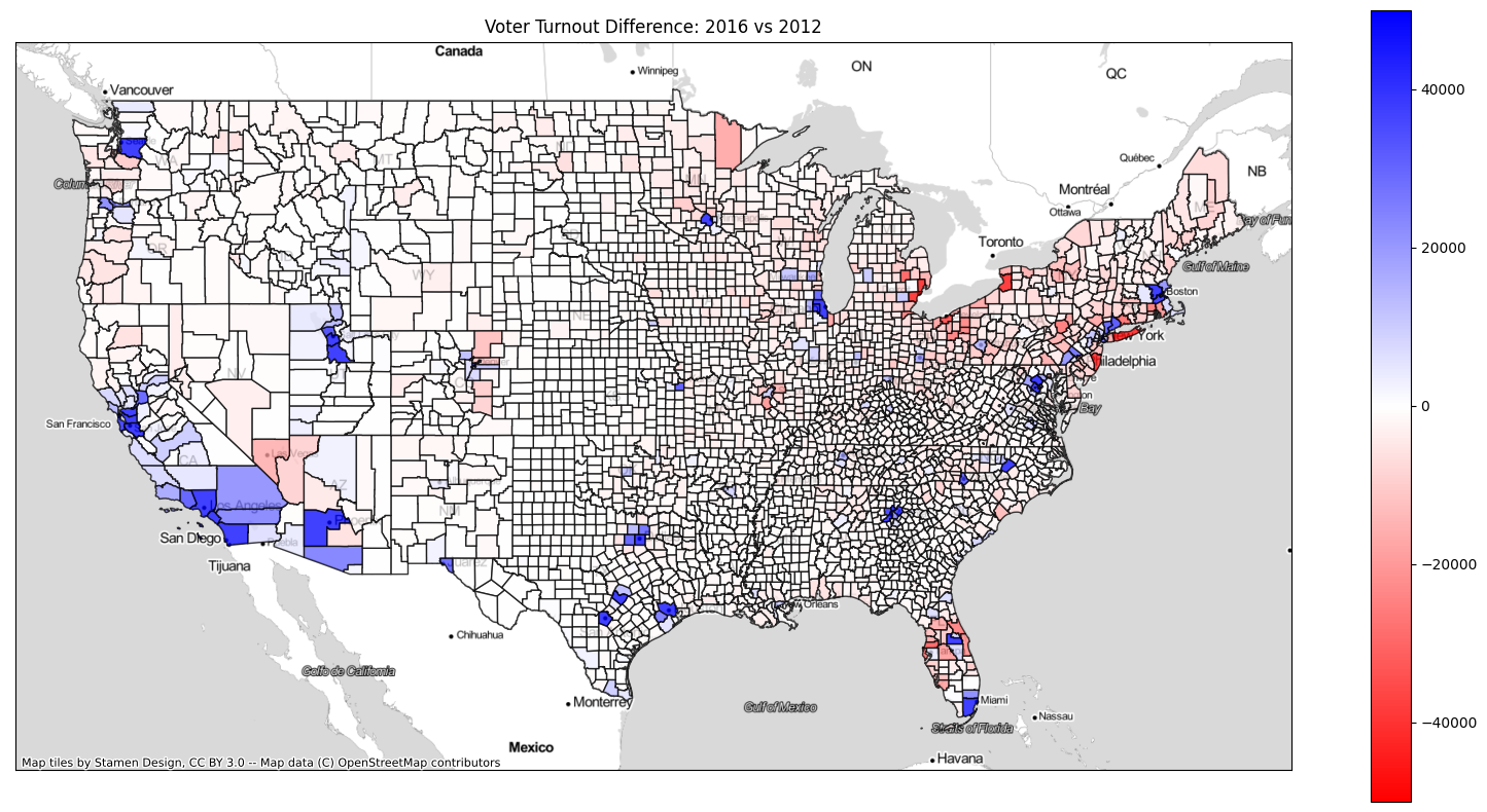
Let’s Look at Maps of Vote Gains
Let’s look at those maps. In addition to comparing 2020 to 2016, I’ve included a map that compares 2016 to 2012.
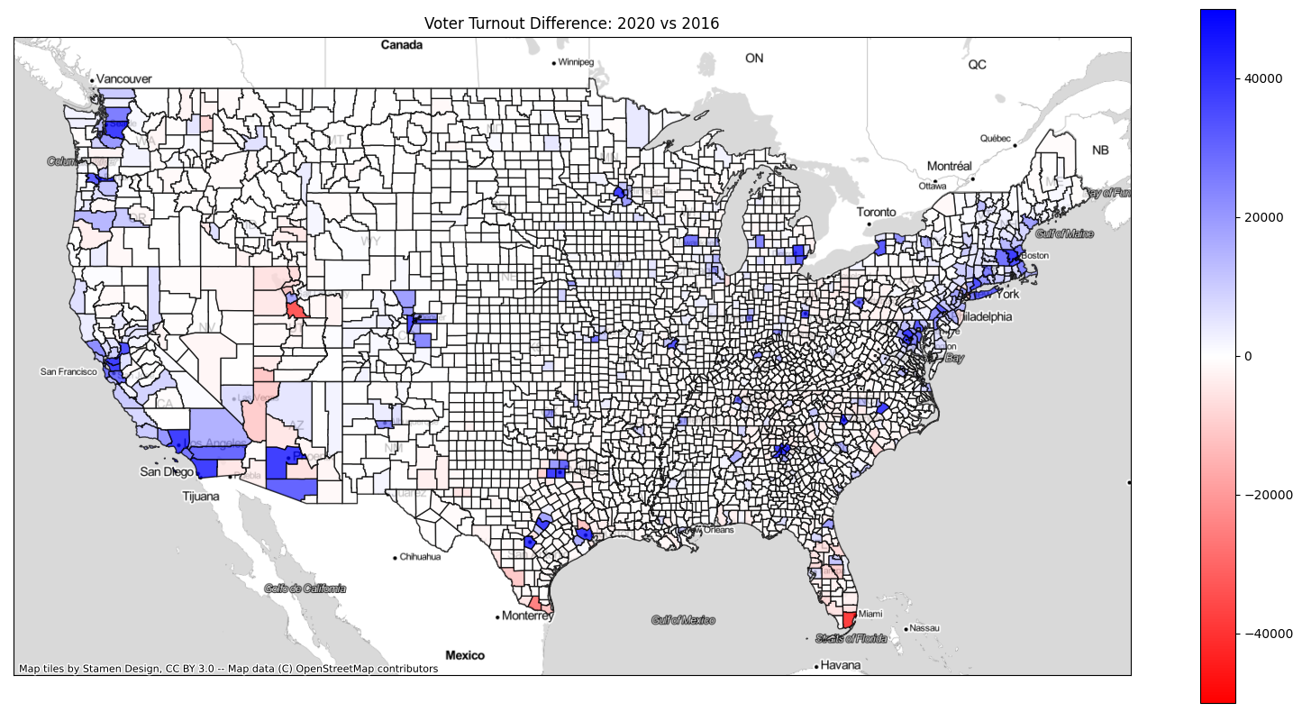
Let’s also look at total voter turnout in each county.
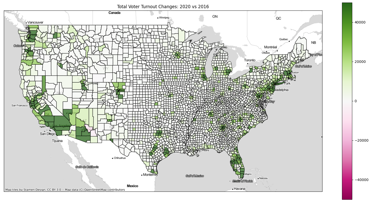

There are a few conclusions I can draw from these maps to combat disinformation and conspiracy theories.
| Metric | 2020 | 2016 |
|---|---|---|
| Voter Turnout | Trump was so polarizing, he turned out massive numbers of voters on both sides. | Many “on-the-fence” voters, especially those that lean Democrat, stayed home for various reasons. |
| Candidate Popularity | As ferociously devoted as Trump’s base was, Democrat voters hated him even more. | Both candidates were wildly unpopular. Many voters felt Trump was the lesser of two evils. |
| Independents | The independents that went for Trump in 2016 turned on him in 2020. Many moderate Republicans voted for Biden, too. | Many independents, especially across the Rust Belt, voted for Trump. The numbers out of Detroit are particularly fascinating. |
| Suburban Voters | Suburban voters revolted against Trump. There are huge Democratic gains in nearly every major city | Dem-leaning suburban voters stayed home or went for Trump, particularly in Detroit and Milwaukee. |
| Where The Election Flipped | Large Democratic turnout in 6 metropolitan areas won the Election for Biden: Philadelphia, Pittsburgh, Detroit, Atlanta, Phoenix, and Milwaukee | Rust belt voters that felt abandoned by Obama came out in droves for Trump, and flipped Pennsylvania, Ohio, Michigan, and Wisconsin, a total of 64 Electoral Votes |
| Florida | Trump picked up significant votes in Miami-Dade County (likely Cuban Americans voting against socialism), giving him a comfortable win in the state. | The Interstate 4 Corridor (Tampa to Daytona) that delivered the state to Obama in 2012 swung significantly back to the right and went for Trump. |
All right, enough about the election. Let’s move on and look at some COVID-19 data.
The COVID-19 Pandemic: A Stunning Exercise in the Spread of Disinformation
If there’s anything that’s torn through the United States faster than COVID-19 itself, it’s the disinformation associated with it. No matter what facet of the pandemic we’re talking about, we cannot agree with our fellow Americans on anything.
Want to know what’s even more frightening? It’s even easier to spread disinformation about COVID-19 than it is about the election. And we don’t have to worry about the election putting us in the hospital or killing us.
The Default COVID-19 Maps are Plagued by the Same Population Issue the Election Is
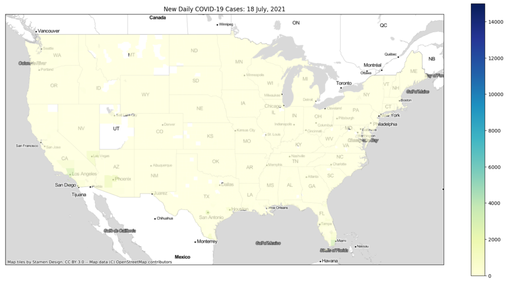
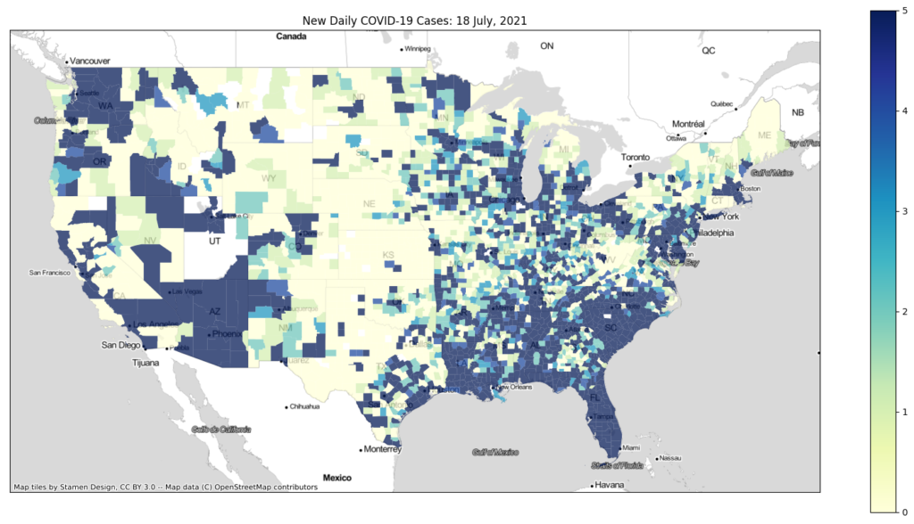
By default, most media outlets show new daily COVID-19 cases by either state or county. While that’s perfectly fine if that’s what you’re looking for, it is a terrible map if you’re trying to identify hot spots. Here’s a recent map of new daily COVID-19 cases in the United States. Take a guess as to where the hottest spot for COVID-19 is.
Looking at this map, you’ll likely identify two hotspots: Florida and the Southwest. Yes, COVID-19 is raging in Florida, Los Angeles, and Las Vegas, but neither of those spots is where the worst outbreak is. And where is that outbreak right now? It’s in Missouri and Arkansas, but you wouldn’t know it looking at this map.
Color Schemes: The Most Insidious Way to Spread Disinformation
The color bar on any map seems innocent enough. Its primary purpose it to make your map look really good. How bad can it be?
Turns out, the color scheme is particularly deceptive. You don’t need to do anything to the actual data. Nor do you need to twist yourself up in pretzel logic just to make your point. Even worse, people choose bad color schemes accidentally all the time, spreading disinformation without even realizing it.
While there are all kinds of ways to manipulate the color bar, here are the three most common.
Change the Upper and/or Lower Limits of Your Color Bar
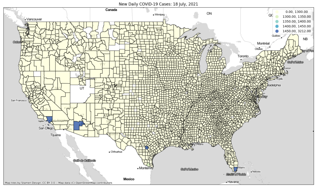
Look at the map of new daily cases above. The data range goes from 0 to 1,462 new daily cases. Now what would happen if I increased the upper limit by an order of magnitude, from 1,500 to 15,000? All of the counties would be shaded either white or very light green, and it would look like there’s no COVID-19 at all.
Conversely, what if I reduced the upper limit from 1,500 down to 5? It would look like the world is about to end, with COVID-19 spreading everywhere. That’s clearly not an accurate representation of what’s going on, either.
Don’t forget, both maps show the exact same dataset. All we did was change the color bar.
Change the Break Points of Your Color Bar
By default, most mapping and GIS programs default to breaking the color bar up in even increments or so that points are distributed evenly throughout the color bar. While neither is perfect, they work well is many cases.
Now let’s take this to the extreme. For this example, you’re a corrupt leader who wants to publish a map showing no COVID-19, despite the fact that it’s raging in your area. Using the same 0 to 1,500 scale, you set the first section of the color bar to cover 0 to 1,300. The remaining colors are set in increments of 50: 1,301 to 1,350; 1,351 to 1,400, and so forth.
That map makes it look like there is basically no COVID-19 spreading in the United States.
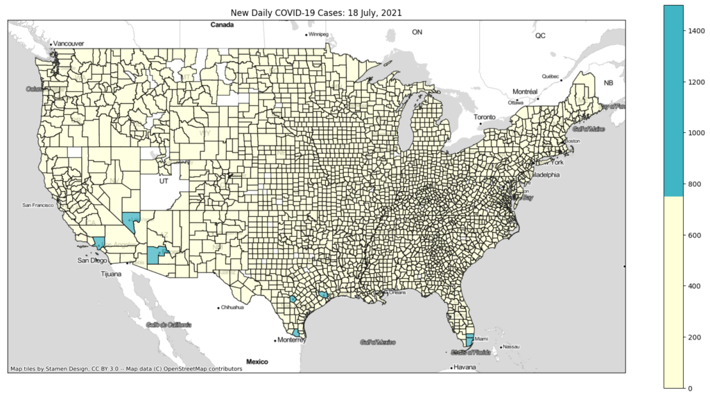
Alter the Number of Breaks in Your Color Bar
While there are certainly isolated circumstances when you want to increase the number of breaks, this method is far more effective when you reduce the number of breaks in your color bar. In our original map, there are 7 breaks for a total of 8 colors.
Now, let’s reduce the color bar from 8 colors to 2. The light yellow color will cover 0 to 750 new cases per day. Likewise, the dark blue color will cover 751 to 1,500 new daily cases.
As for the result? Once again, it looks like there is no COVID-19 in the United States. On other days, though, some areas that are raging look like there’s nothing there. At the same time, other areas that do not have a problem look like COVID-19 is exploding out of control. Talk about disinformation!
I Shouldn’t Give You Any More Ideas to Spread Disinformation, But…
I know what you’re thinking. There’s no way people can so blatantly manipulate the color bar and get away with it. Your intuitions are correct, but those examples we just looked at are extreme examples.
You can easily combine these methods to much more subtly mislead your audience. There are also plenty of other ways to mess with the color scheme that I haven’t touched on here. One easy way is to invert the colors. You can also use an illogical progression of colors throughout the color bar.
This is why when you look at any kind of figure, you should always verify both the color scheme and its limits before you make any assumptions about it. All it takes is a quick glance at the legend.
Use Logarithmic Scaling to Reduce Color Bar Manipulation
So is there anything we can do to reduce such easy color bar manipulation? If you’re dealing with a large range of data, use logarithmic scaling. For those of you who are unfamiliar with the logarithmic scale, it’s simple.
Instead of incrementing your axis in multiples of a number, you’re incrementing it by powers of that number. For example, a linear scale using multiples of 10 would be 10, 20, 30, 40, 50, 60, and so on. A logarithmic scale using powers of 10 would be 1, 10, 100, 1,000, 10,000, 100,000, 1,000,000, and so on.
Why a logarithmic scale? First off, it has preset intervals, so it’s very difficult to subtly alter the breaking points in your color bar. The logarithmic scale’s preset intervals also limit or prevent the data from shifting if you change the limits of the color bar. For example, on the COVID-19 map, 400 new daily cases will fall in the 100 to 1,000 section, no matter how high I set the upper limit of the color bar.
What Color Scale Do I Use?
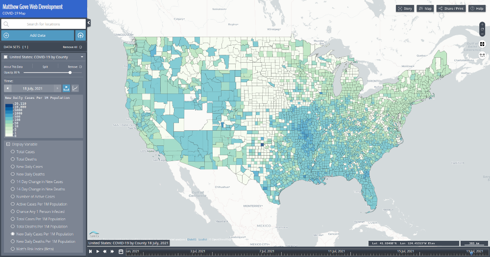
On my COVID-19 Dashboard Map, I use a hybrid logarithmic scale. It’s simply a logarithmic scale with breaks half way through each section of the scale. So instead of break points being at 1, 10, 100, 1,000, and so forth, they are at 1, 5, 10, 50, 100, 500, 1,000, 5,000, and so on.
The reason I chose a hybrid logarithmic scale is because the data range was not big enough to use a straight logarithmic scale. As a result, the map would have been too misleading, and would not have accurately shown areas where COVID-19 is surging.
Look at Other Parameters to Counter Disinformation
Listen to your gut. If it’s telling you a map or figure is misleading, it likely is. Regardless if you’re looking at published map or creating a map to publish, look at other parameters in the same dataset. The more parameters that backup your reasoning, the stronger your argument will be.
Normalize the Data by Population
In our COVID-19 dataset, the easiest way to get around the population issue is to normalize the data by population. Instead of the raw number of new daily cases, plot the number of new daily cases per million people.
That’s a big step in the right direction. You can at least see the big outbreak of cases in Missouri and Arkansas. However, Florida is also getting hit very hard right now, and this map makes Florida look a lot better than it actually is.
14-Day Change in New Daily Cases
Next up, let’s look at the two-week change in new daily cases. It’s a great map for identifying which way cases are trending, but it can be very misleading if you don’t know how to interpret it.
For example, if a county has just peaked and is starting to decline, the county will show bright green. Woo-hoo, right! Not so fast. You’re just past the peak. COVID-19 is still raging.
Here’s what the recent map looks like.
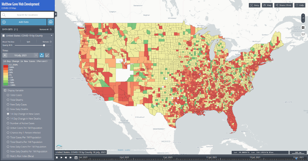
You should never rely on this map alone to make any decisions related to COVID-19. When you start analyzing the map, keep in mind that this map only shows the trends. It does not show how much COVID-19 is in the counties. Look at Massachusetts. It looks like it’s in worse shape than Missouri and Arkansas.
The map doesn’t show that Massachusetts has incredibly low case loads because it’s the most vaccinated state in the country. On the other hand, Missouri and Arkansas have some of the lowest vaccination rates in the country, which is why the Delta variant is ripping through their communities at such an astonishing rate.
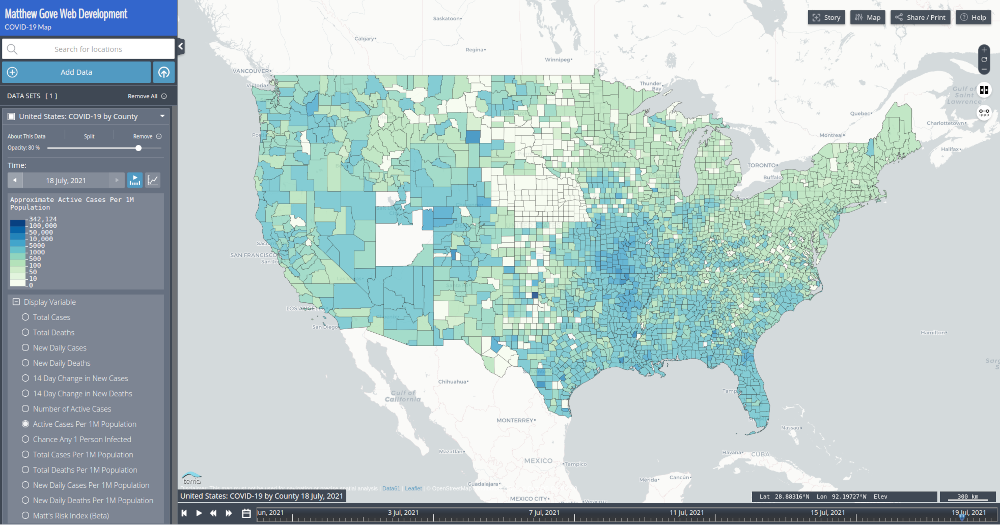
Active Cases Per Million People
The number of active cases per million people looks very similar to the new daily case loads per million people. As a result, you can see the big surge in Missouri and Arkansas, but the surges in both Florida and Las Vegas are lost in the noise.
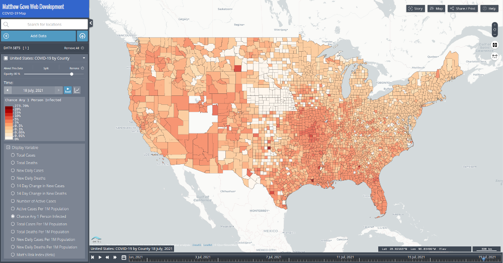
Odds Any One Person You Interact With in Public is Infected
When I drove across the country at the peak of the COVID-19 pandemic last winter, I wanted to minimize my risk of contracting the virus. Calculating the odds that any one random person you cross paths with is a great way to do that. All you need to do is divide the number of active cases by the population.
Again, it’s plagued by the same issue. You can see the big COVID-19 outbreak in Missouri and Arkansas. However, it doesn’t pop off the page and instantly draw your eye to it. Nor can you really see the ongoing surges in Florida or Las Vegas.
None of These Plots Show Hot Spots Well. What Now?
I know what you’re thinking. You just spent this entire post explaining how easy it is do spread disinformation through color bar manipulation. You can’t be about to suggest it now just to show where the COVID-19 outbreaks are.
Rest assured, we will not be doing anything to the color bars. Doing otherwise is flat out hypocritical. Instead, we can use Matt’s Risk Index. The index is essentially a weighted average of all of the parameters we just looked at. It’s designed to make hot spots and high-risk areas really jump off the page. If you’re interested in the math behind Matt’s Risk Index, we discussed it in detail when I first unveiled the index last winter.
Before looking at Matt’s Risk Index, recall where the hot spots in the United States are right now.
- Missouri and Arkansas
- Florida Peninsula
- Clark County, Nevada (Las Vegas)
- Los Angeles County, California
LA County’s huge population likely keeps its risk level quite low for now, but the other three areas should leap off the page when you look at Matt’s Risk Index.
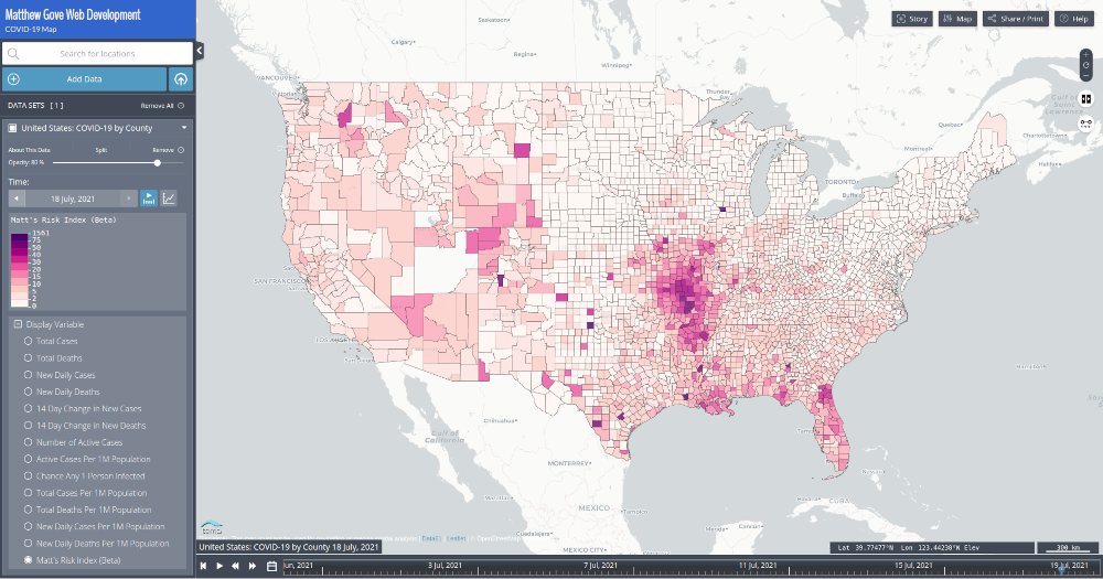
The Matt’s Risk Index map also seems to confirm health officials’ concerns that the southeast US is at very high risk for a Delta variant surge. Louisiana, Mississippi, Alabama, and Tennessee are some of the least vaccinated states in the country, and there are significant outbreaks of the Delta variant on either side of them right now.
My Favorite Example: Georgia’s Stunningly Boneheaded Decision to Spread COVID-19 Disinformation
What goes through the minds of some people when they make graphics is beyond me. In May, 2020 the Georgia Department of Health tried to make its argument to its citizens that it was okay to reopen everything and resume our normal day-to-day lives. COVID-19 was a thing of the past.
To support their argument, the State of Georgia published a chart that at first glance showed steadily declining COVID-19 cases. Unfortunately, when you took a closer look, one small problem appeared. The dates were in the wrong order.
Where does Sunday take place twice a week? And May 2 come before April 26?
The State of Georgia, as it provides up-to-date data on the COVID-19 pandemic.
In the latest bungling of tracking data for the novel coronavirus, a recently posted bar chart on the Georgia Department of Public Health’s website appeared to show good news: new confirmed cases in the counties with the most infections had dropped every single day for the past two weeks.
In fact, there was no clear downward trend.
Atlanta Journal Constitution
You can read the full story from the Atlanta Journal Constitution.
Thankfully, Governor Brian Kemp’s office quickly fixed the error as soon as they got called out for spreading disinformation. But there is no reasonable excuse at all to be publishing that garbage in the first place, let alone the middle of major public health emergency.
Not surprisingly, the late night comedians had a field day with it.
Data and Source Code That Generates the Maps in This Post
I believe in transparency, especially when it comes to the spread of disinformation. You can find the Python code and the data that is used to generate every map in this post in our Bitbucket Repository.
Data Sources
| Dataset | Source |
|---|---|
| County Presidential Election Results | MIT Election Data and Science Lab |
| Electoral College Results | US Federal Government National Archives |
| COVID-19 Data | Queried from our COVID-19 Dashboard database, which gets its data from Johns Hopkins University |
Conclusion
In today’s era of disinformation, it’s shockingly easy to spread disinformation. Maps are one of the easiest, subtlest, and most effective ways to spread a wealth of disinformation. The double-barreled combination of the 2020 Election and the COVID-19 pandemic hit the United States with a tsunami of stupidity that has proven time and time again to have deadly consequences.
Thanks to data gurus around the world, disinformation is being called out more than ever before. Armed with the proper knowledge and logic, you can easily recognize, call out, and disprove disinformation. Today, I ask you for one small favor. Reach out to your favorite data guru, and express your appreciation for their work. Follow them on social media, donate some money to their cause, or simply thank them for their efforts. It’s a small gesture that can make a big impact both in your world and theirs.
Top Photo: The Snow-Capped Sierra Nevada Provide a Stunning Backdrop to a Beautiful Winter Day at Lake Tahoe
Glenbrook, Nevada – February, 2020